The customizable select has entered Chrome 134, allowing us to style this form element to our hearts' content. I decided to write a series about this feature because there are so many cool things we can do with CSS these days to create some really unique and fun experiences. In this first article of the series, I want to talk a bit about the history, while also giving an in-depth guide on how you can start creating your first customizable select as a progressive enhancement, today.
This article could probably be read a 10-fold if I just named it: “10 ways to style your customizable select with CSS”. But I don’t want to do that. Instead I’m going to write a little series, starting with a bit of history and basic workings behind this new capability, and just follow it up with some in-depth examples and trickery.
I do encourage you to read a bit about the history as it might be some good food for thought, but since this is quite the long article, I added a few anchors:
- The History
- Styling the Customizable Select
- Adding Images in the Select
- The Selected Content Element
The history
The customizable select has been in the works for quite some time. Following the evolution of ideas on how we could solve the styling capabilities for developers was something I could witness close by. I’ve learned much about legacy, trade-offs and “naming things” by following along with Open UI for a few years. Even if it was just giving my opinion during Open UI meetings, early adoption, and reporting bugs by creating demos for each iteration of “customizable select”, it puts a big smile on my face to see this feature land in Chrome as of version 134. The amount of work this costs is not to be underestimated, and so many people had a part in this. I, for one, am just really happy I could see it all take shape.
More often than not when I give presentations about new UI capabilities, people ask me if I participate in these W3C community groups as a part of my job, or they wonder if I make some money doing it. The answer to that question is: “no, and I’m not the only one”. Same as in open source projects, some people do this kind of thing out of a passion. Maybe in some cases it’s about frustration as well? Eg: ”I’ve been doing this job for over 10 years, why can’t I style a select already?”
From new - to progressively enhanced element
A lot had been done for this already, but the first iteration (end 2022) I witnessed and based demos on was a new element called the <selectmenu>. There was even a moment when I thought it would be: “the final version”! So, I did what I usually do: I created a fancy article/demo and was convinced that this would be released in stable browsers (oh boy, was I wrong…). The months after, new names were bikeshedded and in about two months, there was a completely different name for this element: the <selectlist>. Ok, just a minor change, so I updated all my demos, feeling confident that this was just a little pre-release change for better naming, as a select isn’t a “menu”.
Even after name changes and other adjustments, the proposals still lacked a bit of clarity, specifically about progressive enhancements and accessibility. A new element does make things a lot more complicated for accessibility: Keyboard controls need to be specified correctly, screen readers would need to be updated to recognize the new element, and users would have to update their screen reader software to even notice that new element for what it is. It could become a real hassle.
One thing became clear during that period, there is a thin line on where you want to block authors for doing certain things. Do we give developers full control? Where should we block things? By default, everything should be accessible in HTML, let’s not forget that. It’s a thin line to which degree you want to give developers a pair of scissors and let them run with it. Please don’t take that the wrong way, I’m just as equally guilty in creating some shady stuff. But where and how could you avoid this, that’s the question.
Let’s fast forward a little bit. In the end, what Open UI does, is write explainers. This kind of research goes on to be presented to the HTML and CSS working groups, and a lot of feedback can come from those steps. One thing that started to happen was collaborative meetings. Mostly due to bad hours for me to follow those, I only joined a few of them, to listen. But I did notice that a lot of handy feedback came from those meetings and things started to move forward at an inclined pace. Everyone loved the capability and the work by Open UI, the things we could do, but the new element idea, it just didn’t sit right. And that’s when a new idea was born…
Let’s re-use the select, and create an opt-in via CSS.
Can we? Shall we? This is where I got lost so many times, this is where talk started to happen on parsing HTML and what is and isn’t possible due to the browser engine and even OS differences. Because a select does differ based on OS as well, especially from an accessibility standpoint. Here is a party trick to do with your colleague:
Create a select, “colleague one” views that select on Windows, the other one on macOS. Use your keyboard to access the select, focus on an option using arrow keys, press the ESC button, which colleague selected the focused option? Who still has the previous selected option? I’ll let you figure out the answer 😉
Anyway, a lot of thought went to this progressive enhanced select, and I don’t know all the details on the browser engineering perspective. However, I did learn that implementing this kind of behavior was difficult. There is a huge collection on GitHub by Joseph that if you want to dive deep on the amount of work, I can highly recommend it.
The most baffling thing is that someone noticed that when you put a <button> inside of a <select>, it just gets completely ignored by browsers and that became the window to truly progressively enhance the <select> and open up a variety of styling possibilities. Do not put an input element in there, for example. (I might get back on that one in a future article) It’s only the <button> element that gets ignored, you can not put an <input> element in there without breaking the backwards compatibility.
Another benefit is that it would ignore unknown elements, which allowed the <selectedcontent> (first named: selectedoption) element to be nested inside of a <select>.
I did spare out some details, conversations about keyboard navigation, the timing of cloning <selectedcontent>, naming (a lot of) things, pseudo-element choices and names, how the checkmark should be defined, etc.
A lot is going on here, and that’s exactly why I at least wanted to write up a little bit of history. There are so many little choices, that we take for granted when new things get added to the web platform. People are excited for this, me being one of them. So many hours went into getting this to the platform. Every engineer, accessibility expert, developer, contributor, is doing a little part in moving this forward. I’ve at least learned to be a little less ignorant, by understanding why these things take time.
All that time, sometimes frustratingly re-creating demos due to changed (pseudo-) element names or behavior - I believe the wait was certainly worth it.
A lot of people will use the word “finally” when podcasting, writing, and video tutorialing the customizable select. But just as we forget with open source, there was a lot of work, for the better. So from me, to all those involved, whether you get paid to do these groups or not: thank you.
Now let’s get styling!
Styling the customizable select
Remember that this is a beginner tutorial so we’re going to keep things as easy as possible for now and create something like this:
The opt-in via CSS and the anatomy of a customizable select
First thing we need to do is to create our <select> using HTML and do the opt-in via CSS, for this demo, I do want to progressively enhance this <select> a bit, because I believe this is where a lot of the power lies, so let’s start with some HTML:
<select>
  <option value="first">First option</option>
  <option value="second">Second option</option>
  <option value="third">Third option</option>
</select>
Now let’s opt-in via CSS:
select {
  appearance: none;
  @supports (appearance: base-select) {
    &,
    &::picker(select) {
      appearance: base-select;
    }
  }
}
So, let’s explain this small CSS snippet a bit. First of all, I set my select to have appearance: none;, this was already possible, and I’m doing this because I do want a bit of styling for my select for browsers that do not support this new feature. Which brings me to the feature query:
@supports (appearance: base-select) {
  &,
  &::picker(select) {
    appearance: base-select;
  }
}
This ensures that when the feature is supported, the select and the picker appear as base-select, opting into that customizable select capability.
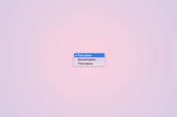
Let’s quickly compare side-by-side. On the left, you have Chrome 134, which supports this new behavior. On the right, you have another browser that falls back to the default appearance: none.
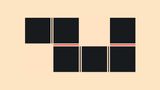
But what happened when we opted in with CSS? Well, a lot of things became available to us, here is an image highlighting things we can target (explainer below):
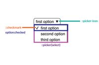
There are a few things that we can select with CSS directly:
::picker-icon: Allows us to change the little icon indicating the select (arrow-down)::checkmark: allows us to alter the check icon that is next to the checked option:checked: A pseudo-class to select our checked option::picker(select): The bounding box that surrounds/lists our options
Styling our select
Let’s start with the basic look and feel of our select, we’re going to set display: flex to get the arrow positioned next to the text, give it a bit of border-radius and just some basic styling, it’s all good here, do something you like for this step:
select {
  display: flex;
  justify-content: space-between;
  align-items: center;
  color: white;
  border-radius: 5px;
  border: 2px solid plum;
  cursor: pointer;
  font-weight: 700;
  padding: 10px;
  background-color: hotpink;
}
Next up, we’re going to make sure that we still have a good experience for browsers that don’t have the new support. Inside of my select, let’s add a little arrow by updating the background and paddings:
select {
  /* Previous properties, but updated the padding */
  padding-block: 10px;
  padding-inline: 10px 30px;
  background: hotpink url("arrow.svg") right 10px center / 20px no-repeat;
}
This gives the padding at the end bit more room and provides a background-image of an arrow to clarify this is a select element. And there you have it, we have a perfectly styled select for browsers that don’t support this new feature:

Progressive enhancing our customizable select
Now that we have set a good basis, let’s dive a bit deeper. According to the anatomy, we can now access the ::picker-icon pseudo-element to update our arrow, let’s do this right away.
We will remove the background-image on our select itself and reset the padding in favor of using the pseudo-element as a progressive enhancement:
select {
  /* Previous properties with background-image */
  @supports (appearance: base-select) {
    padding-inline: 10px;
    background-image: none;
    &::picker-icon {
      content: "";
      width: 20px;
      height: 20px;
      background-image: url("arrow.svg");
      transition: rotate 0.2s ease-out;
    }
  }
}
Noticed that I added a transition on the ::picker-icon? We also get an :open pseudo-class with this new feature, let’s put that in action and rotate our icon when the select is open:
select {
/* ... */
@supports (appearance: base-select) {
/* ... */
&::picker-icon {
/* ... */
}
&:open::picker-icon {
rotate: 180deg;
}
}
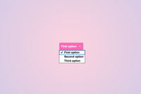
}This is our current state when the select is open:
Styling the select picker and options
Now is the time to finally style what we came here for: styling the picker and options. With the ::picker(select) pseudo-element we can style the box that contains our selects.
For this part, let’s keep building it up inside of that @supports query:
select {
/* ... */
@supports (appearance: base-select) {
&:open::picker-icon {
/* ... */
}
&::picker(select) {
padding: 0;
margin-top: 5px;
border: 2px solid hotpink;
background: white;
border-radius: 5px;
font-weight: 400;
}
}
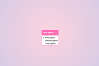
}This allowed us to style the listbox and this is the result:
Wonderful! All that is left for us to do is to style the options themselves, in a nutshell, this is what I’ll be doing here:
- Remove the checked icon by setting the
::checkmarkpseudo-element todisplay: none - Create my own checked state with the
:checkedpseudo-class - Add a bit of beautiful styling and some transitions
option {
  padding: 10px;
  border-top: 1px solid plum;
  cursor: pointer;
  transition-property: color, background;
  transition-duration: 0.2s;
  transition-timing-function: ease-out;
  &:where(:hover, :focus, :active) {
    background: plum;
    color: white;
  }
  &:checked {
    background: violet;
    color: white;
  }
  &::checkmark {
    display: none;
  }
  &:first-child {
    border: 0;
  }
}
And there you have it, a beautifully styled select:
Animations
I am going to keep the animation part for another articles as I’m planning to go a bit wild with animations for those. Do not forget that the picker is inside of the top-layer, so you will need to animate with that in mind. However, I don’t want to keep you hanging completely, so for this example you could do something such as animate the height and opacity:
select {
  /* ... */
  @supports (appearance: base-select) {
    &:open::picker-icon {
      /* ... */
    }
    &::picker(select) {
      /* ... */
      opacity: 0;
      height: 0;
      overflow: clip;
      transition: height 0.5s ease-out, opacity 0.5s ease-out, overlay 0.5s,
      display 0.5s;
      transition-behavior: allow-discrete;
    }
    &:open::picker(select) {
      opacity: 1;
      height: calc-size(auto, size);
      overflow: auto;
      @starting-style {
        opacity: 0;
        height: 0;
      }
    }
    /* ... */
  }
}
Final note on the first example
In contrast to the non-customizable-select, the width of the select is fluid, meaning that it does not take the size of the largest option by default. So you will need to provide something for this. In the final example I added a min-width.
Here is the full CodePen:
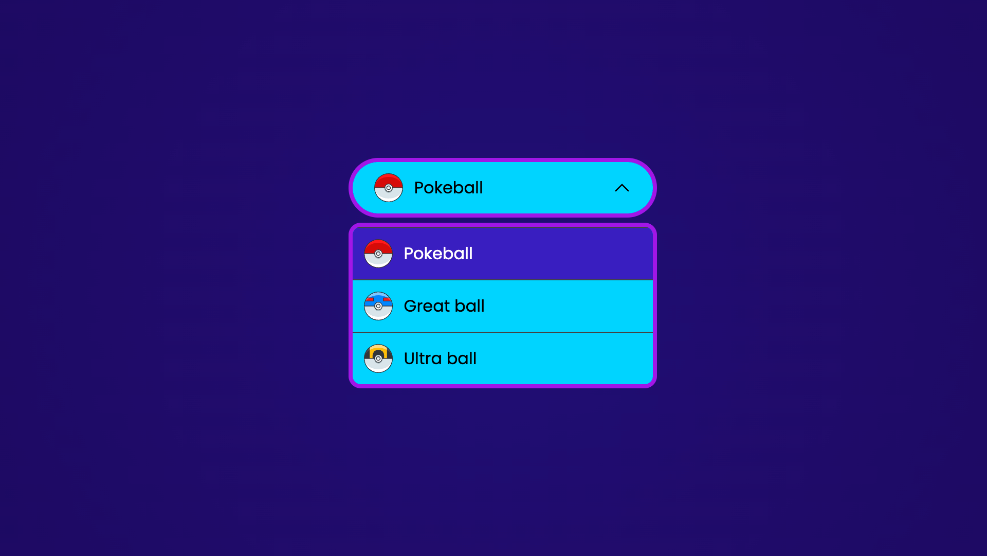
Adding images in the select’s options!
Now that we know the foundation of the customizable select, it might be interesting to know that this new feature allows us to add images or icons inside of the options. Re-using the same select (but with a bit of different styling), this is an example where I just added some SVGs inside of the options:
You could do something like this:
<select>
  <option value="pokeball">
    <img src="..." alt="" />
    Pokeball
  </option>
  <option value="greatball">
    <img src="..." alt="" />
    Great ball
  </option>
  <option value="ultraball">
    <img src="..." alt="" />
    Ultra ball
  </option>
</select>
And in my CSS, I updated my options a bit:
option {
  display: flex;
  align-items: center;
  padding: 10px;
  gap: 10px;
}
The result is that inside of my options the images are visible:
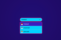
This is great, no harm done for non-supported browsers as they don’t get rendered for those, but wouldn’t it be nice if we were able to see that image inside of our select when it’s closed?
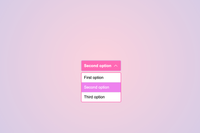
The selectedcontent element
One of the great things is that buttons and new elements get ignored in browsers that don’t support this feature. Taking the same poké-adventure, let’s make that Pokéball pop up in the selected content. This is how I updated the HTML:
<select>
  <button>
    <selectedcontent></selectedcontent>
  </button>
  <option value="pokeball">
    <img src="https://assets.codepen.io/159218/pokeball.svg" alt="" />
    Pokeball
  </option>
  <option value="greatball">
    <img src="https://assets.codepen.io/159218/great-ball.svg" alt="" />
    Great ball
  </option>
  <option value="ultraball">
    <img src="https://assets.codepen.io/159218/ultra-ball.svg" alt="" />
    Ultra ball
  </option>
</select>
The <selectedcontent> will clone the content of our selected option inside of it. We do need to style it a bit with CSS:
selectedcontent {
  display: flex;
  align-items: center;
  gap: 10px;
}
This is our final result:
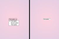
In case you were wondering, if this feature is not supported, it is still a perfectly beautiful and usable select:

One more step
The last thing I want to address is that we can visually hide some text inside of that <selectedcontent>, thus really manipulate the look and feel between the select itself and the options. I am not going to go in detail on this right now, but this means you could do something like this:

More on that later, but if you can’t wait to dig in, you can find that CodePen here.
Much more to come
In the next few articles, I’m going to focus on some specific demos and techniques to create some really cool gamified experiences. I’m really happy this feature landed in Chrome and I just love playing around with it. It gives the ability to create some fun experiences, never forget to have some fun with the web.
What’s more, I will be talking about this in depth at CSS Day this year!
I know this was a long article, I promise the next ones will be a bit shorter. But here is the foundation for you to start creating those awesome customizable selects as a progressive enhancement!
Happy selecting!
Other articles on Select:
- The customizable select - Part two: Potions, anchoring, and radial shenanigans in CSS
- The customizable select - Part three: Sticky Options
- The customizable select - Part four: Scroll snapping, state queries, monster hunter, and gamification
- The customizable select - Part five: Optgroup, creating a true select menu