In this third episode of my exploration of the customizable select, I thought it was time to show how we can have a little bit of fun with an old friend: sticky positioning. In this article, we’ll be following up on earlier techniques while exploring how we can use the :checked pseudo-class to create a fun open and close effect. We’ll be messing with top-layer functionality, interpolate-size and other trickery to create an emoji picker.
Quick recap
In the previous part, I showed how we can use anchor positioning to place our picker holding our options on top of the select itself. We will be re-using this idea, but with a twist! After all, anchoring is part of Interop 2025, so we’d better get acquainted with it as much as possible.
The idea for this is to use the :checked pseudo-class of an option to drag it right to the center to create a fun experience.
If you have been following this series from the start, you know that I like to live in a real world where I just can’t ship an unstyled select for browsers that don’t support this feature. So this example will also have somewhat of a progressive enhancement ideology.
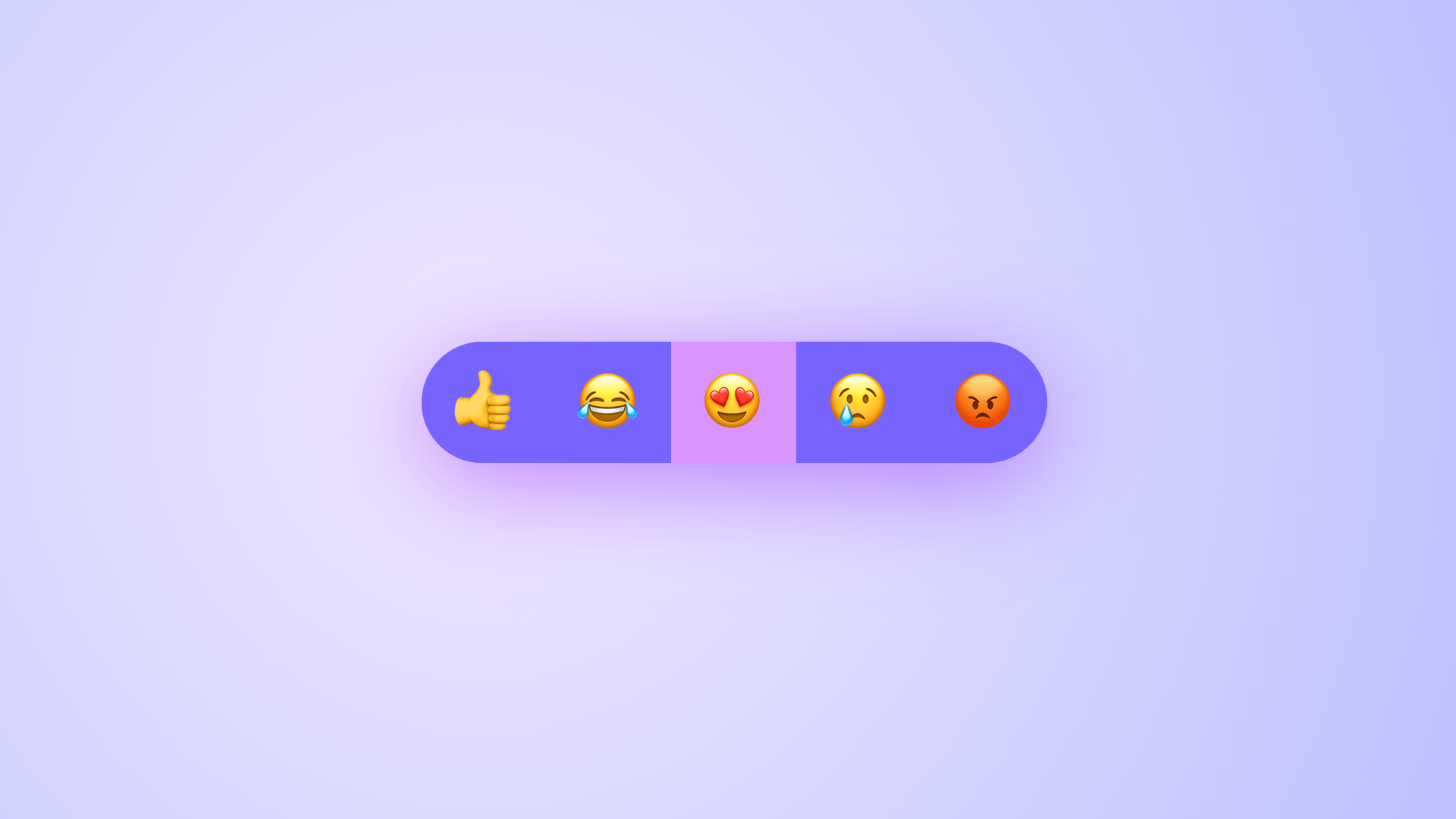
This is what we’ll be creating:
The setup of our emoji picker
The HTML for this example is pretty straightforward. We won’t even need the <selectecontent> element for this one. This is the main setup:
<label for="mood-picker" class="inclusively-hidden">Select a mood</label>
<select id="mood-picker">
  <div class="items">
    <option>👍</option>
    <option>😂</option>
    <option>😍</option>
    <option>😢</option>
    <option>😡</option>
  </div>
</select>
This is a pretty straightforward select. Note that I added a label here with the class .inclusively-hidden. I’m going to visually hide my label, but keep it available for screen readers. It’s perfefctly ok to keep this label visible, I’m just doing it to pretty my demo a bit. Still I wanted to keep the label there as a reminder that we should label our form elements… always.
This is how you can do this, if you want to do the same:
.inclusively-hidden {
  clip: rect(0 0 0 0);
  clip-path: inset(50%);
  height: 1px;
  overflow: hidden;
  position: absolute;
  white-space: nowrap;
  width: 1px;
}
Ok, our HTML is set, let’s start by creating some of the groundwork of our customizable select.
We will be needing two colors which I will add in variables, a basic background color and a selected color. We will be transitioning to a width: auto;. Thanks to interpolate-size: allow-keywords, this has become a possibility and can be used as a progressive enhancement as well. There is a way to do this individually with cal-size(), but I’d like to take the lazy route for this one by adding the following to the root of my CSS:
:root {
  --selected-color: oklch(99% 0.44 280);
  --light-color: oklch(90% 0.49 269);

  @supports (interpolate-size: allow-keywords) {
    interpolate-size: allow-keywords;
  }
}
This will allow us to animate from, for example, a width: 64px to width: auto. We’ll circle back to this later on, but first, let’s set up some of that basic select styling. Remember, I’m first styling for every browser before we get to the main dish:
select {
  appearance: none;
  display: flex;
  place-items: center;
  justify-content: center;
  width: 64px;
  height: 64px;
  padding: 0;
  border: 0;
  border-radius: 50%;
  font-size: 2rem;
  line-height: 1;
  text-align: center;
  text-align-last: center;
  background: var(--selected-color);
  }
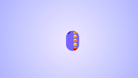
This would currently result in the following for every browser:

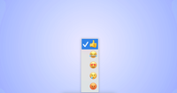
But when you click it, you get the default picker:
The only special fix here is the text-align-last property, which is used to center our select’s content for Safari. Ok, we got a nice and solid foundation, let’s get going to our select with sticky options.
Opting in and positioning our ::picker(select)
First, we want to create our opt-in to the customizable select and sprinkle a nice little anchor positioning on top, to place our ::picker(select) above the select. I am also directly hiding the ::picker-icon pseudo-element, we don’t really want it for this demo:
select {
  /* ... */
  @supports (appearance: base-select) {
    appearance: base-select;
    &::picker-icon {
      display: none;
    }
  }
}

/* For easy tinkering, I wrap the whole custom shebang in a new feature query */
@supports (appearance: base-select) {
  select::picker(select) {
    appearance: base-select;
    inset-block: anchor(top) anchor(bottom);
    width: 64px;
    height: 64px;
    overflow: clip;
    padding: 0;
    border: 0;
    background: var(--light-color);
    border-radius: 60px;
  }
}
There are a few things going on here. By using the anchor functions, I am placing the picker on top of my select, clipping overflow, and giving it the same size as the select itself. This is the setup for magic to happen.
Why do we use anchor functions for our positioning?
The ::picker(select) is inside the top-layer, located outside of the document flow. We don’t really need to provide an anchor-name for this because the picker is automatically associated with the select button via CSS anchor positioning. This is why we are still using anchor functions to position the picker.
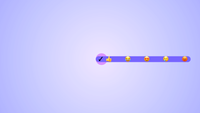
By now, you should have something like this:

Once again, notice how our options are on top of our select and completely visible. Now let’s add a bit of styling.
Styling the picker and options
For easy tinkering, what I would suggest is to remove the comment on our previously set width and height we’ve set on our select for now:
select::picker(select) {
  /* comment out these lines
  width: 64px;
  height: 64px;
  */
}
That way, we can see our options completely:
So let’s get to styling, first off, let us set the .items wrapper to flex our options:
select .items {
  display: flex;
  overflow: auto;
  scrollbar-width: none;
}
We are also hiding the scrollbar in this example as we don’t really want to see this peeping. The overflow needs to be set to auto for the sticky effect to happen later on.
Next up is for us to add a bit of styling to our options and hide that checkmark:
option {
  display: flex;
  align-items: center;
  font-size: 2rem;
  flex: 0 0 66px;
  width: 66px;
  height: 66px;
  line-height: 1;
  padding: 0 1rem;
  background: var(--light-color);
  transition: background 0.4s;
  cursor: pointer;
  &::checkmark {
    display: none;
  }
}
We are mainly just setting our options to be full height and set in the middle. I did however notice some pixel rounding issues from time to time, so I decided to make them a bit higher than the picker, because the overflow is clipped anyway, that’s perfectly fine here. Since the example works with rounded corners, we will also need to give our first and last-child a bit of a border-radius:
option {
/* Previous code */
  &:first-child {
    border-radius: 60px 0 0 60px;
  }
  &:last-child {
    border-radius: 0 60px 60px 0;
  }
}
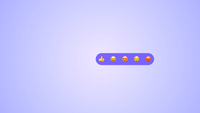
We currently see how we want our select to be when expanded:
Now let’s uncomment the width and height of our picker again:
 select::picker(select) {
  /* uncomment out these lines */
  width: 64px;
  height: 64px;
}
Creating the open effect and sticky dragging of the checked option
We haven’t created an animation for our select to open up. I have some thoughts on this, so do read on after the code blocks.
Let’s update our picker to have a transition on width:
Note: Currently, there seems to be an issue on touch devices. There is a workaround for now by setting pointer-events only to trigger when the select is fully open.
I will keep this article updated for progress on that part, and will also inform on my social when the issue would be fixed.
So, currently the pointer-events hack is added.
select::picker(select) {
  /* Previous code */
  transition: width 0.5s ease-out, display 0.5s, overlay 0.5s, pointer-events 0.5s;
  transition-behavior: allow-discrete;
}
Let’s also set the final state of our open select and the @starting-style
select:open::picker(select) {
  display: flex;
  width: auto;
  pointer-events: auto;
  @starting-style {
    width: 64px;
    pointer-events: none;
  }
}
Because we’ve set interpolate-size: allow-keywords on our :root, we can transition from a fixed width to an auto width. Since the picker is inside the top-layer we have to set transition-behavior: allow-discrete to transition the overlay and display property, and use @starting-style for when that picker is opened.
Ok, our select opens smoothly and so the last piece of the puzzle is to add position: sticky to the :checked option
option {
  &:checked {
    position: sticky;
    background: var(--selected-color);
    inset-block: 0;
    inset-inline-end: 0;
    z-index: 1;
  }
}
We now have our “sticky options” effect, and I think it’s pretty cool that we can do this!
In the final demo, I also updated some hover animations for the options and some alternative on smaller window sizes. Do check it out:
At the current time, the demo seems to have some issues on mobile devices, something to look at for sure.
Some thoughts
I would never consider myself an accessibility expert, although sometimes I get the feeling I know more than some “experts” (If you’re reading my blog, chances are high you’re not the kind of person I’m referring to). But after some quick testing I did notice small nuances on how VoiceOver handles the menu items, sometimes I get a count (eg: item 1 of 5), sometimes I only get a general “5 items”. And this is why I’m not an expert, I test this, I notice the difference, but what is the real impact here? I think it’s an honest question. A user can surely navigate this example, and I think it makes sense, but inconsistencies are never a good thing. So, I’m certainly not red-flagging this as an accessibility hazard, but still, something to keep in mind.
Besides this concern… To quote Una recently at Google I/O, we are entering a golden age of UI.
It’s so cool that we can create these little fun experiences.
Other articles on Select:
- The customizable select - Part five: Optgroup, creating a true select menu
- The customizable select - Part four: Scroll snapping, state queries, monster hunter, and gamification
- The customizable select - Part two: Potions, anchoring, and radial shenanigans in CSS
- The customizable select - Part one: history, trickery, and styling the select with CSS