In this second part of my customizable select series, I’d like to highlight one feature from Interop 2025 that works beautifully with this feature: anchor positioning. This article contains one of my first demos ever created when styling the select and has evolved with every new syntax and iteration across the months / years. We'll also be taking a glimpse at a few experimental features, but the basis of this can be used today. Let’s take a look at my potion selector with CSS.
In the first part of this series, I never really said how many parts this series is going to be. To be honest, I don’t really know myself. Between the first article and now, I already had the inspiration for another article, this select capability is just so cool…
So, there will undoubtedly be parts 3 and 4, and I’m guessing a part 5 is also cooking somewhere in my brain. This part will be about a single demo, a radial select, and a potion picker with CSS. I don’t want to go back into history as I did in the first article, but it is worth mentioning that this is one of the very first demos I created with the customizable select, back when the initial idea was still a new element. However, I do believe that this demo also had a bit of a helpful contribution to the end product we have now, as it did expose some difficulties to browser engineers regarding animating options that overlap the select button while clicking. Look at me talking like I make a big difference… but really, I just loved experimenting and I’m happy it helped, even if it’s just that tiny little bit.
CSS Anchor positioning and the customizable select
CSS Anchor positioning is one of those features that I’m really excited about, what’s even more fantastic, is that it’s part of Interop 2025. I won’t be going into the full syntax of anchoring but will focus on some trickery specifically for this use case. (I also have written on anchor positioning before)
Where we left off…
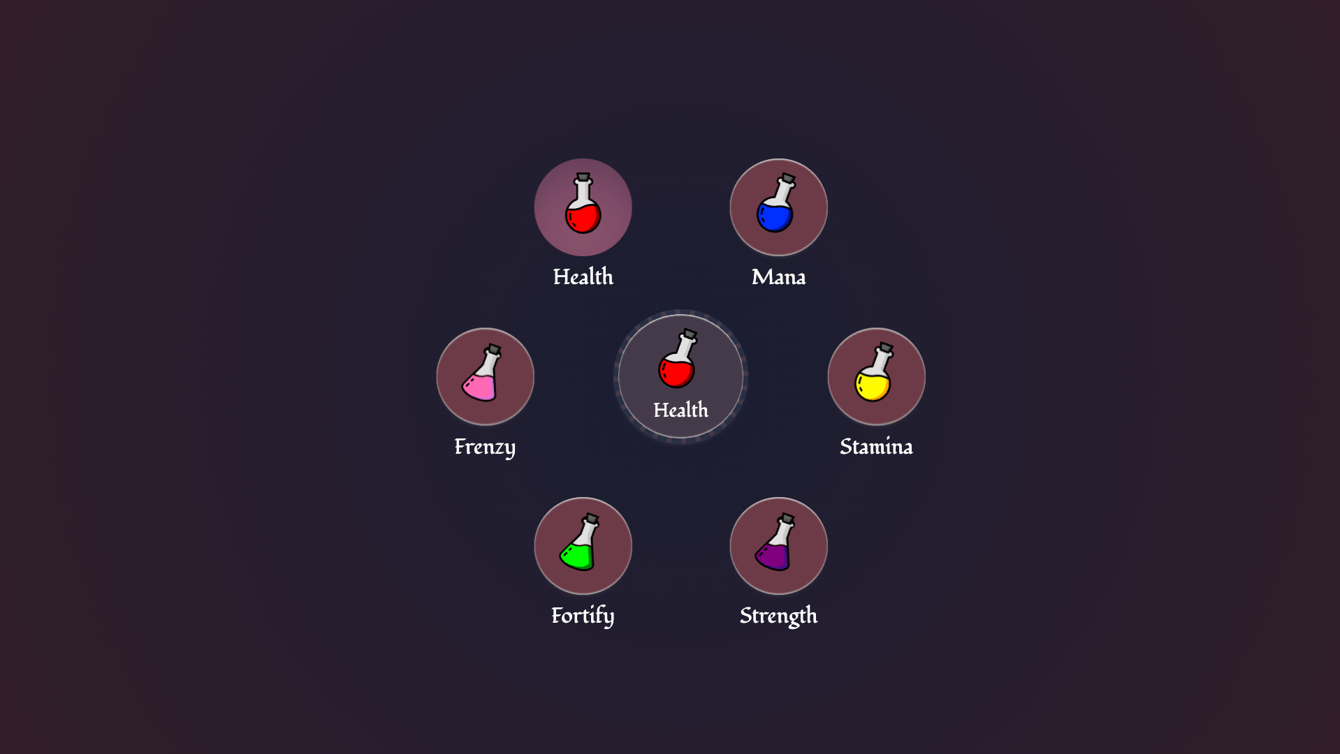
In the previous article, we ended up with images inside of our options and used the new <selectecontent> element to show the checked option’s contents. We are going to keep building on this idea. This is what we’ll be making in the end:
For the rest of this article, I am going to presume you are already familiar with the intro on the customizable select. Ready? Let’s get to it!
The HTML of our potion selector
<select>
  <button>
    <selectedcontent></selectedcontent>
  </button>
  <div class="items">
    <option value="health">
      <div class="potion-holder">
        <svg class="icon icon-health" aria-hidden="true">
          <use xlink:href="#potion" />
        </svg>
      </div>
      <span>Health</span>
    </option>
    <option value="mana">
      <div class="potion-holder">
        <svg class="icon icon-mana" aria-hidden="true">
          <use xlink:href="#potion" />
        </svg>
      </div>
      <span>Mana</span>
    </option>
    <!-- and the options in this trend.. -->
  </div>
</select>
This is looking pretty much the same as the things we did previously. We have our <select> and inside of it, we added a <button> containing our <selectedcontent> element. Quick recap: The <selectedcontent> element will hold the full content of the current selected <option>.
Inside of every option, we’ll add an SVG that holds the image of a flask as well as a <span> containing the text of that option. Please note, that I’m adding aria-hidden="true" to these SVG’s as they are purely decorative in this example. The main difference here is that there is an extra wrapper around the options with the .item class, more on that later on.
The basic setup in CSS - variables and basic select styles
The first thing on the agenda for our custom select is to create some variables and make sure that we include this as a progressive enhancement. In my :root variables, I also did a bit of default styling to my body background, but I’m not covering this to stay on point. Here are the color names I used and the sizing:
:root {
  /* colors */
  --color-space: #282f44;
  --color-dark-liver: #453a49;
  --color-liver: #634570;
  --color-catawba: #6d3b47;
  --color-catawba-light: #8c516c;
  --color-lightest: #fafafa;
  /* sizing */
  --orb-size: 110px;
  --option-size: 80px;
  --circle-size: 320px;
}
The first thing we should handle is to create a bit of basic styling for browsers that do not support this feature yet. Once again, we are using the following system for this:
select {
  appearance: none;
  @supports (appearance: base-select) {
    &, &::picker(select) {
      appearance: base-select;
    }
  }
}
For the default styling, I want to set the pieces in play for our customized select as well. I think it’s rather nice to have a strong default. That way it becomes truly progressive enhancing instead of “graceful downgrading”. Here are the updated select styles and what we have so far. (info below the image)
select {
  appearance: none;
  display: flex;
  align-items: end;
  justify-content: center;
  text-align: center;
  text-align-last: center; /* Safari fix */
  border: 4px dashed var(--color-space);
  width: var(--orb-size);
  aspect-ratio: 1;
  padding-block: calc(var(--orb-size) / 2) 15px;
  border-radius: 50%;
  cursor: pointer;
  font-family: "Fondamento", cursive;
  box-shadow: inset 0 1px 1px #ccc, inset 0 -1px 1px #aaa, 0 2px 4px -3px #666;
  transition: box-shadow 0.3s ease-out, color 0.3s ease-out;
  color: var(--color-lightest);
  background-color: var(--color-dark-liver);
  &:is(:hover, :focus) {
    background-color: var(--color-liver);
    box-shadow: rgba(50, 50, 93, 0.25) 0px 30px 60px -12px inset,
      rgba(0, 0, 0, 0.3) 0px 18px 36px -18px inset;
  }
  @supports (appearance: base-select) {
    &, &::picker(select) {
      appearance: base-select;
    }
  }
}
This is a great starting point for what we want to achieve. It’s a nice little orb with a fun hover state. So, important here is that we set the width with our custom property. I used a pixel value in the variables, but this can surely become a container unit, viewport unit, or whichever you desire. The idea I have is that we want this to work as a calculation throughout the code (you’ll see more of that soon). The font I’m using for this demo is Fondomento, I thought it gave a rather nice touch to the theme. The rest of the code mostly contains padding, borders and an aspect ratio to keep things square (or round… in this case). I like to set cursor: pointer as well for selects, or is that just me?
So… it does look alright, but it could be nice to give it a bit of extra “oomph” for browsers that don’t support this feature and add a little background-image for the flask. So in the example, the following was added:
select {
   /* ...Previous code */
  background-image: url("potion.svg");
  background-repeat: no-repeat;
  background-position: center 12px;
  background-size: calc(var(--orb-size) / 4);
  /* Hover state and support query... */
}
I added a few background properties to position a flask in the center of the select. For demo purposes, I did not shorthand them in this article so that you can see what is going on more clearly, but in the final demo this became the following:
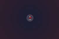
background: var(--color-dark-liver)
    url("potion.svg") center 12px /
    calc(var(--orb-size) / 4) no-repeat;
We now have our starting point:
Going custom: anchoring the ::picker(select) to our select element
Everything is set in place for us to create a fun experience. We already had our opting-in set with the following:
@supports (appearance: base-select) {
  &, &::picker(select) {
    appearance: base-select;
  }
}
The way I see it, there are two ways to approach this, we could further CSS-nest everything inside of that select or we could start some new rules. I found the latter to be a bit cleaner, but this is of course subjective, and if you want to keep on nesting everything feel free to do so.
So below the previous code, I added a new line with a feature query and started working inside of that:
@supports (appearance: base-select) {
  select {
    padding-block: 0;
    background-image: none;
    &::picker-icon {
      display: none;
    }
    .icon {
      width: calc(var(--option-size) * 0.375);
      height: calc(var(--option-size) * 0.625);
      transform: rotate(20deg);
      transition: transform 0.15s;
    }
  }
}
What happens here? We removed the padding of our select, as we don’t need it for the custom version, and also removed that background-image we set earlier as the <selectedcontent> will hold the actual potion from our checked option, so we don’t need that background anyway. We also added some styling for our SVG’s in there, giving them a width and height based on the previously set --option-size custom property.
note that for the rest of this article, I won’t be repeating that feature query, we will be working inside of it for the rest of the time
Below our select, let’s style our picker:
::picker(select) {
  --rotation-divide: calc(180deg / 2);

  top: anchor(center);
  left: anchor(center);
  transform: translate(-50%, -50%);
  overflow: visible;
  transition: overlay 0.5s, display 0.5s;
  transition-behavior: allow-discrete;
  /*  Removing some UA styles */
  margin: 0;
  padding: 0;
  background: transparent;
  border: none;
}
First thing you see here is that we added a new custom property --rotation-divide, this is used to place our options in a circle, this will set the default for the use-case when two options are available, more on that later. Let’s focus on the anchoring.
The ::picker(select) is inside the top-layer, located outside of the document flow. We don’t really need to provide an anchor-name for this because the picker is automatically associated with the select button via CSS anchor positioning. This way, we can directly use the anchor function and a little transform, making sure that the picker is set to the center.
To remove potential flashing of scrollbars, the overflow here is set to visible and we are also adding a transition-behavior for top-layer transitions.
Styling the radial options
If you are actively following this tutorial, I suggest for the next steps, you reduce your select to only contain one option (just put the others in comment for now):
<select>
  <button>
    <selectedcontent></selectedcontent>
  </button>
  <div class="items">
    <option value="health">
      <div class="potion-holder">
        <svg class="icon icon-health" aria-hidden="true">
          <use xlink:href="#potion" />
        </svg>
      </div>
      <span>Health</span>
    </option>
  </div>
</select>
Ready? Then it’s time to style our options, notice how we’re setting up some custom properties (--half-circle, --deg, --negative) that will be crucial for positioning and rotation later on.
option {
  --half-circle: calc(var(--circle-size) / -2);
  --deg: var(--rotation-divide);
  --negative: calc(var(--deg) / -1);

  display: flex;
  align-items: center;
  justify-content: center;
  position: absolute;
  top: 50%;
  left: 50%;
  width: var(--option-size);
  aspect-ratio: 1;
  margin: calc(var(--option-size) / -2);
  background: var(--color-catawba);
  border-radius: 50%;
  opacity: 0;
  box-shadow: inset 0 1px 1px #ccc, inset 0 -1px 1px #aaa, 0 2px 4px -3px #666;
  transition: opacity 0.5s, box-shadow 0.3s, transform 0.5s;
  cursor: grab;
  &::checkmark {
    display: none;
  }
  &:checked {
    background: var(--color-catawba-light);
  }
}
The new variables: --half-circle, --deg, and --negative are being calculated based on other variables we’ve set before. --half-circle will help with positioning around the central orb, --deg will determine the rotation angle, and --negative will be its inverse. The reasoning behind this is that we set the option by default right over the main select orb by using absolute positioning and negative margins based on the options orb size. I’m sure there are some better ways to do this with trigonometric functions nowadays but to be honest, I am not that good at maths…
We are also setting the options to an opacity of 0 because we want to fade them in using a transition. Further on, we will hide the default ::checkmark of the customizable select, and set our own little background color for the select option using the :checked pseudo-class.
Let’s also style our label inside of the option:
option {
  /* ... previous styles */
  & span {
    position: absolute;
    bottom: -30px;
    left: 50%;
    transform: translateX(-50%);
    font-size: 1.1rem;
    color: var(--color-lightest);
    opacity: 0;
  }
}
The text will also be absolutely positioned based on the option, and we’ll fade that in later on based on the :open state of the select, we can already add a little animation for that:
@keyframes fade-in {
  from {
    opacity: 0;
  }
  to {
    opacity: 1;
  }
}
For now, we laid our groundwork, it’s time to make these options appear!
The fan-out effect
We have everything set for our transitions, and now we will make use of those custom properties to make those options “fan-out”
select:open option {
  transform: rotate(var(--deg)) translate(var(--half-circle))
    rotate(var(--negative));
  opacity: 1;
  & span {
    animation: fade-in 0.4s ease-out forwards 0.4s;
  }
  @starting-style {
    transform: none;
  }
}
Let me break down how this transform works:
rotate(var(--deg))rotates each option around the center of the select. The--degvariable will be calculated based on the number of options (we’ll add those in a bit).translate(var(--half-circle))moves the rotated option outwards along its rotated axis, placing it on the circumference of an imaginary circle.rotate(var(--negative))counter-rotates the option so that it remains upright despite being positioned on the circle.
And to finalize things, let’s add a bit of a hover/focus effect that rotates the potion-icon a little bit and set a pronounced inset shadow as well. We’re also going to leave that potion rotated when the option is `:checked.
option:is(:hover, :focus) {
box-shadow: rgba(50, 50, 93, 0.25) 0px 30px 60px -12px inset,
rgba(0, 0, 0, 0.3) 0px 18px 36px -18px inset;
}
option:is(:hover, :focus, :checked) .icon {
transform: rotate(0);
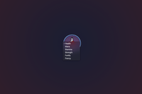
}This is what it currently looks like with one option:
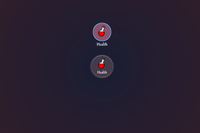
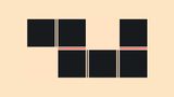
But of course when adding a second option, the following will happen:
This is why these custom properties need to be updated based on the amount of children. For this, we’ll be using :has(), but once again. I am aware the easier calculations might be possible these days for those strong with trigonometric functions.
The rotation adjustment
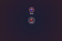
In the end this is what I want to achieve:
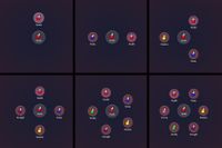
It’s a bit sad, that most people won’t see the full potential of this demo, but I absolutely love the way they were positioned based on the amount of items. O well….
To achieve this behavior, there are two sets of rules:
The first set uses the :has() pseudo-class in combination with :nth-child() to target the parent element .items, we can not target the ::picker(select) directly with this method, which is why we needed that extra wrapper. Based on the number of options present, we’re recalculating the --rotation-divide custom property.
.items:has(option:nth-child(2)) {
  --rotation-divide: calc(360deg / 2);
}
.items:has(option:nth-child(3)) {
  --rotation-divide: calc(360deg / 3);
}
.items:has(option:nth-child(4)) {
  --rotation-divide: calc(360deg / 4);
}
.items:has(option:nth-child(5)) {
  --rotation-divide: calc(360deg / 5);
}
.items:has(option:nth-child(6)) {
  --rotation-divide: calc(360deg / 6);
}
Next, we have rules that target each specific option using :nth-child() and adjust their rotation:
option:nth-child(2) {
  --deg: calc(var(--rotation-divide) * 2);
}
option:nth-child(3) {
  --deg: calc(var(--rotation-divide) * 3);
}
option:nth-child(4) {
  --deg: calc(var(--rotation-divide) * 4);
}
option:nth-child(5) {
  --deg: calc(var(--rotation-divide) * 5);
}
option:nth-child(6) {
  --deg: calc(var(--rotation-divide) * 6);
}
And the last rule here is that we only allow a certain amount of options, a maximum of 6 that is. This potion satchel isn’t infinite:
option:nth-child(1n + 7) {
  display: none;
}
Future: sibling-count() and sibling-index()
In the future, the previous calculations with :has() and :nth-child() could be reduced to a single line of code:
At the place where we set our option styling:
option {
    --half-circle: calc(var(--circle-size) / -2);
    --deg: calc(var(--rotation-divide) * sibling-index());
    /* Rest of the code */
}
And the complete counter could be reduced by this:
.items:has(option:nth-child(2)) {
    --rotation-divide: calc(360deg / sibling-count());
  }
If you’re feeling experimental, I added an extra example for Chrome Canary that you can access here.
The final result
I love the way we can use anchor positioning with the customizable select and I’ll be adding a few more of those examples later on. But this one might’ve gotten a bit complicated due to the rotation of the orbs. Sorry if I lost you there…
I did however have a blast writing this article because this was one of my first select demos ever. It’s been through so many iterations of the customizable select and I’m happy that I could clean this up a little to write this article. It’s also been one of those demos that got share on quite a few interesting places such as the Chrome blog. Does make me a feel proud though 🙂 I for one hope this demo may inspire you to create some other cool customizable selects.
Here is that final demo!
Other articles on Select:
- The customizable select - Part five: Optgroup, creating a true select menu
- The customizable select - Part four: Scroll snapping, state queries, monster hunter, and gamification
- The customizable select - Part three: Sticky Options
- The customizable select - Part one: history, trickery, and styling the select with CSS