In this part of my customizable select series, I want to highlight option groups! Option groups are part of our select interactions to provide clarity, and now, they can be styled. This will certainly not be the last demo I did on the select, and more updates are coming to this element. With a wink to the past, we will be creating a restaurant dish picker, a true “Select Menu”.
Quick recap
If you were following this series, I’m sure you are pretty much in love with the select element and have been tinkering with it at least for a bit. I am not going to go on about how the progressive enhancement works in this article and the various elements. I’ll just quickly talk about the idea and fundamentals of this demo and some others.
If you do get lost, I suggest you go back to the previous in this series:
- Part one: history, trickery, and styling the select with CSS
- Part two: Potions, anchoring, and radial shenanigans in CSS
- Part three: Sticky Options
- Part four: Scroll snapping, state queries, monster hunter, and gamification
What we’re making
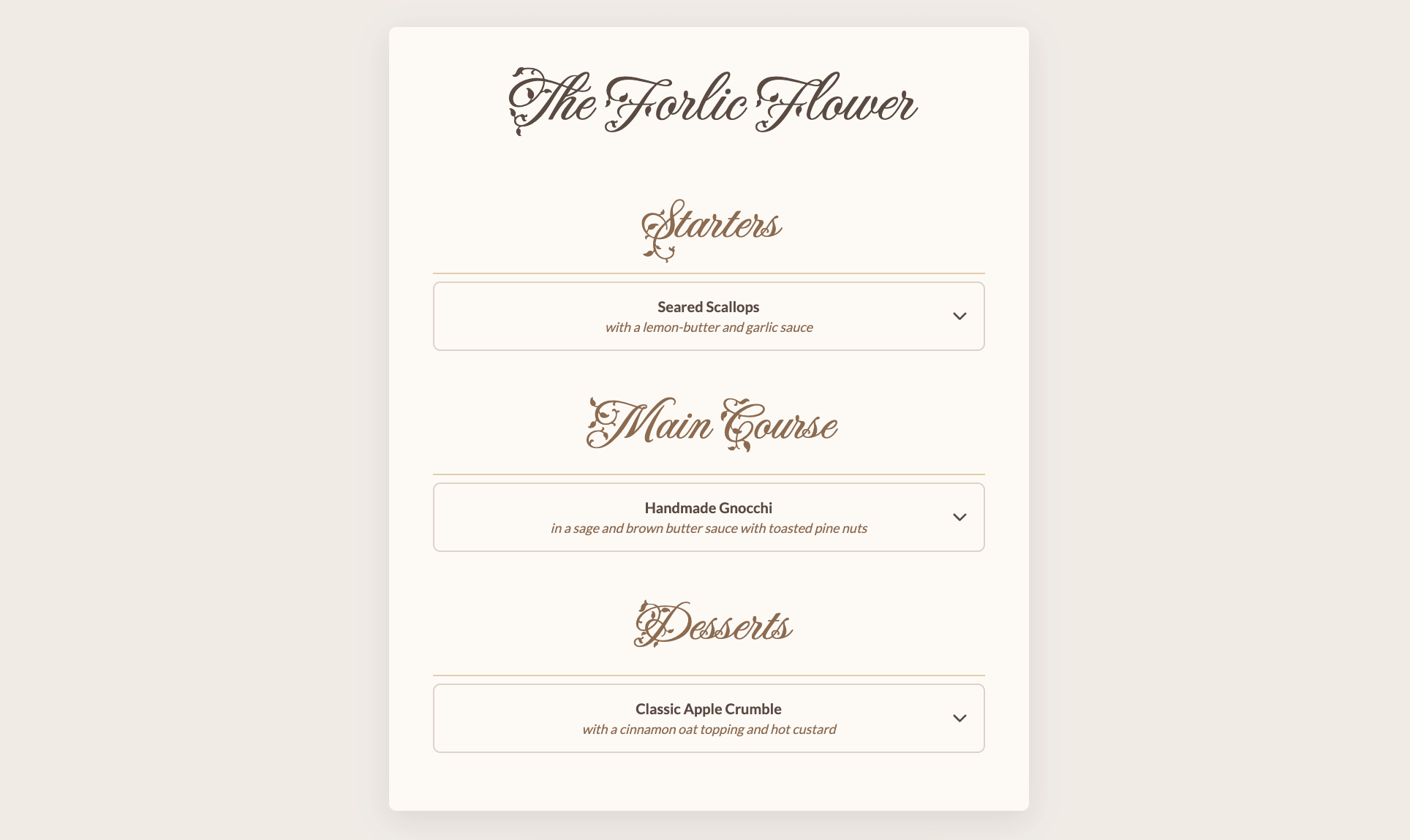
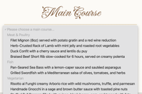
Here is the full demo showing a menu-picker:
Adding our HTML: A select with optgroup
In the final demo, there are a few of these selects, but we’ll be focusing on just one, as the others are just a copy. First of all, let’s set our HTML, a <select> with categories in <optgroup> elements and some <option>s inside. Let me jump right in with a full example and add an explainer below:
<label for="main-course-select">
  Main Course
</label>
<select name="main_course" id="main-course-select">
  <button>
    <selectedcontent></selectedcontent>
  </button>
  <!-- This wrapper is for some extra styling -->
  <div class="menu-options">
    <!-- placeholder text -->
    <option value="" selected disabled>Select a main course...</option>
    <optgroup label="Meat & Poultry">
      <option value="filet_mignon">Filet Mignon
        <span class="info">Served with potato gratin</span>
      </option>
      <option value="rack_of_lamb">Rack of Lamb
        <span class="info">With mint & root vegetables</span>
      </option>
    </optgroup>
    <optgroup label="Fish">
      <option value="sea_bass">Pan-Seared Sea Bass
        <span class="info">With lemon-caper sauce</span>
      </option>
    </optgroup>
    <optgroup label="Vegetarian">
      <option value="risotto_funghi">Mushroom Risotto
        <span class="info">With truffle & parmesan</span>
      </option>
      <option value="gnocchi">Handmade Gnocchi
        <span class="info">With sage butter sauce</span>
      </option>
    </optgroup>
  </div>
</select>
A few things are noteworthy here:
- We added a
<label>for our<select>, which is just good practice, especially for assistive technology users. - We will be using the
<selectedcontent>element to style our selected option’s content. - We created a placeholder text for our select with an option that is both
disabledandselected - We categorized our dishes into
<optgroup>, giving each a distinctlabel - Inside our options, we have an extra
<span>that will be used for some smaller text - We have an extra
.wrapperdiv-element, which we’ll need for styling
Note that the date in this select is different from in the final demo, but I wanted to keep the text of the options a bit shorter in the article.
The base styles for all browsers
The first thing we want to do is create our base styles. To keep things simple, we’ll just add the opt-in somewhere separately:
select {
  appearance: none;
  @supports (appearance: base-select) {
    &,
    &::picker(select) {
      appearance: base-select;
    }
  }
}
And first, let’s create our select, there are a bunch of variables I’m using as constants, they are mainly for colours, and borders, but I’ll add these here for completeness:
 :root {
   --text-dark: #5a4a42;
   --text-heading: #8c6b4f;
   --border: #dcd3c9;
   --border-accent: #e0cda9;
   --border-hover: #8c6b4f;
   --font-heading: "Fleur De Leah", cursive;
   --font-body: "Lato", sans-serif;
   --card-max-width: 700px;
   --border-radius: 8px;
}
And here is the styling of that <select>:
select {
  width: 100%;
  padding: 1rem 2.5rem 1rem 1rem;
  border: 2px solid var(--border);
  border-radius: var(--border-radius);
  background-color: var(--card-bg);
  background-image: url("chevron-down.svg");
  background-repeat: no-repeat;
  background-position: right 1rem center;
  background-size: 20px;
  font-family: var(--font-body);
  font-size: 1rem;
  font-weight: 700;
  color: var(--text-dark);
  cursor: pointer;
  transition: border-color 0.3s ease;
  &:where(:hover, :focus) {
    border-color: var(--border-hover);
  }
}
This bit of default styling gives us a good starting point and will be available in all browsers:
Withs some extra styling on the label this is that result:

But yes, when opened we get our default picker as a fallback, still pretty usable and slick to start with.
Time go custom!
Creating our menu choice
The next part is best to be wrapped inside the @supports query. I’ll break it down step by step:
body:has(select:open) {
  overflow: hidden;
}
This is quite the heavy selector, but we’ll be needing it as we want our ::picker(select) to take the full height of the screen.
select {
  padding: 1rem 2.5rem;
  justify-content: center;
  &::picker-icon {
    display: none;
  }
  ::checkmark {
    display: none;
  }
}
We are updating the paddings, removing the ::picker-icon, and hide the :checkmark inside of our <select>.
These are all things we’ve done before, but we’re going somewhere new in the next bit.
::picker(select) {
  gap: 3vw;
  position-anchor: --body;
  inset: 0;
  width: 100%;
  height: 100%;
  max-height: 100%;
  opacity: 0;
  transition: opacity, translate, display, overlay;
  transition-duration: 0.4s;
  transition-timing-function: ease-in-out;
  transition-behavior: allow-discrete;
}
There are a few things going on here with the ::picker(select). We’re going to give it a “fake” position-anchor (or you could actually give your <body> that anchor-name if you want to…). This allows us to set our picker fixed to the root element instead of the select itself, allowing us to create something full width and height.
We’ll also set up a smooth animation. The picker starts out invisible (opacity: 0) and then we’ll transition its opacity to fade it in and its translate property to move it into place with @starting-style later on. To make sure the top-layer transition works perfectly, we also animate two discrete properties: display and overlay.
The open state for that transition will be the following:
select:open::picker(select) {
  opacity: 1;
  translate: 0;
  @starting-style {
    opacity: 0;
    translate: 0 20vh;
  }
}
Next up, I wanted my options to flow in two columns. I did this with CSS columns and a simple media query, but feel free to give it your own spin. This is why we needed the extra wrapper; Otherwise, we would run into overflow issues:
.menu-options {
  @media (width > 600px) {
    columns: 2;
    columns-width: 45vw;
  }
}
Styling the optgroup and options
All that is left to do is some basic styling.
Just as our options we can now style our optgroup:
optgroup {
  padding: 1.5rem 1.5rem 0.5rem;
  margin-top: 1rem;
  border-bottom: 2px solid var(--border-accent);
  font-family: var(--font-heading);
  font-size: 2.25rem;
  font-weight: 400;
  text-align: center;
  color: var(--text-heading);
  cursor: default;
  &:first-of-type {
    margin-top: 0;
  }
}
That’s it! I did some extra things for the options, which might be interesting. I will remove the presentation styles in the next example. Feel free to see the demo for those:
option {
  display: flex;
  flex-direction: column;
  white-space: normal;
  break-inside: avoid;
  &:first-of-type {
    break-before: avoid;
  }
  &:disabled {
    display: none;
  }
}
These are some of the extra-special things I did with the option. First, we set the white-space to normal again, countering the UA-stylesheet. We do not want a break with the CSS column inside the options, so this is why we have break-inside: avoid; in there.
For cleaner presentation, we also don’t want an <optgroup> text separated from he first option, which is why the first option in an option group is set to break-before: avoid.
We also hide our disabled placeholder select from the select itself.
To finalize, we style our extra .info a bit and center our <selectedcontent> to match the styles:
.info {
  display: block;
  margin-top: 0.25rem;
  font-size: 0.9rem;
  font-weight: 400;
  font-style: italic;
  text-align: center;
  color: var(--text-heading);
}

selectedcontent {
  text-align: center;
}
Here is that final demo again.
More fun with option groups
Another idea I did with <optgroup> is the following:
Based on my previous potion selector demo, I went with a radial theme. In this example, the <optgroup> text is only visible when hovering. This is the trick behind this:
optgroup {
  &::after {
    content: attr(value);
    color: var(--text-color);
    position: absolute;
    opacity: 0;
  }
  &:hover,
  &:has(option:hover),
  &:has(option:focus-visible) {
    &::after {
      opacity: 1;
    }
  }
}
What happens here is that we don’t visually show the optgroup but instead use an ::after pseudo-element that uses the attr() syntax to contain the value op the <optgroup> inside the content property. Next up, we show this pseudo-element when the <optgroup> is hovered, or an option inside that optgroup is hovered/focused.
Conclusion
I can’t wait to see what people will do with this new power where we can also style the <optgroup>. I always had some sort of country selector in mind where the optgroup, for example, could be the layout of Europe, and the countries could be options. Feel free to steal that idea, I’d love to see it!
This almost concludes my series on the customizable select for now. I will be doing one more in a week or so, just to quickly highlight some other demos I created without going in-depth, because they do deserve a place on this blog.
Other articles on Select:
- The customizable select - Part four: Scroll snapping, state queries, monster hunter, and gamification
- The customizable select - Part three: Sticky Options
- The customizable select - Part two: Potions, anchoring, and radial shenanigans in CSS
- The customizable select - Part one: history, trickery, and styling the select with CSS