
Modern Web Guidance is a set of skills from the Chrome and Edge teams that feeds expert-written platform guidance straight into your coding agent, with Baseline compatibility data baked in. It's good, but it also has no idea what your design system looks like. This post is about how it works, how I pair it with my own token skills, why fallbacks and polyfills matter, and the honest bits about data it keeps, the licence, and that whole you're just doing Google work for free argument.
Right before my summer break I wrote that AI might become a category on this blog, but only if it was about value, related to UI and UX, and only if it actually helped people. I described it as “no rockstar-nonsense”. Well, I’m back, I did the European thing for a few weeks, long vacationing, I read fiction, did some drawing, played golf good and badly, and I think I found the topic.
At the day job I barely write code by hand anymore. I orchestrate, I review, I try to keep the standard up. I’m still not sure how I feel about that, to be honest, some days it’s great and some days I miss just sitting in a file for two hours just to get that “aha!” moment.
I still like CSS, I still love web standards and believe in the value of good code but I have a daytime job that puts food on the table, where AI is priority number one.
The thing that annoys me most in this AI world isn’t the philosophical part. It’s that first drafts keep coming back looking like 2019, or seeing bad practices shipped everywhere. A div with a dedicated role where a <dialog> would do. A good old fashioned aspect ratio hack, and a resize listener instead of anchor positioning where possible. And the worst ones are the three hundred lines of JavaScript for something the browser now does in four lines of CSS.
It makes sense because these models were trained on the entire internet’s worth of blog posts and Stack Overflow answers, and most of that content is old. There is simply way more code in the world using the 2019 way than the 2026 way. This is why the model isn’t being stupid.
It’s being statistical.
So, at Google I/O this year, on the 19th of May, the Chrome team shipped a preview release of something aimed straight at that problem. It’s called Modern Web Guidance, and I’ve been running it in Cursor and in Antigravity for a while now. I also did a short video on it while I was at Google I/O Connect in Berlin. This article is what I’ve learned from it, including the parts that deserve a raised eyebrow.
So what is Modern Web Guidance?
It’s a set of expert vetted skills. If you’re not deep in agent tooling: a skill is just a markdown file with instructions that your coding agent reads when it decides the skill is relevant. Simply put, it does things like: “when the user asks for X, do Y“.
This one is a bit more than just one little skill. Modern Web Guidance currently ships 103 web platform features across 131 real-world use cases, all written and reviewed by people who actually work on this stuff (and not only big-tech people). It’s not stating things like “here is the MDN page for popover”, but rather “here is how you build a navigation drawer, here is the gotcha that will bite you, here is the fallback”. You can browse the full guides catalog here: skills/modern-web-guidance/guides.
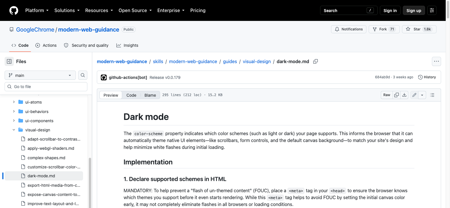
One thing worth mentioning right away, because it changes how you read the rest of this article: the repo credits the Google Chrome team, the Microsoft Edge team, and the wider web development community. It’s a Google-run project, no question about that, and I’ll get to the uncomfortable parts of that later. But it isn’t a Chrome-only thing.
Installing it is one command:
npx modern-web-guidance@latest installThat runs a little wizard and sets it up for whichever agent you’re using. There are also direct routes for pretty much everything: Claude Code plugins, Gemini CLI extensions, Copilot CLI, and for Antigravity.
How it works
There is no sort of service in the middle. The skill file tells your agent that for any web platform question, it should shell out to a CLI. That CLI does two things. First, a search:
npx -y modern-web-guidance@latest search "animate a dialog modal backdrop"Which hands back a ranked shortlist, something like this:
[
  {
    "id": "animate-to-from-top-layer",
    "description": "Animate dialogs, popovers and their backdrops as they enter and leave the top layer.",
    "category": "ui-behaviors",
    "featuresUsed": [ "@starting-style", "transition-behavior", "overlay" ],
    "tokenCount": 1620,
    "similarity": 0.8143
  },
  {
    "id": "animate-element-entry-exit",
    "description": "Animate elements on entry and exit, including toggles between display none and visible.",
    "category": "ui-behaviors",
    "featuresUsed": [ "@starting-style", "transition-behavior" ],
    "tokenCount": 1180,
    "similarity": 0.7402
  }
]
Both of those are real guides: animate-to-from-top-layer and animate-element-entry-exit. The top one is exactly what I’d want here, it has a section on animating ::backdrop and it makes overlay mandatory in the transition list so the dialog stays in the top layer while it fades out instead of getting clipped halfway through.
Notice the similarity scores too. The agent doesn’t get one answer, it gets candidates with a confidence number attached, and it takes the top id from there and pulls the full guide into its context.
I like this design more than an MCP server sitting there eating context on every single request. The guides only enter the conversation when they’re needed, and each one is written to be token-efficient on purpose. It’s still new, of course. But speaking about efficiency… they even run evals to find and prune content the models already know. Most documentation projects want to be bigger. This one actively tries to get smaller. That’s great!
The evals also get published. They generate a Playwright grader per guide, calibrate it against a reference implementation that must pass 100% and a deliberately broken one that must fail 100%, then run real agents on realistic prompts with and without the skill. From the snapshot in the repo at the end of August: Claude Code went from 57% to 92%, Antigravity from 60% to 89%, Codex CLI from 60% to 81%.
Look, those are the project’s own numbers on the project’s own tasks, so read them with the appropriate amount of salt.
In the end… AI results can always differ. But the results of it matches what I see day to day. Even when you “dumb dumb prompt” it, the draft that comes back really is more accessible than the one you’d have gotten without the guidance. What it won’t do is get you all the way there. Turning that better starting point into something genuinely accessible still takes expertise. If you over-rely on AI to make your things accessible on the get-go, well, that’s a human educational problem, not a curated skillset problem. There are so many variables here: way of prompting, which LLM, current environment, etc…
Before Modern Web Guidance I already had a similar system in place for my projects. I’m happy to remove some of them and use this instead in combination with my own stuff (I’ll get back to that). For my favorite “React” people who are amazing JS-wizards but not always “standards-wizard” I tell them to install this for when they try to colour outside the lines, making the review I get to do or cleanup work at least a bit more relaxed.
Baseline as a… euh… baseline
If you’ve read some of my posts in the past, you know I’m all for progressive enhancements. I rebuilt this entire site on that philosophy partly to practice, but also to make a point. So this next part is the reason I stuck with the tool instead of trying it once and forgetting about it.
Modern Web Guidance is wired into Baseline. Quick refresher, because not everyone lives in this world:
- Limited availability: not interoperable yet.
- Newly available: it works in all major engines, but for less than 30 months.
- Widely available: interoperable for 30 months or more.
Every guide knows the Baseline status of the features it recommends, and it adapts what it tells your agent accordingly. By default it assumes Baseline Widely available, which is the conservative choice and probably the right default for a tool that strangers and “vibers” install without reading anything.
But you can change it. One line, in your AGENTS.md or CLAUDE.md:
This project's Baseline target is Baseline 2024.That’s it. Now the agent knows a feature satisfies your target if its “Baseline since” date is 2024 or earlier, and it stops writing fallbacks you never asked for.
The skill file also documents custom browser support policies, and reading through them showed that some people had thought properly about the different kinds of projects that exist:
- “Do not implement feature fallbacks.” for exploratory prototypes of the cutting-edge web.
- “Safari 17.4+” for internal tools or Tauri-based desktop apps.
- “Never recommend or implement polyfills; if a Baseline Newly Available feature is required for core functionality, provide a lightweight custom fallback or redesign the approach.”
That last one is basically my personal preference most of the time, which brings me to:
Polyfills and fallbacks
In general, my approach is “polyfills: none, progressive enhancement only”. If corner-shape doesn’t land in your browser, you get a normal rounded card. Nobody is harmed by my squircles not showing up.
This however, only counts for my side projects, it’s a rule for a personal blog written by someone who enjoys making modern stuff on the platform. If I would turn this into rule and give it to a team building a checkout flow for a bank, I’ve done something wrong.
Additive versus critical
The repo splits features into two categories, additive and critical.
Some enhancements are purely additive, such as speculative preloading. If the browser doesn’t understand your speculation rules, nothing prefetches, and that’s that. Whether you think speculation rules are a good addition or “too much Chrome only for now ” is not the question here. It’s about giving the best experience to each person, no matter which browser they use. If you over-relied on speculation rules for your performance, once again, a human problem, not an AI problem.
The other category is critical. The example here are dialog controls. If a <dialog> opens but can’t be dismissed, you haven’t shipped a slightly less polished experience, you’ve trapped somebody in a modal. Same category of “new platform feature”, completely different consequence when it goes missing.
A view transition that doesn’t run is a missing flourish. A popover that never opens is a broken feature.
Modern Web Guidance will not automatically fix all your accessibility issues. Still a human job.
The policy
What I appreciate is that the approach is lightweight, case-specific custom fallbacks of under about 50 lines, or conditionally loaded polyfills. There is no intention on dropping heavy third-party bundles on everybody.
In the contributing guidelines, the people responsible for each content area have to align guides to a Baseline Widely available target, and if a recommended feature isn’t widely available, the guide must specify the fallback and the automatically generated Playwright grader must test for it. So the fallback isn’t a paragraph somebody forgot to write. It’s a graded part of the guide, and if it breaks, their nightly evals go red.
What a layered fallback actually looks like
The dark mode guide is a fun example, because it grades three different features three different ways in a single file.
:root {
  --brand-accent-light: #0056b3;
  --brand-accent-dark: #00e5ff;
  --accent-color: var(--brand-accent-light);

  /* Fallback for browsers without light-dark() */
  @media (prefers-color-scheme: dark) {
    --accent-color: var(--brand-accent-dark);
  }

  @supports (color: light-dark(white, black)) {
    --accent-color: light-dark(var(--brand-accent-light), var(--brand-accent-dark));
  }

  color-scheme: light dark;
  accent-color: var(--accent-color);
}
Look at how differently each piece is treated. color-scheme has been Baseline Widely available since February 2022, so it’s pure progressive enhancement, browsers that don’t know it just ignore it and you get default light UI. light-dark() is Newly available since May 2024, so it gets a real @supports ladder with a prefers-color-scheme floor underneath.
That “per-feature nuance” is something a model gets wrong easily. It’ll either wrap everything in @supports like a nervous wreck, or wrap nothing at all.
And then, polyfills
Here is an example on popovers (I got a soft spot for those). The guide for conditionally loading async dependencies shows this:
// conditionally-load-polyfill.js

// Check if the feature is missing before doing any work.
if (!('popover' in HTMLElement.prototype)) {
  await import('/path/to/popover-polyfill.js');
}

export const polyfillLoaded = true;
// main.js
import './conditionally-load-polyfill.js';
const myPopover = document.getElementById('my-popover');
myPopover?.showPopover();Top-level await in the polyfill module means anything importing it pauses until the polyfill is ready. Feature detection means the browsers that don’t need it download exactly zero bytes.
Truth be told, my mental image of “polyfill” is still stuck somewhere around 2016, shipping a 90KB bundle to every single visitor so that Internet Explorer doesn’t fall over. This is not that. This is a conditional import that costs (almost) nothing for everyone whose browser is fine. It helps to protect a product to be usable by everyone.
I’m not going to start polyfilling this blog though, I like thinking about workarounds and progressive enhancements without them. But I love how this will work for me during my day job.
It knows the platform, not your house.
So I installed the thing, pointed it at a component, and the CSS that came back was correct. It used the features I’d have used, in the way I’d have used them.
It also looked nothing like my codebase. It felt like a stand-alone demo in my code.
That’s the design. Their contributing rules say core guides must remain “vendor-agnostic and key on web feature IDs and browser compat data”. Which by definition means they can’t know about your naming convention, your cascade layers, your folder structure, or the token system you spent a weekend arguing with yourself about.
Here’s the dark mode guide again, close to how it actually ships:
:root {
  --color-brand-light: oklch(45% 0.23 270);
  --color-brand-dark: oklch(85% 0.15 210);
  --color-brand: light-dark(var(--color-brand-light), var(--color-brand-dark));

  color-scheme: light dark;
}

button.primary {
  background-color: var(--color-brand);
}
Everything there is right. color-scheme on :root and not on body, which matters because the browser looks at the root element to theme the viewport, the root scrollbars and the initial canvas. It keeps the raw values in separate custom properties so they’re easier to recombine and easier to build fallbacks from. It even tells the agent to add <meta name="color-scheme" content="light dark"> in the head to avoid a flash of un-themed content.
But let’s take a look at the shape. One flat tier of custom properties. No cascade layer. A button.primary selector that would lose a specificity fight with half my stylesheet. If I let that land as-is, and then let it land forty more times over a few months, I don’t have a design system anymore, I have a pile.
For anyone who hasn’t read the architecture post from March, the very short version of what I run here is a three-tier token system. Primitives (--p-*) hold raw context-free values. Semantic tokens (--s-*) give them meaning. Component tokens (--c-*) are local overrides that always fall back to a semantic token. Components never reach for a primitive directly, and everything lives inside a cascade layer.
So the same feature, through the ladder, becomes this:
@layer tokens {
  :root {
    --p-color-brand-500: oklch(45% 0.23 270);
    --p-color-brand-300: oklch(85% 0.15 210);

    --s-color-brand-primary: light-dark(
      var(--p-color-brand-500),
      var(--p-color-brand-300)
    );

    color-scheme: light dark;
  }
}

@layer atoms.button {
  .button--primary {
    background: var(--c-button-background, var(--s-color-brand-primary));
  }
}
Same feature and the same light-dark() & color-scheme in place. But now it survives contact with the rest of the codebase, it can be themed correctly, and it sits in a layer where I know exactly what it will and won’t beat.
That gap, right there, is the whole point of this article. It should stay a platform expert. I don’t want it guessing my token names.
Throwing container style queries in the mix
I’d like to pick up another skill in this repo. It’s called design token reactivity. Most of design tokens live as custom properties. But higher-order tokens, the ones that describe a mode rather than a value, could never live there, for example (but not exclusively): density, theme, and tone. Those were usually contained in a class name, a data- attribute convention, or props and context in a JavaScript framework. That is, until container style queries gave us a good answer for this.
They are newly available everywhere at this point, and the guide’s example is just on point:
.features { --density: spacious; }
.bugs { --density: compact; }

@container style(--density: compact) {
  .card { padding: 8px; }
}

@container style(--density: spacious) {
  .card { padding: 24px; }
}
Two things the guide points out that are easy to get wrong. The container you’re querying does not need a container-type or a container-name, which trips people up because every other flavour of container query does need one. And a container cannot be styled by its own style query, only its descendants can. That second one trips non-skills AI agents all the time!
Combined with a token system in place it should switch the token, not the value. Combined with some of my skillsets, this is the output it got:
@layer molecules.card {
  .card {
    --card-padding: var(--c-card-padding, var(--s-spacing-md));

    padding: var(--card-padding);
  }
}

@container style(--density: compact) {
  .card {
    --card-padding: var(--c-card-padding-compact, var(--s-spacing-sm));
  }
}

@container style(--density: spacious) {
  .card {
    --card-padding: var(--c-card-padding-spacious, var(--s-spacing-lg));
  }
}
There is a bit of bad news though… Container queries don’t have a fallback that keeps the benefit of using them, and they are really fresh at the moment, not always progressive enhancable. Modern Web Guidance offers this solution:
:where([data-density="compact"]) .card {
  padding: var(--card-padding-compact);
}

:where([data-density="spacious"]) .card {
  padding: var(--card-padding-spacious);
}
Note the :where() so you don’t inflate specificity, that’s a nice touch. But the guide is upfront that this fallback cannot nest. Both selectors have identical specificity, so order of appearance decides, and spacious will always beat compact regardless of which one is closer in the tree.
So its position is: use this for a density preference, don’t use it for something that has to be right everywhere.
A tool that talks me out of a shiny feature is a tool I trust more than one that just cheerleads. I’ve read a lot of “look what’s new in CSS” content this year, mine included, and considerably less “here’s why you should wait”. I don’t like hypes, except for the CSS ones… that one’s on me.
It also hands you a pure CSS feature check, which is a lovely little trick:
:root {
  --style-queries-supported: check;
}

.density-toggle {
  display: none;
}

@container style(--style-queries-supported) {
  .density-toggle {
    display: revert;
  }
}
Hide the density toggle unless the browser can actually honour it. That’s progressive enhancement applied to the control itself rather than just to the styling, and I don’t think I’d have thought of it. If you want to go deeper on this family of features, I wrote about scroll-state queries a while back, they’re the same idea pointed at scrolling instead of custom properties.
Writing my own skills on top
When I rebuilt this site at the start of the year I wrote the token system first and the skill second for future projects. The skill only exists because I kept catching agents skipping tiers. You write --c-button-background with a semantic fallback nine times, and the tenth time something reaches straight for a primitive and nobody notices until a theme change goes sideways.
So here are a few CSS related ones I actually run. They’re not clever. They are highly opinionated… That’s sort of the point, a good skill is boring and specific.
1. The token skill
---
name: design-tokens
description: Use whenever writing or editing CSS in this project. Enforces the three-tier token system and cascade layers. Runs AFTER modern-web-guidance, never instead of it.
---

# Design tokens

## Order of operations

1. FIRST use the `modern-web-guidance` skill for the platform question.
   Search, retrieve, read the guide. Do not skip this step.
2. THEN translate whatever it returned into the rules below before
   writing any CSS.

The guides know the web platform. They do not know this codebase.
Both steps are mandatory, in that order.

## The ladder

Tokens flow in one direction only: `--p-*` then `--s-*` then `--c-*`.

- `--p-*` primitives: raw, context-free values. OKLCH colours,
  spacing, radii, font weights. Never referenced by a component.
- `--s-*` semantic: primitives given a meaning. Text, surface,
  border, brand, spacing scale, motion.
- `--c-*` component: local overrides. ALWAYS written with a
  semantic fallback.

Never skip a level.

## Translating guidance into tokens

When a retrieved guide hands you literal values:

- A raw colour becomes a `--p-*` primitive, then a `--s-*` token
  that describes its job.
- A raw length becomes an existing `--s-spacing-*` token. If none
  fits, add the primitive first, then the semantic.
- A property on a component reads `var(--c-thing, var(--s-thing))`.
  Never `var(--p-thing)`.

For complex components, declare the private locals at the top of
the ruleset, then use them:

    .card {
      --card-padding: var(--c-card-padding, var(--s-spacing-lg));
      --card-surface: var(--c-card-surface, var(--s-color-surface-elevated));

      padding: var(--card-padding);
      background: var(--card-surface);
    }

## Layers

All CSS lives inside `@layer`. The layer name matches the atomic
folder level: `atoms`, `molecules`, `organisms`, `pages`.

## Exceptions

If a component genuinely must use a primitive directly (a swatch
that displays literal palette values, for example), write a comment
above the rule explaining why. No silent exceptions.
The benefit is not that it produces prettier CSS. It’s that it removes a whole category of review comment from my life. I used to spend my review time on “this should be a token” and “this needs to be in a layer”. It removes a lot of wrestling with agents. And for the record, I am aware that this is not the best usage of layers. I just like this way of organizing my CSS.
2. The theming skill
This one is deliberately thin, because Modern Web Guidance already carries an excellent dark mode guide. My skill’s job is to say “use theirs, then do these five things that are specific to me”.
---
name: theming
description: Use for any colour, theme, or dark mode work. Layers project rules on top of the modern-web-guidance dark mode guidance.
---

# Theming

## Order of operations

1. FIRST retrieve `dark-mode` from `modern-web-guidance`. For
   elements that need to opt out of the page theme (code blocks,
   media players), also retrieve
   `component-specific-light-dark-theme`.
2. THEN apply the project rules below.

## Project rules

- `color-scheme: light dark` is declared once, on `:root`, inside
  the `tokens` layer. Never on `body`.
- Colour semantics use `light-dark()` and live at the `--s-*` tier.
  A component never writes `light-dark()` itself.
- Both sides of every `light-dark()` call must be `--p-*` primitives,
  never literals.
- The manual toggle is a two-state control: system, or the opposite
  of system. Do NOT add a third explicit option.
- The CSS must default to the system preference. If JavaScript fails
  to run, the site still themes correctly.

## Dark mode is not only colour

This is the rule the platform guides cannot know. In this project,
dark mode also adjusts:

- shadow opacity, because a shadow tuned for a light surface reads
  as a smudge on a dark one
- image and illustration brightness
- border contrast on elevated surfaces

If you are adding a surface, check whether it needs a non-colour
adjustment too. Ask if unsure, do not guess.
That last section is the one I care about. Every dark mode guide in the world tells you about colour tokens. Almost none of them tell you that your beautiful soft shadow turns into a grey smear the moment the background goes dark. If you want the paired MWG guide I reference in this skill, it is here: component-specific-light-dark-theme. That’s project knowledge, and project knowledge is exactly what your own skills are for.
3. The component states skill
---
name: component-states
description: Use when building interactive component states, transitions, entry/exit animation, or scroll-reactive UI.
---

# Component states

## Order of operations

1. FIRST search `modern-web-guidance` for the behaviour. Useful
   starting points:
   - sticky headers that change when stuck: `state-aware-sticky-headers`
   - elements animating in and out of the DOM: `animate-element-entry-exit`
   - dialogs and popovers entering the top layer: `animate-to-from-top-layer`
2. THEN apply the rules below.

## Project rules

- Prefer a CSS-only solution. If the guide offers a declarative
  option and a scripted one, take the declarative one.
- Anything not Baseline Widely available goes behind `@supports`,
  and the unsupported path must still be usable. Not pretty. Usable.
- State styles live in the same layer as the component they belong to.
- Respect `prefers-reduced-motion`. If a transition communicates a
  state change rather than decorating it, keep the state change and
  drop the motion. Never drop both.
The three linked behavior guides in that block are public too: state-aware-sticky-headers, animate-element-entry-exit, and animate-to-from-top-layer.
These are not necessarily best practices, they’re some of my practices that feel like a good default and seem to get some things right, use as you please…
Why the order matters
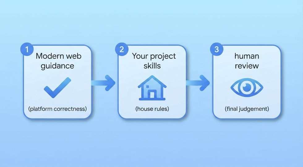
The pattern in all three is the same, and it took me a few tries to land on it.
- Modern Web Guidance goes first. It answers how the platform actually works in 2026. That’s the question my agent is worst at, and the one where being wrong costs the most, since a wrong answer there means 300 lines of JavaScript that shouldn’t exist.
- My own skills go second. They answer how we do that here. That’s the question the guides can’t answer and shouldn’t try to.
- Then you go third, because both of those together still produce something that needs a human to look at it. The acceptance rate is high, really high, but things can still go wrong.
The missing third link: DevTools MCP
Chrome DevTools for agents turns this system into three links instead of two. Modern Web Guidance says how the platform works. My own skills say how it works here. And DevTools checks whether the result actually behaves in a real browser.
It hit a stable 1.0: an MCP server, a CLI, and its own set of agent skills, with a live Chrome for your agent. It works with any MCP client, Cursor and Claude Code included, and it comes pre-bundled with Antigravity 2.0.
I’m not going to go in more details for now, as it will take me too far. The configuration surface is big, there’s a whole conversation to have about --autoConnect letting it drive your actual Chrome with your actual logged-in sessions, and Lighthouse and trace analysis deserve real examples rather than a paragraph. I’ll try to work on something nice in the future.
Right, so what does it send back to Google?
Two separate things to tackle here: telemetry, and the licence.
Modern Web Guidance itself documents its telemetry in the readme, and the list is short. Google collects anonymous usage information: installation counts, the ids of guides that get retrieved, and the search queries your agent generates. Their own example of a query is “dark mode scrollbar color-scheme”, which is representative, it’s the agent’s paraphrase of your task rather than anything you typed. Raw user prompts are explicitly not collected. They point you at the source file where it happens so you can read it yourself, which is more than most tools bother with.
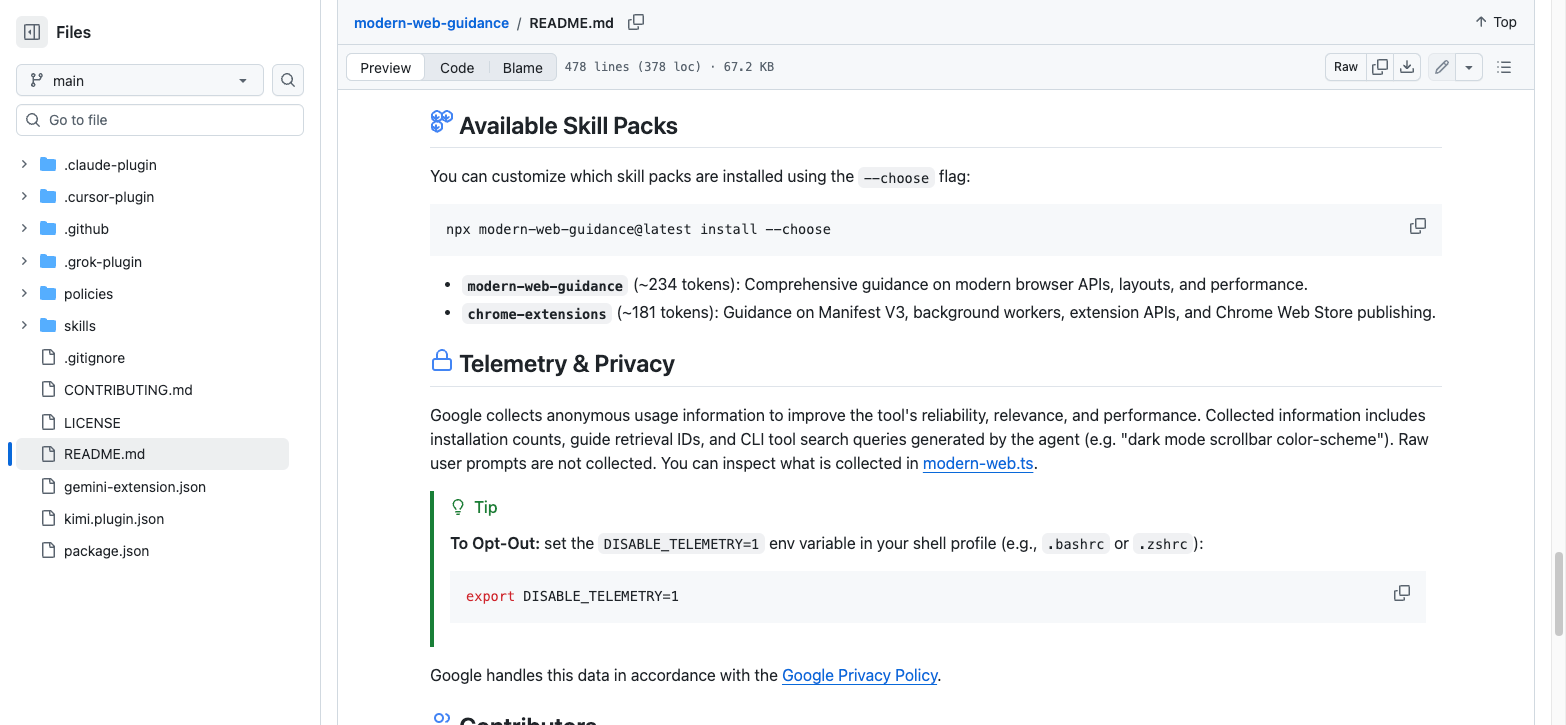
Turning it off is one environment variable in your shell profile:
export DISABLE_TELEMETRY=1Now, one nuance remains. The same readme has a tip saying the CLI works offline, completely private and local. Both statements are true, they’re just about different things. The semantic search does run on your machine with no network call, that’s the TensorFlow.js part. But the query string it searched with still gets reported as telemetry unless you set that variable.
It’s not hidden, it’s two sections apart in the same document. But “completely private and local” and “we collect your agent’s search queries” sitting in one readme is worth reading twice. These things matter in the corporate world, and this is exactly why I briefly researched this.
The licence, and the “you’re just working for Google” thing
Modern Web Guidance is Apache-2.0. In practice, for you, that means you can use it commercially, fork it, modify it, and vendor the guides straight into your own repo if you want them pinned and offline forever. The guides also carry attribution back to MDN, W3C, WHATWG and IETF, which is where a lot of the underlying material comes from.
As open source licences go, that’s about as unencumbered as it gets. If Google walked away from this tomorrow, the community could fork it and carry on.
Now the argument I keep seeing, in various tones of voice: contributing to this is just doing unpaid work for Google.
I want to take that seriously rather than wave it off, because parts of it are true.
Every contribution needs a signed Google Contributor License Agreement, even one that only changes documentation. Merge decisions sit with maintainer roles defined and staffed by Google. The telemetry flows to Google. And the word “modern” here is an editorial position held by a specific group of people, not a neutral fact of the universe. When a curated view of best practice gets baked into the tools of millions of developers, that shapes a lot of code. Worth noticing.
But the other side is real too, and it’s checkable rather than something I’m asking you to take on faith.
Their contributing rules require core guides to stay vendor-agnostic and to key on the shared web-features project and browser compatibility data rather than on Chrome. They state outright that a negative standards position from a browser vendor is not a reason to exclude a guide about how to use a feature, which is a notable thing for a browser team to write down (there is an undertone here that I’m aware of, interest invokers for one). Chrome-branded stuff like extensions and Web Store APIs is quarantined behind an opt-in flag rather than mixed into the core. Origin trial features are excluded entirely because they churn too much. The Microsoft Edge team is credited alongside Chrome.
But also it licenses contributions you make, it doesn’t take your copyright. You still own what you wrote. Combined with Apache-2.0, anything you contribute stays available to everyone, including to a fork that cuts Google out completely.
So where do I land?
Actually pretty positive. It’s a good project, and should be treated like this. I think people are more mindful about it because it came from a big tech company, which is understandable. If it were created by “Average Joe” people are sometimes even more eager to just accept in good faith.
It is still a bit opinionated. Of course it is, all documentation is. Some people will call it Google pushing its own agenda into your editor, and I’d ask those people to go read a few guides first, because the skill in there that told me not to use container style queries for core features does not just sound like a company trying to sell me on Chrome.
There are a lot of people out there right now shipping websites by prompting, with very little idea of what the output does. If the first draft those people get is (better) accessible by default, uses native dialogs, respects reduced motion and doesn’t ship 90KB of JavaScript to reimplement a tooltip, then the web gets a bit better. Better first drafts. I’ll take that. That still doesn’t mean you just have to “yolo” your whole code and depend on this. I hope we (devs) are better than that.
It’s still not magic. It doesn’t make a bad agent good, it doesn’t remove the need for you to know CSS, and on any given day it might get politely ignored by your model.
Modern Web Guidance answers how the platform works. Only you can answer how it works in your codebase.
And always, always, be skeptical of code outputted by agents, whether you are using extra skills or not.