The :has() relational pseudo class has landed in Chrome and Safari and even though it gets less hype than for instance container queries, I believe this little pseudo class contains a lot of improvements to the way we write CSS today.
Using :has() as a simple parent selector
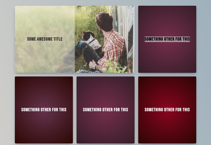
How many times have we added an extra class to check if an element contains an image, or has some extra information that we want to display. For example, You might want to make a grid where the grid item is shown bigger when it contains an image:

Whichever the templating language you’re using. You’ll probably add a condition to check if an image is available like this:
<div class="articles">
	{% for article in articles %}
        <article class="article{% if article.image %} has-image{% endif %}">
            {# content here #}
        </article>
    {% endfor %)
</div>
While this works and has worked for many years, there is a fundamental problem with this approach. We are actually using different class names and controlling those with our templating language. Usually adding a class name such as .has-image , but this can lead to inconsistencies when working with bigger teams. For example, another person might prefer to add a class to the grid saying .is-wide based on the availability of the image. Before you know it, those inconsistencies pile up, and the project becomes harder to maintain. With the :has() pseudo class, all of this is in the past as we can check the availability of an image inside of our grid with ease:
article:has(figure) {
	/* do stuff */
}
Here is a full example of that in action:
Using :has() and :not() pseudo classes combined

Taking the previous grid a step further we might want to display our grid a bit differently when there aren’t any images (figures) available. We can easily do this by combining the :has() and :not() selector. In this use-case I just wanted the “only text grid” to fill the space by using a flex layout instead of grid. So adding the following does just that:
.articles:not(:has(figure)) {
  display: flex;
  flex-wrap: wrap;
  text-align: center;
  border-radius: 10px;
}

.articles:not(:has(figure)) article {
  padding: 40px 20px;
  flex: 1;
  min-width: 280px;
}
Be mindful that the order plays an important role here. For example:
.articles:not(:has(figure))Will target.articlesthat doesn’t have a figure.articles:has(:not(figure))Will target.articlesthat has anything in it besides a figure. So an empty.articleswould not be targeted in this case
And you can see this in action here:
Changing a list-type based on hover without hassle
It might be something that isn’t as popular as it used to be when it comes to design, but I really implemented a lot of hover states in footer links where the bullet of a list item had to be filled when hovering over it. This usually required adding a pseudo element with absolute positioning. An image says more than a thousand words so let me just show what I’m talking about:

This could be done by creating a simple unordered list and doing something like this:
<ul role="list">
    <li><a href="..." target="_blank">Tim Berners-Lee</a></li>
    <li><a href="..." target="_blank">Robert Cailliau</a></li>
    <li><a href="..." target="_blank">Vint Cerf</a></li>
    <li><a href="..." target="_blank">Bob Kahn</a></li>
</ul>
ul {
  list-style: none;
  margin: 0;
  padding: 0;
}

li {
  margin-block: 6px;
}

a {
  display: flex;
  align-items: center;
  color: #6247AA;
  text-transform: uppercase;
  font-weight: 600;
  text-decoration: none;
}

a::before {
  content: "";
  display: block;
  width: 10px;
  height: 10px;
  margin-inline-end: 10px;
  border: 1px solid #6247AA;
  border-radius: 50%;
}

a:hover, a:focus {
  color: #A06CD5;
}

a:hover::before, a:focus::before {
  background: #A06CD5;
  border-color: #A06CD5;
}
But now, let’s enter the :has() pseudo element into the equation and use our default list styles to create pretty much the same thing with less lines of code:
ul {
  list-style: circle;
  margin: 0;
  padding: 0;
}

li {
  margin-block: 6px;
  color: #6247AA;
}

li::marker {
  font-size: 27px;
}

li:has(:hover, :focus-within) {
  list-style: disc;
  color: #A06CD5;
}

a {
  color: currentColor;
  text-transform: uppercase;
  font-weight: 600;
  text-decoration: none;
}
There is a minor drawback here and that is that we won’t be able to add a transition based on the list-style. But it’s still a pretty neat thing to do. I just love the fact that this is possible. If you have followed and read some of my articles before then you know that sometimes I like to make things that aren’t completely practical but just fun to do. (For example: My little container query flappy bird. Below you can see the full example of the lists on hover.
Form validation messaging with :has() to check invalid states
Forms have never been my favorite thing to style but lately they have become less tedious because of all the possibilities out there (accent-color, appearance, …). Also, open-ui is getting a lot more love from the community and that’s a good thing. I’m really looking forward to getting more control over forms eventhough I do understand the accessibility and UX concerns.
But let’s get into the validation of forms. Most of the time we had to rely on JavaScript to give us instant feedback when a user is typing something that isn’t allowed. In the previous two examples I’ve shown we can check for elements, states such as hovering of a link which means we can now check for states of our form elements. Let’s start off with the demo this time:
We created an HTML5 input field with a regex validation that only accepts lowercase text. By using the following we can check if the form is invalid:
fieldset:has(:invalid) .feedback {
  opacity: 1;
}
There is something else we should take care of. Because we added the required flag to the input field, an empty field will also be considered invalid and show the error message. We can fix that by checking for placeholder text:
fieldset:has(:placeholder-shown) .feedback {
  opacity: 0;
}
Note: it might be a bit “hacky”. But you could use an empty placeholder with a space in it if you just don’t want placeholder text inside of the element or hide it with CSS.
Creating a tiger striped table based on the number of rows
Another awesome thing we can do is to check the amount of children our parent selector has by combining :nth-child with the :has() pseudo class. For example, I created a table that only shows a tiger striped pattern when it has more than 5 children (or rows…). I love the fact that we can keep this layout decision in CSS, rather than relying on our templating files to add an extra class. We can achieve this by this little bit of code, it’s that easy:
table:has(tr:nth-child(5)) tr:nth-child(odd) {
  background: hotpink;
  color: #FFF;
}
We’ve only scratched the surface
There are already many examples out there on how to use this new pseudo class and I’m sure many more will follow. This really packs a lot of power and can change the way we handle front-end development in the future.
It :has() been a blast experimenting with this relational pseudo class and I’ll sure be playing around with it a lot more.

