If I were to divide CSS evolutions into categories, then last year was probably the year that ended with animations and colors getting better; This year, the end of the year seems to be about those ease-of-life features. We had one of those not that long go with :has(), but with things such as sibling-count, sibling-index, functions, and conditionals, the way we write CSS might just change for the better once again. In this article, I want to dip my toe in sibling-index() and sibling-count(), while also carefully adding some functions in the mix.
I’ve been living a lot in “select land” with my last articles, and even tho I’m still passionate about all things Open UI, I really wanted to get back to some of those newer yummy CSS features. I was building a bunch of demos already, but never had the chance to do a full write-up. So, I’m playing some catch-up because the features I’m tackling today are already available in Chromium browsers. This article is about sibling-count() and sibling-index(), and some of my first ideas for this new feature. What can we use it for? Where does it make our lives easier? Let’s get to it.
So, what is this about?
I feel like I don’t need to explain it too much:
sibling-index()returns a number representing the position of the current element relative to all its sibling elementssibling-count()returns a number representing the total number of siblings of the element on which it is used, including itself.
That’s it, the only tricky one is that sibling-count() also counts itself. I will be going over 4 demo’s and some extras in the end. Here are some quicklinks:
- Creating staggered animations using sibling-index()
- Dynamic color spectrum: Give each card a different color using sibling-index() and sibling-count()
- Placing items in a circle using sibling-index(), sibling-count(), and @function
- Creating a casino cards fan effect using sibling-index() and sibling-count()
- Further experiments, demos that didn’t make the article
Creating staggered animations using sibling-index()
One of the things that I used in past animations was setting an inline custom property with CSS to create staggered animations.
return (
    <>
        {cardData.map((card, index) => (
          <div
            key={index}
            className="card"
            style={{ '--stagger-index': index }}
          >
            <h2>{card.title}</h2>
            <p>{card.content}</p>
          </div>
        ))}
    </>
  );
}
And then I would handle my animation delay as follows:
.card {
  animation: reveal 0.6s ease-out forwards;
  animation-delay: calc(var(--stagger-index) * 100ms);
}
And this works like a charm as long as you’re looping over some cards. But imagine the situation where you suddenly have a call to action in the middle of the cards, then it gets a lot trickier. You’d have to start propagating the index to another component; it’s not necessarily the hardest thing to do, but a cleaner way is more than welcome.
This is one of those things that suddenly becomes a lot easier with sibling-index(). Instead of just trying to get our CTA inside the loop or passing down index counts in other components, we could just use CSS!
Here is pretty much the gist of it:
.card-container > * {
  animation: reveal 0.6s ease-out forwards;
  animation-delay: calc(sibling-index() * 0.1s);
}
I love a bit of ease-of-life enhancements. It’s just nice to clean up the code a bit.
Here is that in a little codepen:
Dynamic color spectrum: Give each card a different color using sibling-index() and sibling-count()
Ever wanted to create a bunch of cards where each one of them has a different background, color, or border-color? What if you want to have a fixed starting color and want to end on a fixed color as well, giving each card an equal hue in between? Well, this just got a lot easier.
The idea here is that we calculate a “hue” based on an element’s position in a list (sibling-index()). We can use this to create some sort of gradient that flows across any number of items, without ever having to write a single line of JS or add manual style tags with custom properties..
Let’s look at the CSS right away. Now… the calc() function might seem a little much at first, but once we break it down, it will make sense. As a sidenote, this is one of the reasons I write about this stuff, to keep these calculations as a snippet for future reference. (I thanked my past self a few times)
In this example, we’re going to have the background of our cards range between a 180deg on the hue wheel for the first item, to a 300deg for the last item. (hence the variables in the next example: 180 + 120 = 300).
Here is the gist of it:
.spectrum-item {
  --start-hue: 180;
  --hue-range: 120;
  background-color: oklch(
    65% 0.35
      calc(
        var(--start-hue) + (var(--hue-range) / (sibling-count() - 1)) *
          (sibling-index() - 1)
      )
  );
}
The formula to achieve this is the following:
start + (range / total_steps) * current_step
The hard part here was figuring out how far along the color spectrum each item should be, as we want to start and end on the same color and want everything equally spaced on the hue wheel.
The first step is to determine the size of each “step” in our color transition. To do that, we need to know how many steps there are in total. That’s where sibling-count() - 1 comes in. If you have 5 items, there are only 4 steps between them.
Next up, we divide our “color journey” (the --hue-range of 120 degrees) by the number of steps we just calculated. This gives us our “hue increment,” aka, the exact amount the color should change from one item to the next.
Finally, we need to know which step we’re currently on. That’s where sibling-index() - 1 comes in. We subtract one because we want our calculation to start from zero. The first item is 0 steps away from the start color, the second is 1 step away, and so on.
In my demo, it starts with 5 items. So in that example that would mean the following:
For five items, the hue amount for each step is 30: 120 / (5 - 1).
- Item 1: The hue is 180 + (30 * 0), which equals 180 (our start color).
- Item 2: The hue is 180 + (30 * 1), which equals 210.
- Item 5 (the last one): The hue is 180 + (30 * 4), which equals 300 (our end color).
Here is a little sandbox of the idea:
Placing items in a circle using sibling-index, sibling-count, and CSS functions
Staggered animations and color spectrums are cool and all… But what if we want to fundamentally change the layout of our elements?
I’m talking about arranging items in a perfect circle, a task that can be a real pain in the… I already played with this in another article about select elements. But this time I wanted to start fresh. Before we continue, here is the demo:
To create this behavior, you’d typically have to calculate every single position manually in JavaScript or use a pre-processor with complex loops.
With the combination of sibling-index() and sibling-count(), we can bring some trigonometry directly into our stylesheet to hack on some perfect circle placement. I’m also throwing the new CSS @function in the mix, just because I can, and I really love this feature.
First, let’s look at the custom functions that do the heavy lifting.
@function --pos-x(--index, --count, --radius) {
  result: calc(var(--radius) * cos(360deg / var(--count) * (var(--index) - 1)));
}

@function --pos-y(--index, --count, --radius) {
  result: calc(var(--radius) * sin(360deg / var(--count) * (var(--index) - 1)));
}
I’d like to think of these two functions as our little engines. So cool we can set these aside like that, these CSS Functions will really help for cleaner code.
They calculate the exact X and Y coordinates for any point on a circle. To do this, they need to know three things:
- The total number of items (
--count) - Which item we are currently placing (
--index), - How big the circle should be (
--radius)
Let’s break these functions down:
First, we need to figure out how big each “slice” of our circular pie is. A full circle is 360 degrees. By dividing 360deg by the total number of siblings (sibling-count()), we get the angle for each segment. If we have 6 items, each one gets a 360 / 6 = 60-degree slice of the circle.
Next, we determine the specific angle for the current item. We multiply the size of each slice by the item’s position (sibling-index() - 1). Just like in our color spectrum example, we subtract 1 so that our first item starts at an angle of 0 degrees (at the right of the circle).
- For our 6 items, the first item would be at 60 * 0 = 0 degrees.
- The second item would be at 60 * 1 = 60 degrees.
- The third item would be at 60 * 2 = 120 degrees,
- and so on…
This is where the trigonometry comes in. The cos() function gives us the X coordinate for a given angle on a circle, while sin() gives us the Y coordinate.
Now that our functions are ready, using them is incredibly clean. We apply a transform to each item, passing the dynamic sibling values directly into our functions.
.circle-container div {
  --radius: 120px;
  position: absolute;
  top: 50%;
  left: 50%;

  transform:
    translate(-50%, -50%)
    translateX(--pos-x(sibling-index(), sibling-count(), var(--radius)))
    translateY(--pos-y(sibling-index(), sibling-count(), var(--radius)));
}
We start by centering each item perfectly with translate(-50%, -50%). Then, we apply two more translations. translateX pushes the item horizontally by the amount calculated by our --pos-x-function, and translateY pushes it vertically based on --pos-y.
It’s a really cool effect! You can see the items smoothly rearrange themselves to form a new, perfectly symmetrical circle.
Now, truth be told… this might not be the best way to create a circle, I’ve seen a very clean way to do this as well by Temani Afif. In my example, the radius is rather static, but at the same time gives a bit more layout control. I think both methods have their benefits. But the idea by Temani is really awesome!
Check out this method of placing images in a circle with CSS here.
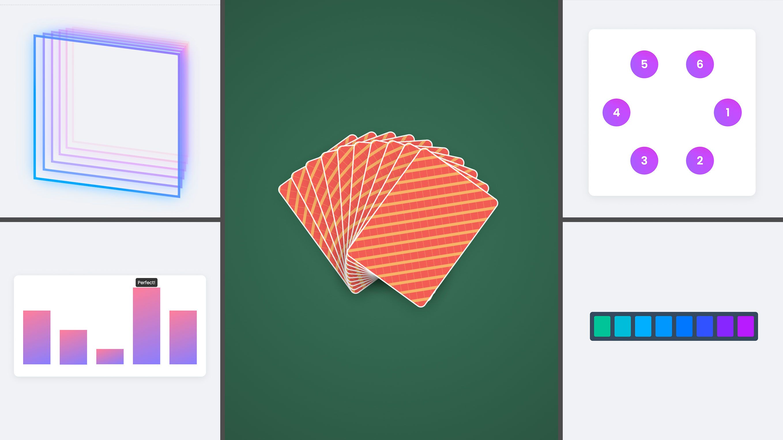
Creating a casino cards fan effect using sibling-index() and sibling-count()
So far, the demos were mostly about progressing from a start point to an end point. But what if you want to create something symmetrical, fanning out from a central point? Think of holding a hand of playing cards. The cards don’t all lean to one side; they fan out evenly.
Let’s take a look at the code first:
.card {
  --rotation-per-card: 8deg;
  --center-index: calc((sibling-count() + 1) / 2);

  transform:
    rotate(
      calc(var(--rotation-per-card) * (sibling-index() - var(--center-index)))
    )
    translateY(calc(4px * (sibling-index() - 1)));

  transform-origin: bottom center;
}
You see that our card has two custom properties, which will be used as levers for this demo. I’ll get to the --rotations-per-card in a bit, but first of all, I want to go to the secret to this entire effect: --center-index.
Inside of this --center-index custom property, you can find a simple calculation: calc((sibling-count() + 1) / 2).
This calculation finds the middle item in our list based on the number of siblings, for example:
- If we have 5 cards, the calculation is (5 + 1) / 2, which gives us 3. The 3rd card is our center.
- If we have 6 cards, it’s (6 + 1) / 2, which gives us 3.5. This means the center point is right between the 3rd and 4th card.
Since we already have our center point, we can go on to calculate the rotation for each card. Look at the rotate() part of the transform:
calc(var(--rotation-per-card) * (sibling-index() - var(--center-index)))This calculates each card’s “distance from the center” and multiplies it by our desired rotation amount (8deg), this is one of those levers we set (--rotation-per-card).
Let’s use a 5-card hand for a starting example, where the center index is 3:
- Card 1: The distance is 1 - 3 = -2. The rotation is 8deg * -2 = -16deg (tilted left).
- Card 2: The distance is 2 - 3 = -1. The rotation is 8deg * -1 = -8deg (tilted slightly left).
- Card 3: The distance is 3 - 3 = 0. The rotation is 8deg * 0 = 0deg (perfectly straight).
- Card 4: The distance is 4 - 3 = 1. The rotation is 8deg * 1 = 8deg (tilted slightly right).
- Card 5: The distance is 5 - 3 = 2. The rotation is 8deg * 2 = 16deg (tilted right).
The result is a symmetrical fan. Cards to the left of the center get a negative rotation, and cards to the right get a positive one.
But! There is more! There’s one little effect that was added as the final detail: the translateY().
This pushes each card down slightly, creating the illusion that they are physically stacked on top of one another. The formula calc(4px * (sibling-index() - 1)) simply moves each subsequent card down by an additional 4px and adds a bit of depth. That is more of a gut feel than an exact science. Once again, we can rely on sibling-index() to just really finalize this example. Ah, sweet sibling counting, I’m a fan!
Further experiments, demos that didn’t make the article
I’m trying to switch up my blogging and demos a bit; Maybe you noticed it on my demos. I wanted to add some information on there for when people come across them in other places. I’m also thinking of writing some more comments. But it’s a fine line between overcommenting and just enough.
For this article, I created some other experiments that I thought would be a bit too much. One of them is this bar chart, almost the same as the animation stagger effect, but using a bit of CSS conditionals in there just for funsies! (When the value is 100, it gets a perfect label on top).
And last but not least, I have this demo, combining the hue changing with some 3D experimentation. I might make another article about that one specifically. Feel free to give a shout-out if that interests you. I’m not that good at 3D stuff in CSS. I based the demo on a bunch of other pens and did some hacking. But to prettyfy this demo, I had a little secret:
I put in a prompt to A(I)mit Sheen, who is a true wizard in this sort of thing. If you haven’t heard of his work, you really should! Check out some of Amit’s work.
Here is a little 3D example (And thank you, Amit!):
To close…
I really love this feature, I love it so much that once again, my article might’ve been a bit too long. It’s how my brain works… I start something, and then I get stuck in experimenting and demos. I could cut these articles up into smaller pieces, but it’s just not in my nature. Anyway, for you, who actually went through the whole thing, thank you for your attention! And for those who just skimmed the article for the demos, that’s fine too.