Scroll-driven animations have been one of my favorite features to land in CSS. Being able to play animation progress to scroll positions opens up so many possibilities. But I always felt that something was missing: sometimes you don't want to scrub through an animation. Sometimes you just want the scroll position to determine when an animation plays, not how it plays, which for me was a far more common pattern in the past. Well, with scroll-triggered animation, this final piece of the puzzle is there. What's more, when you combine the two, it's a match so perfect, even Cupid would be impressed by the timing.
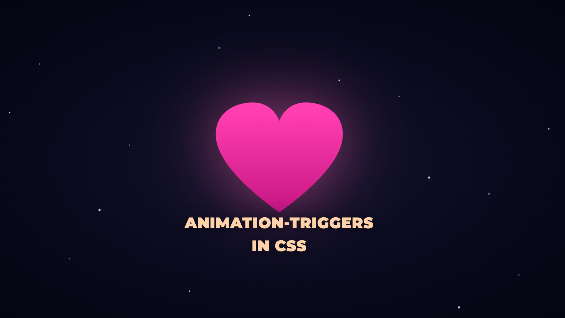
I love scroll animations. In the past few years, I’ve written a blogpost on Valentine’s Day that has something to do with scroll, from scroll-driven animations to carousels. This year I’m releasing it two days prior, but I am really excited about a new feature, and I’m happy that I can do something “scroll” again for 2026 with a new kid: CSS scroll-triggered animations.
I’ve been having a lot of joy experimenting with this feature. It is currently available in Chrome Canary with the experimental web platform features flag enabled. In this (edit: long) article, I’d like to go over the basics as well of giving you some insights on a big demo I created (once again… it started small, really…). I promise that I did my best to make this article as complete as possible, but I am thinking of creating a workshop out of this in the future. Feel free to contact me if you’d like this sort of thing.
This article should cover most things scroll-trigger related, as well as some hot tips to keep your sanity when entering the depths with scroll animations.
For those who just want the demo… here it is, or watch the video if your browser doesn’t have the support. For those who like to learn about this juicy feature (and some hot tips), read on!
(The demo also has a secret message. Can you spot it? Let me know on the socials! 😀)
The difference between scroll-driven and scroll-triggered
I thought I’d at least put a little section in here to explain the difference with a simple example. Imagine you have a text element that should fade in when it enters the viewport.
With scroll-driven animations, the opacity would be tied directly to scroll position. Scroll down a bit? 30% opacity. Scroll more? 60% opacity. The animation literally scrubs frame by frame based on where you are in the scroll.
/* Scroll-driven: opacity tied to scroll position */
.text {
  animation: fade-in linear both;
  animation-timeline: view();
  animation-range: entry 0% entry 100%;
}
This works great for things like parallax backgrounds or progress indicators. But in a lot of cases, such as a text fading in, it feels… off. The text sort of “oozes” into existence rather than appearing with a nice, smooth transition. It’s just not snappy, and snappy can be really good.
With scroll-triggered animations, the scroll position only determines when the animation starts. Once triggered, the animation plays at its normal duration and easing, just like any other CSS animation would.
/* Scroll-triggered: plays normally when triggered */
.text {
  animation: fade-in 0.6s ease-out both;
  animation-trigger: --my-trigger play-forwards play-backwards;
}
There are always exceptions, and “it depends” is probably the biggest phrase in webdevelopment, but for a simple rule of thumb, I find this true for these kids of animations:
Use scroll-driven for continuous effects, use triggers for discrete transitions.
Here is a little demo to illustrate the difference:
Creating a first scroll-trigger
Let’s do the basic example. No tricks, no cleverness. One trigger, one animation. Here’s the HTML:
<section class="scene">
  <div class="trigger"></div>
  <div class="box">I animate when the trigger is in view.</div>
</section>
The .trigger is just an invisible element positioned inside the section. It’s the thing we’ll “watch” for visibility. The .box is what actually animates.
Now the CSS. Two new properties, and that’s it:
Step 1: Define the trigger on the trigger element
.trigger {
  position: absolute;
  inset: 30% 0;
  timeline-trigger: --my-trigger view() contain / cover;
}
What’s inside this new timeline-trigger property?
--my-trigger: a name for this trigger (dashed ident, just like custom properties)view(): the timeline source. This creates a view timeline based on the element’s positioncontain / cover: the enter range / exit range
Step 2: Connect the animation to the trigger
.box {
  animation: fade-in 0.5s ease-out both;
  animation-trigger: --my-trigger play-forwards play-backwards;
}
What’s inside this new animation-trigger property?:
--my-trigger: which trigger to listen toplay-forwards: what to do when the trigger activates (enter action)play-backwards: what to do when it deactivates (exit action)
That’s it. No intersectionObserver, no JavaScript event listeners, no threshold calculations that never feel quite right.
Don’t worry about the ranges and actions, we’ll get to these in a minute.
But in general, this is it for the first demo. When the trigger element becomes fully visible in the viewport (contain), the animation plays forward. When it starts to leave (cover), it plays in reverse. You can see this working in the “hello trigger” demo.
Enter and exit ranges: controlling the timing
I always found the naming of those enter and exit ranges confusing. I usually rely on visiting scroll-driven-animations.style when I need them. For those wondering, this is also why I still write: as my blog and Codepen have served me well as my own little snippets lab. And actually writing about it makes me remember it better.
The range is where you fine-tune the trigger’s firing. The syntax is enter-range / exit-range, separated by a slash.
The keywords
cover: from the first pixel entering the viewport to the last pixel leavingcontain: only while the element is fully visibleentry: while the element is entering (first pixel to become fully visible)exit: while the element is exiting (fully visible to the last pixel)
You can also use percentages within those ranges for fine control:
Here’s a little example
/* active from first pixel in to last pixel out */
timeline-trigger: --trigger view() cover / cover;

/* activates and deactivates at the same boundary */
timeline-trigger: --trigger view() contain / contain;

/* fires halfway through entry, releases halfway through exit */
timeline-trigger: --trigger view() entry 50% / exit 50%;
In short… contain / cover means the animation plays when the trigger is fully in view, and only reverses once it starts leaving the viewport. That’s a pretty big active window, which I use most of the time. On the other hand, contain / contain is much tighter; in that case, the trigger deactivates as soon as the element isn’t fully contained anymore, which is great for when you want snappy behavior.
If you need to use longhands (If you’d want to vary just the range per element while keeping the same trigger name), you can split things up:
.trigger {
  timeline-trigger-name: --my-trigger;
  timeline-trigger-source: view();
  timeline-trigger-range: contain;
  timeline-trigger-exit-range: cover;
}
I built a range demo where five identical animations use different range configurations. Same trigger, same animation, wildly different timing. Honestly, playing with these helped me understand the ranges better than reading the spec ever could. It’s not a perfect educational demo, but I had fun creating it. I think the tool by Bramus is much more educational. Still, it would be a shame not to share it:
Please don’t use this demo as your go-to; there are many other options beyond what I’m showing here. Since this is a love message to tinkering, I thought it was fun to display these ranges by triggering them.
Animation actions when using triggers
The second thing I sort of introduced in the first demo, without really explaining, are the actions inside of animation-trigger. They do a lot more than just the options play-forwards and play-backwards. There’s a whole table of actions in the CSS Animations Level 2 spec, and they give you surprisingly fine-grained control.
The syntax is always:
animation-trigger: <trigger-name> <enter-action> <exit-action>
Here’s what each action does:
play-forwardsSets playback rate to positive, then playsplay-backwardsSets playback rate to negative, then playsplayPlays the animation (at current rate)play-oncePlays the animation, but only from initial or paused state (ignores if already finished)pausePauses the animation (only if currently playing)resetSets progress back to 0 and pausesreplaySets progress back to 0, then playsnoneDoes nothing
The real power is in the combinations. I’m still in the progress on creating a few more demo’s that I don’t want to reveal just yet, but here are the my first takes on which combinations I’ll likely use the most
play-forwards / play-backwards: The classic. Plays forward when triggered, reverses when the trigger deactivates.play-forwards / none: Plays forward on enter, and does absolutely nothing on exit. The animation stays wherever it ended up. Great for one-directional reveals that shouldn’t reverse when you scroll pastplay-forwards / reset: Plays forward on enter, snaps instantly back to the beginning on exit. No smooth reverse, just a hard cut. Useful when you want a clean slate every time.play-forwards / pause: This one’s fun! But I still have to find the practical use-case. It plays forward on enter, and freezes mid-animation if you exit while it’s still playing.play-once / none: Plays the animation exactly once. After it finishes, the trigger is effectively ignored; scroll away and back, and nothing happens. This is great for intro animations that should only run the first time. This will probably be my go-to in many cases, having nice entries and not overly bombard the user with animationsreplay / none: Every time the trigger activates, the animation restarts from the beginning. Even if it was still playing. This is the “eager restart” option.
I created a little “animation actions demo” with a progress bar that fills over 2 seconds. The slow animation and tight contain / contain trigger range make it easy to scroll away mid-fill and actually see the difference between pause, reset, none, and play-backwards. I had a bunch of different tests in order to get a grasp on this and thought I should combine it in one single package… descriptions only get you so far… and a picture/demo is worth…
Note: I used custom properties here to fill the actions. I didn’t find a dedicated property for the actions, which would’ve been helpful in this case.
Going in-depth with the scroll-trigger + scroll-driven Valentine demo
Here’s the thing I’ve come to really appreciate: combining triggers with scroll-driven animations. To be honest, it probably was my first thought: “combined, this will be awesome”. Really, think about it, these kinds of things are complementary. In the same project, you might want:
- Triggers for text reveals (they should fade in with a nice ease-out, not scrub)
- Scroll-driven for background visibility (fade backgrounds in and out based on scroll position)
- Scroll-driven for parallax effects (layers moving at different speeds)
- Triggers for SVG drawing effects (a waterfall should draw itself once triggered, not scrub)
The combination gives you the best of both worlds: precise scrollytelling for the big picture, with natural-feeling animations for the details.
So.. I started this demo with a Valentine’s Day poem, the plan was a small demo, but that went overboard really quick. I’d love to tell you about the thought behind the poem, but feel free to skip to the next section if you just want the technical info.
I’ve been going to quite a lot of conferences in 2025 and saw a lot of AI talks. There are always so many strong believers, and so many haters. I really hate both extremes in this case. The worst people on the “extreme pro end” are the ones who claim that handcrafting things is dead… It’s really not. Yes, for your typical agency work, this might become less and less needed. But there are still tinkerers, crafty people, innovative leaders. People who create beautiful experiences that can’t just come into existence by completely relying on a machine (it will make things faster and help… for sure, or they have to train their agents). People mostly buy furniture from IKEA, but that doesn’t mean there aren’t any crafty people who create beautiful tables, dressers, etc… Guess who designs these types of furniture to begin with? Some people just enjoy it, and I strongly believe that those people, the ones who tinker and enhance themselves with “the machines,” are the ones we’ll need if we want to grow in quality as well as quantity, the ones that have that extra “edge”. Tinkering leads to new knowledge, interesting features, and better ways. I applaud combining tinkering with AI, it’s fantastic. But we still need to grow in combining both, finding the right balance. So I thought… for those that also heard the comment or doubt themselves, “Is my handcrafting still worth it?”, well, this one is for you.
Ok, let’s continue with the technical part 🙂
The basic setup, fixed stuff + scroll trigger + driven
The idea is pretty straightforward: all the visual stuff (backgrounds, SVGs, illustrations) live in position: fixed layers that cover the full viewport. They don’t scroll. What does scroll is a <main> element containing the poem text. I decided to split them with <section> elements stacked vertically, creating enough height to create the scroll distance.
<!-- Fixed visual layers (don't scroll) -->
<div class="fixed-layer bg-layer bg-paper"></div>
<div class="fixed-layer centered-layer tinkerer-container">...</div>
<div class="fixed-layer bg-layer bg-mountain"></div>
<div class="fixed-layer waterfall-container">...</div>
<!-- ...more layers... -->

<!-- Scrollable poem (this is what creates the scroll) -->
<main id="poem">
  <section class="poem-section">
    <div class="section-trigger" data-trigger="--heart-trigger"></div>
    <p class="poem-text" data-trigger-ref="--heart-trigger">To you...</p>
  </section>
  <!-- ...more sections... -->
</main>
Each fixed layer fades in and out based on scroll position using animation-timeline: scroll(root). So as the user scrolls through the poem, the backgrounds cross-fade behind the text. I recently watched a musical where they did the same thing… There was a stage where the backdrops changed while the actors (the text in this metaphor) walked on and off. So next up…
Two animation systems, combined!
As I explained with my stage metaphor, I changed the backgrounds using the root scroller for that true scorllytelling experience.
.bg-mountain {
  animation: visible linear both;
  animation-timeline: scroll(root);
  animation-range: 16% 27%;
}

.heart-stroke {
  animation: heart-draw linear both;
  animation-timeline: scroll(root);
  animation-range: 0% 4%;
}
The poem text, on the other hand, uses scroll-triggered animations. Each section has a trigger element, and when that trigger enters the viewport, the text plays a text-reveal animation with a proper easing (no half opacity text anymore)
.section-trigger {
  timeline-trigger: --heart-trigger view() contain / cover;
}

.heart-text {
  animation: text-reveal 0.6s ease-out both;
  animation-trigger: --heart-trigger play-forwards play-backwards;
}
The result: backgrounds scrub smoothly with your scroll, while the text pops in. I migh’ve been geeking out a bit too much on this but I dragged that scrollbar for minutes to see the satisfying difference between the two.
Now, if you look at that last code block and imagine repeating it for all those sections… yeah, that feels like a dumb machine would write it and “it just works”, but we’re smart, so… Let’s fix that.
Scaling up: making it DRY
The demo has 11 sections, each with its own trigger. Writing a separate timeline-trigger rule for every single one is kind of painful. Let me show you how I avoided that.
So yes, I really started like this:
.trigger-heart {
  timeline-trigger: --heart-trigger view() contain / cover;
}

.trigger-cascade {
  timeline-trigger: --cascade-trigger view() contain / cover;
}

.trigger-robot {
  timeline-trigger: --robot-trigger view() contain / cover;
}
/* ... and so on for every single trigger */
This works, but it’s tedious. Every new section means a new CSS rule that’s essentially copy-paste with a different name.
The attr() one-liner
This is where the new typed attr() syntax in Chrome comes in. If you store the trigger name in a data-trigger attribute on the HTML element:
<div class="trigger" data-trigger="--heart-trigger"></div>
<div class="trigger" data-trigger="--cascade-trigger"></div>
<div class="trigger" data-trigger="--robot-trigger"></div>
…you can read it directly in CSS:
.trigger {
  timeline-trigger: attr(data-trigger type(<custom-ident>)) view() contain / cover;
}
One rule for all the triggers! The attr(data-trigger type(<custom-ident>)) tells the browser to read the attribute value and interpret it as a custom identifier, the exact type that timeline-trigger expects.
The same trick works on the animation side. Give each animated element a data-trigger-ref pointing to the trigger it should listen to:
<div class="heart-text" data-trigger-ref="--heart-trigger">...</div>
[data-trigger-ref] {
    animation: text-reveal var(--duration-normal) ease-out both;
    animation-trigger: attr(data-trigger-ref type(<custom-ident>)) play-forwards play-backwards;
}

.heart-text {
  /* custom reveal variables */
}
Add a new section? Add a trigger element in the HTML with the right data-trigger value. No CSS changes needed. I love how smart we can make this by just using some modern capabilities.
Reusable keyframes with CSS variables
While I was creating this demo, I was starting to struggle a bit with duplicate animations, so I decided to simplify the keyframes a bit. Instead of writing separate animations for “fade from left”, “fade from right”, “fade from below”, we can use variables with fallbacks in combination with custom properties:
@keyframes text-reveal {
  from {
    opacity: 0;
    translate: var(--reveal-x, 0) var(--reveal-y, 30px);
  }
  to {
    opacity: 1;
    translate: var(--end-x, 0) var(--end-y, 0);
  }
}
By default, this reveals from 30px below. But when I wanted to create an exception, I just had to update the variables:
.from-left {
  --reveal-x: -50px;
  --reveal-y: 0;
}

.from-right {
  --reveal-x: 50px;
  --reveal-y: 0;
}
One keyframe, infinite directions…
Centralizing your “scroll choreography”
Do people say choreography in this sense? I dunno, might be my daughter’s dancing lessons in my head… Anyway, this one’s a hot tip for full-page scrollytelling. When you’re using animation-range on a bunch of scroll-driven elements, those percentage ranges end up scattered across your stylesheet. I was constantly scrolling back and forth, tweaking those percentages… Until I got sick of them and decided to pull them all into a dedicated layer:
@layer scrollTimeline {
  :root {
    --range-hero: 0% 9%;
    --range-intro: 7% 18%;
    --range-feature: 16% 27%;
    --range-detail: 25% 45%;
    --range-outro: 90% 100%;
  }
}
This way, I could play around with a sort of centralized storyboard. Overlaps are visible, retiming is a single-line change; think of it as a timeline editor built into your stylesheet.
.waterfall-container {
  animation-range: var(--range-hero);
}

.robot-container {
  animation-range: var(--range-intro);
}
Debugging: visualizing your triggers
When building scroll-triggered pages, it really helps to see where your triggers are. A dashed border on the trigger element goes a long way:
.trigger {
  border: 1px dashed oklch(60% 0.1 180 / 0.3);
}

.trigger::after {
  content: "trigger zone";
  position: absolute;
  font-family: ui-monospace, monospace;
  font-size: 0.6rem;
  color: oklch(60% 0.1 180 / 0.4);
}
If you’re using the data-trigger attribute approach, you can make the label dynamic:
.trigger::after {
  content: attr(data-trigger);
}
Each trigger gets the correct label automatically. When you’re done debugging, comment it out or hide it behind a .debug class. I left it in the demo; feel free to uncomment it to see it in action.
Here is that demo once again:
Browser support
I know, I know.. This is, unfortunately, still experimental. As of writing, you need Chrome Canary with the “Experimental Web Platform features” flag enabled. The feature should arrive in Chrome 146, which might actually arrive by the end of February.
For production, you’ll want a fallback; you can add a support query for this, but in general it’s up to you… Do you want this as a progressive enhancement, or do you have the time to create an intersectionObserver fallback?
@supports not (animation-trigger: none) {
  /* Fallback styles */
}
Conclusion
Animation triggers are one of those features that feel obvious. We’ve had scroll-driven animations for a while, but the ability to use scroll position as a signal rather than a driver always felt a bit broken. I’m really happy it’s here.
The basics are simple: timeline-trigger on an element to define when it fires, animation-trigger on another element to say what should happen. But the depth is there when you need it: action pairs for fine-tuning control, longhand properties for per-element ranges, and the attr() capability really comes in handy here for scaling to dozens of triggers. I do believe an extra property to target actions individually would’ve been handy for one of my demos, but not sure if I’d miss it in a real-world situation, that part is for me to discover at a later stage.
Further reading:
Happy Valentine’s Day and happy triggering