It’s Valentine's Day! As usual, I want to write about something I love, and this time it’s still highly experimental but something I am extremely excited about. Something new is on the horizon named CSS scroll-markers and it allows you to create a fully functional slider without the need of any JavaScript. Don’t believe me? Let’s take a look, shall we? Here is my first impression of creating a carousel with only CSS and some accessibility concerns as well.
Carousels, who likes them? Clients! Yes, clients love them. Developers, not that much… During my career, I’ve spent a lot of time finding the perfect slider, tweaking the default styles of slider libraries, and hacking them to be awesome. This was usually accompanied by a lot of swearing behind my keyboard. But maybe - just maybe - this new idea of creating a carousel with CSS might be a way to remove a lot of that frustration and, dare I say, even make creating sliders something enjoyable.
Let’s start with some basic theory before I show you what it can do.
Scroll markers what are they?
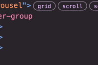
As usual, it starts with a new magical CSS property: scroll-marker-group.
When this new property is set to a scroll container (aka, a box with scrolling overflow) It creates a new ::scroll-marker-group pseudo-element attached to that container.
.some-container {
    overflow-x: auto;
    scroll-marker-group: after;
}
This ::scroll-marker-group has three possible values:
- none
- before
- after
Compared to the ::before and ::after pseudo-elements, this value will place this new ::scroll-marker-group as a sibling preceding or following the scroll container it is attached to.
But that ::scroll-marker-group does not do anything by itself, it is a container that collects different scroll-markers, more about those later.
The new ::scroll-button() pseudo-element
When you add a ::scroll-button(<direction>) pseudo-element on your scroll container, you can add some buttons that move the scroll position based on the value of their flow-relative direction:
::scroll-button(inline-start)::scroll-button(inline-end)::scroll-button(block-start)::scroll-button(block-end)
To make them visible, you will need to add the content property, just as you would with a ::before, ::after pseudo-element.
According to the spec, they are both focusable and activatable by default, with their activation behavior being to scroll their originating element by one “page” in their associated direction, similar to pressing the PgUp/PgDn keys, But we’ll get to that later.
The new ::scroll-marker pseudo-element
Just like our ::before and ::after pseudo-elements, all elements will be able to have a ::scroll-marker pseudo-element (yes, all of them). Just as our previously known pseudo-elements, we’ll need to give this a content property in order to work. These new elements have some special knowledge:
- They contain the scroll-target of the element they’re attached to
- They behave like anchor links when you click on them.
- They know when their corresponding element is visible in the scroll container
- They have a stylable pseudo-class when their linked element is visible:
:target-current
Ok, I tried to keep this short and to the point, there are probably a lot of caveats here, but let’s get into the sliding of things.
Snaps with benefits
The groundwork for creating a slider with CSS was already done some time ago. We already can use scroll-snapping in our projects, but it always felt like it missed a bit of control.
Without further ado, let’s create a basic slider with just CSS. First, let’s set up the HTML:
<div class="carousel">
  <div>
    <img src="..." alt="...">
  </div>
  <div>
    <img src="..." alt="...">
  </div>
  <div>
    <img src="..." alt="...">
  </div>
</div>
And let’s make this a scroll-snapping container, notice that I created it so that the images have an aspect ratio of 16/9, it’s a simple technique here, but that’s the whole point, keep the first demo as simple as possible:
.carousel {
  display: grid;
  grid-auto-columns: 100%;
  grid-auto-flow: column;
  overflow-x: auto;
  overscroll-behavior-x: contain;
  scroll-snap-type: x mandatory;
  scrollbar-width: none;
  scroll-behavior: smooth;
  div {
    scroll-snap-align: start;
    scroll-snap-stop: always;
  }
  img {
    width: 100%;
    aspect-ratio: 16/9;
    object-fit: cover;
  }
}
Ok, great, we now have our scroll-snapping container in place. A little note on this: You can perfectly use proximity in your scroll-snap-type property as well, however for this example to give that real slider feel on scroll, mandatory works best from a UX standpoint. We are also hiding the scrollbar with scrollbar-width: none; because we are going to provide our custom controls. We also set the scroll-behavior: smooth; as this will give a nice feel when the controls are in place.
Ok, this is our basic set up, let’s add the markers:
Creating the controls: slider bullets
Let’s just dive in right away and add the following to our previous code:
.carousel {
/* previous code */
scroll-marker-group: after;
div {
/* previous code */
}
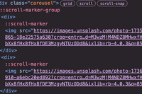
}This will open that group of markers, we can clearly see this ::scroll-marker-group in our DevTools, which is a very nice feature to have:
Ok, moving on, it’s time to add those ::scroll-marker pseudo-elements to our sliders children:
.carousel {
  /* previous code*/
  scroll-marker-group: after;
  div {
    /* previous code*/
    &::scroll-marker {
      display: block;
      content: " ";
      aspect-ratio: 1;
      width: 24px;
      border-radius: 50%;
      border: 1px solid silver;
      cursor: pointer;
      background: transparent;
      justify-content: center;
      transition: background 0.5s ease-out;
    }
  }
}
Let’s update this just a little further before I show you what we created. In the theory, I mentioned that we can set a style when a ::scroll-marker is active, let’s do that as well and give the little bullet a background when that happens:
.carousel {
/* previous code*/
scroll-marker-group: after;
div {
/* previous code*/
&::scroll-marker {
/* scroll marker base styles */
}
&::scroll-marker:where(:hover, :active, :focus) {
background: lightgray;
}
&::scroll-marker:target-current {
background: white;
}
}
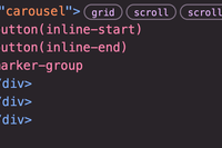
}This is what we can see now in our DevTools:
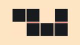
Now they are just sitting there on the side of my slider, which isn’t ideal, however, it does work very nicely:
This is where our ::scroll-marker-group comes into play, it’s quite refreshing to see something like this in CSS as it dedicates itself as a wrapper around the children’s ::scroll-marker pseudo-element, meaning that this wrapper can be used for layout as well:
.carousel {
  /* Previous code */
  &::scroll-marker-group {
    width: 100%;
    display: flex;
    gap: 12px;
    align-items: center;
    padding: 20px 0;
    justify-content: center;
    z-index: 20;
  }
  /* children styling */
}
And there you have it, a fully functional slider:
Adding the scroll buttons
Let’s add a left and right arrow button for our slider. The ::scroll-button() pseudo-element accepts logical naming, so let’s add this right away:
.carousel {
  &::scroll-button(inline-end),
  &::scroll-button(inline-start) {
    cursor: pointer;
    content: "";
    inline-size: 44px;
    aspect-ratio: 1;
    background-color: rgb(255 255 255 / .6);
    background-image: url("arrow-left.svg");
  }
  &::scroll-button(inline-end) {
    content: "";
    background-image: url("arrow-right.svg");
  }
  &::scroll-button(inline-end):where(:hover, :focus, :active),
  &::scroll-button(inline-start):where(:hover, :focus, :active) {
    background-color: rgb(255 255 255);
  }
}
I kept the properties to a minimum here, but of course, they are a bit more styled in the final version (you can watch the full code in the demo later on). Let’s break down this code a bit:
- First, I set the scroll buttons to have an empty
contentproperty. - As I want them to have arrows, I also give them a
background-imagecontaining an arrow - Lastly, I set hover and active states for these buttons to light up a little bit.
All that is left for us, is to position these buttons. For my use case, I found the quickest way was to use anchor positioning in CSS. This is how I positioned them:
.carousel {
  anchor-name: --carousel;
  &::scroll-button(inline-end),
  &::scroll-button(inline-start) {
    z-index: 1;
    cursor: pointer;
    position: absolute;
    position-anchor: --carousel;
    top: anchor(center);
    inset-inline: anchor(start) anchor(end);
  }

  &::scroll-button(inline-end) {
    top: anchor(center);
    inset-inline: auto anchor(end);
  }
}
By setting an anchor-name on my scroll container (.carousel), it’s really easy to position the pseudo-elements on it. I can do this by using the anchor() function on my scroll buttons to position them right into place. As for some readers, this anchor positioning might still feel like a new thing. I wrote a little guide to anchor positioning in CSS before.
If you read this article this far, I have good news! You made it!, This is the final result and the CodePen.
I tested this experimental feature in Chrome Canary. If you want to play around with them you’ll have to enable the Experimental Web Platform features after going to chrome://flags
Note: In the CodePen I used layers to make it easier to follow along with this tutorial.
Further experimentation (and cool stuff on scroll-markers in CSS)
I created a bunch of fun stuff with this… It’s kinda how this goes for me, when I love a feature, I can’t help myself. I might do an in-depth tutorial of one later on…
Experiment 1: Inherit colors in ::scroll-marker and full-axis slider
The fun thing about the ::scroll-marker pseudo-element is that they are children of our carousel’s children. Which in turn means we can inherit colors:
For example:
.slider-item:nth-child(1) {
  background: oklch(0.73 0.28 339.69);
  color: oklch(0.92 0.22 101.77);
}

.slider-item:nth-child(2) {
  background: oklch(0.92 0.22 101.77);
  color: oklch(0.73 0.28 339.69);
}

.slider-item::scroll-marker {
  border-color: currentColor;
  background: inherit;
}
I combined this with a scroll-snap over both axis to create a 3by3 slider. And this my first Valentines Day Demo:
Experiment 2: Recreating a slick-slider with just CSS
This one might deserve a new article on itself later on, but recently, Chrome release the new attr() possibilities. Which allows reading more attributes from HTML into our CSS. Read about the new attribute capabilities here.
In my years as a developer, I created a lot of webshops, so inspiration for this was easily found
This is the experiment:
In my HTML I did the following:
<div class="carousel">
  <div data-src="url(my-slick-image.webp)">
    <img src="my-slick-image.webp" alt="">
  </div>
   <!-- other items in the same way -->
</div>
I added a data-src attribute on my sliding item, with the new update mentioned above, this means I can read this inside of my ::scroll-marker:
.carousel > div {
  /* Get the attribute of the div containing the background-image (Chrome since v133) */
  --image: attr(data-src type(<image>), "");
  &::scroll-marker {
    /* Set image variable from parent as background */
    background: var(--image, green);
    background-size: cover;
    background-repeat: no-repeat;
  }
}
Result:
Experiment 3: More than one item on a slide
As a last one, I wanted to show the capability on skipping some items. In this example, I wanted my slider items to be shown 3 by 3 and snapped in the center. Now because of this, I wanted my slider items to scroll by 3 using scroll-markers, and this is how I did that:
.carousel > *:nth-child(3n + 2)::scroll-marker {
  content: "";
  aspect-ratio: 1;
  width: 24px;
  border-radius: 50%;
  border: 1px solid silver;
  cursor: pointer;
  background: transparent;
  justify-content: center;
  transition: background 0.5s ease-out;
  border-color: white;
}Accessibility concerns - Love is in the air
While I was experimenting, I noticed that when focusing on the buttons and markers, we do not get a default focus ring, do take note that this is still a work in progress and it might be a bug, or a feature yet to be developed. Also, the current scroll markers don’t show up in the accessibility tree, but I’ve been informed that this is due to a bug and it’s been reported.
Since we’re talking about accessibility, maybe a quick hot tip for the future: If your slider contains a lot of items, try to be so kind as to provide a skip-link at the start of it, your users will thank you for it.
Learn more from Adam
If you think these demos are crazy, wait until you see what Adam from the Chrome DevRel team made! Adam is working on a full Carousel Gallery also combining state queries and a lot of other goodies, check it out!
He will also be talking a bit about this on CSS Day, I’ll be there to bombard him with questions on it for sure, and if you can’t make it, no worries, I’m sure he and the team will be writing some in-depth about this future.
Other resources
I can’t wait to experiment more with this. I still have some question marks on it, but this might be one of those features I never thought we’d get in CSS. It can reduce dependencies, I can style it just the way I want without overruling some baked-in library styles… You know what… I’m gonna say it:
I love sliders!
Happy Valentines Day