A few weeks ago, I didn't think I'd start the year with another demo on customizable select. To be honest, I was hoping to let it go for a little while. But there is an update on the rise that needs to be talked about: The multiple select. This little attribute could change a lot of things in making multiple selections; it could turn a series of checkboxes into one element, and it could improve accessibility. This is still in development, but we can take a peek in Chrome Canary.
In this article, I’m not going to repeat the whole process of creating a customizable select, and I’m not adding this to the part of the series I wrote earlier on this great feature. But I want to take a look at the work that is being done when you add the attribute multiple to the select element.
The multiple select
Who uses this element? Let’s be honest that usage on the web is scarce. It’s not very intuitive to operate with a mouse, actually, it’s probably more intuitive with a keyboard in this case? It’s a strange element. I actually showed it to a few of my colleagues; you would be amazed at how many people don’t know that you have to hold ctrl/cmd to make a selection. In my experience, I always rely on checkboxes to create a multi-selection instead of using this dedicated element.
Making this element customizable should, in my opinion, challenge the original design, while still making sense for keyboard users and assistive technology. Different, but better, could be the way to go here.
And that is exactly what it is starting to look like at this moment. Please note that this is still under development, and many aspects are still under active discussion.
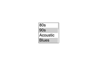
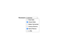
For this first demo, I created a music picker with the ’90s and blues as selected options.
This is what this element looks like at the moment:
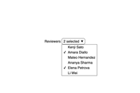
Now, when we turn this into a customizable select with:
select {
  @supports (appearance: base-select) {
    &,
    &::picker(select) {
      appearance: base-select;
    }
  }
}
We see the following:
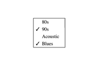
But more is changing than just looks,…
There are some navigational differences, for example:
Mouse navigation
When using the mouse on the original design, you had to hold ctrl/cmd while clicking to select multiple options. This now turns to a single click.
Now… personally, I am happy with that; it makes the element way more intuitive than before. Just as I did, I’d encourage you to test this with your friends by giving them a normal multiple-select and letting them select multiple options; you’ll be amazed at how many would fail on their first try.
Even more… on touch devices, it was already a “single tab”.
Keyboard navigation
If you want to navigate this element with a keyboard, you also need to hold the ctrl/cmd key and use your up and down arrows to go through the selection when you want to select multiple options, and you press the spacebar to confirm it. The thing I hate about that design is that when you accidentally let go of your Ctrl key, you lose your selection and only select one item.
With the customizable select the need for holding cmd/ctrl is removed. But we do lose a few smaller keyboard functionalities:
- Ctrl/cmd + a: to select them all
- Ctrl/cmd + arrow: to select the one below right away.
I personally feel like this is a minor loss compared to the wins. But I’ll let you be the judge of that.
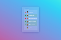
The ability to style the customizable select
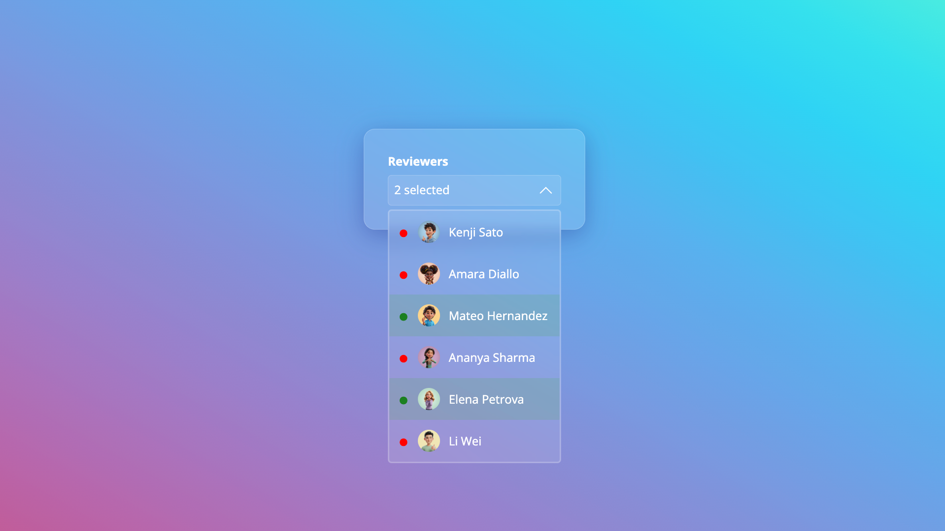
This updated behavior allows us to style the customizable select like a proper selection. A thing that came directly to mind was a music genre selection. In a lot of cases, people like more than one music genre, so I was able to style this with just one select element:
You can check out the following demo in Chrome Canary for now:
This is pretty much the gist of it:
<select id="genres" class="genre-select" aria-label="Select multiple music genres" multiple>
  <div class="options-grid">
    <option value="80s">
      <svg class="icon" aria-hidden="true">
        <use href="#80s"></use>
      </svg>
      <span>80s</span>
    </option>
    <!-- other options -->
  </div>
</select>
And then with the extra .options-grid we can do the following:
.options-grid {
  display: grid;
  grid-template-columns: repeat(auto-fill, minmax(min(160px, 100%), 1fr));
  gap: 20px;
  option {
    /*    Style options as a card */
    &::checkmark {
      /* style checkmark to top right */
    }
  }
}
Why this could be a win for accessibility
Apart from the questions I raised about keyboard navigation, I believe that by following the idea behind the previous demo, you can imagine this could remove a lot of the bad checkbox or button tricks in the world. Too many times have I seen places where people use checkboxes for it, and just set their checkbox to display: none; too many times have I seen it to be buttons with bad behavior, lost outlines, etc…
In this example, I didn’t change anything for the outlines. I just set the picker to a grid and styled the options as cards, and it just works…
Yes, people will always be able to break these things, and since I’m human and prone to error, I’ll probably make a bad example as well in my future career, but this does provide a solid default, and I think that’s the important thing to keep in mind here.
The size attribute on a multiple select element
You probably thought we were done here? Well, we’re not.
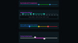
The size attribute on a select is a special one. It determines how many options of the select are visible by default. For the multiple select, this is by default set to 4, and if we choose to set this to one, we get a rather peculiar look:
Suddenly, the multiple select changes to a dropdown type of select with checkboxes inside. I find this a strange design choice that feels like it was bolted on due to the nature of the multiple select not being used often (I am not familiar with the history here).
Now of course this should still be supported with a customizable select. When you opt-in to the feature with CSS, you get the following result:
I really like this idea, and I’ll tell you why. With this design, we always have the checkmarks (::checkmark), same as in the “non-multiple customizable select”, the “auto-sized multiselect”, and in the “size="1" multiselect”. If there is one thing that I like about defaults, it’s consistency.
Sweet sweet consistency
Same as with the customizable select, we can now style this, and it can open up a lot of possibilities:
You can check out the following demo in Chrome Canary:
This system also allows me to easily switch up the design to a multiple select without a dropdown. First of all by removing the size attribute, removing my picker animations, and setting my ::picker(select) to height: fit-content;
The listbox rendering mode (the fact if the select is rendered in-flow or in the page rather than with a separate button and popup by setting the size atttribute) is set to release in Chrome 145, but this is not yet for multiselect.
Future ideas with selectedcontent?
There still isn’t anything set in stone concerning the selectedcontent element in combination with these examples. If you’d ask me, I’d love to see a version where with size="1", a <selectedcontent> would hold every option instead of falling back to “2 selected, 3 selected”.
More specifically, I think it could be styled easily by wrapping your options with a <div>, and maybe using pseudo-elements to add commas or even just style them as little blocks.
<select multiple size="1">
  <button>
    <selectedcontent></selectedcontent>
  </button>
  <option><div class="wrapper">option</div></option>
  <option><div class="wrapper">option2</div></option>
  <option><div class="wrapper">option3</div></option>
</select>
selectedcontent .wrapper::after {
content: ',';
}Just sharing a thought here…
I opened an issue at Open UI to discuss this in the future.
Conclusion
I didn’t really go into too much detail on the styling of these demos because I have other articles for that. I’m planning on doing some more CSS-heavy demos in the (near) future. I did want to write about this feature because I’ve constantly told people in the past year that all these UI changes are a work in progress and that there is much more to come. This is just an update on something existing, but a very welcome feature.
I’d like to give a reminder as well: if you are passionate about these things, if you want to test more on the “accessibility side of things” for this feature, then this might be a good time to ease into this feature and play around with it.
With questions open, such as the selectedcontent element, I’m still very much excited to see what custom selects will be able to do in the future (even after all the demos I created for this feature).
Furthermore, for you reading this, I hope you had a wonderful time with family and/or friends to start the New Year. My best wishes for 2026!