A little while ago, in Chrome 133, a feature called popover=”hint” landed in the browser. This feature paved the way to something bigger, more specifically, popovers being triggered on hover/focus. This comes with a new attribute “interestfor” and some CSS properties to change the delay speed when showing popovers using that method. There still isn’t much definitive on how this should behave on devices without hover capabilities, and that’s what this article is all about. I want to make sure the content of these popovers is accessible on touch devices.
Most of you reading my blog know I love me some good popovers, and I’m so happy that things are moving forward at a rapid pace. Currently, if you use Chrome Canary with the experimental web platform features enabled, you can play around with the new way to trigger popovers, using a new attribute. I’ll try to keep the intro short in order to make my statement. This post is “general accessibility” on touch devices; I am not the right person to debate about detailed accessibility for specialized assistive technology (e.g., Screen readers).
How do interestfor and popover=“hint” work?
Just as you would do with regular popover using popovertarget (or commandfor if the browser supports it), you can trigger popovers on hover/focus using the following snippet:
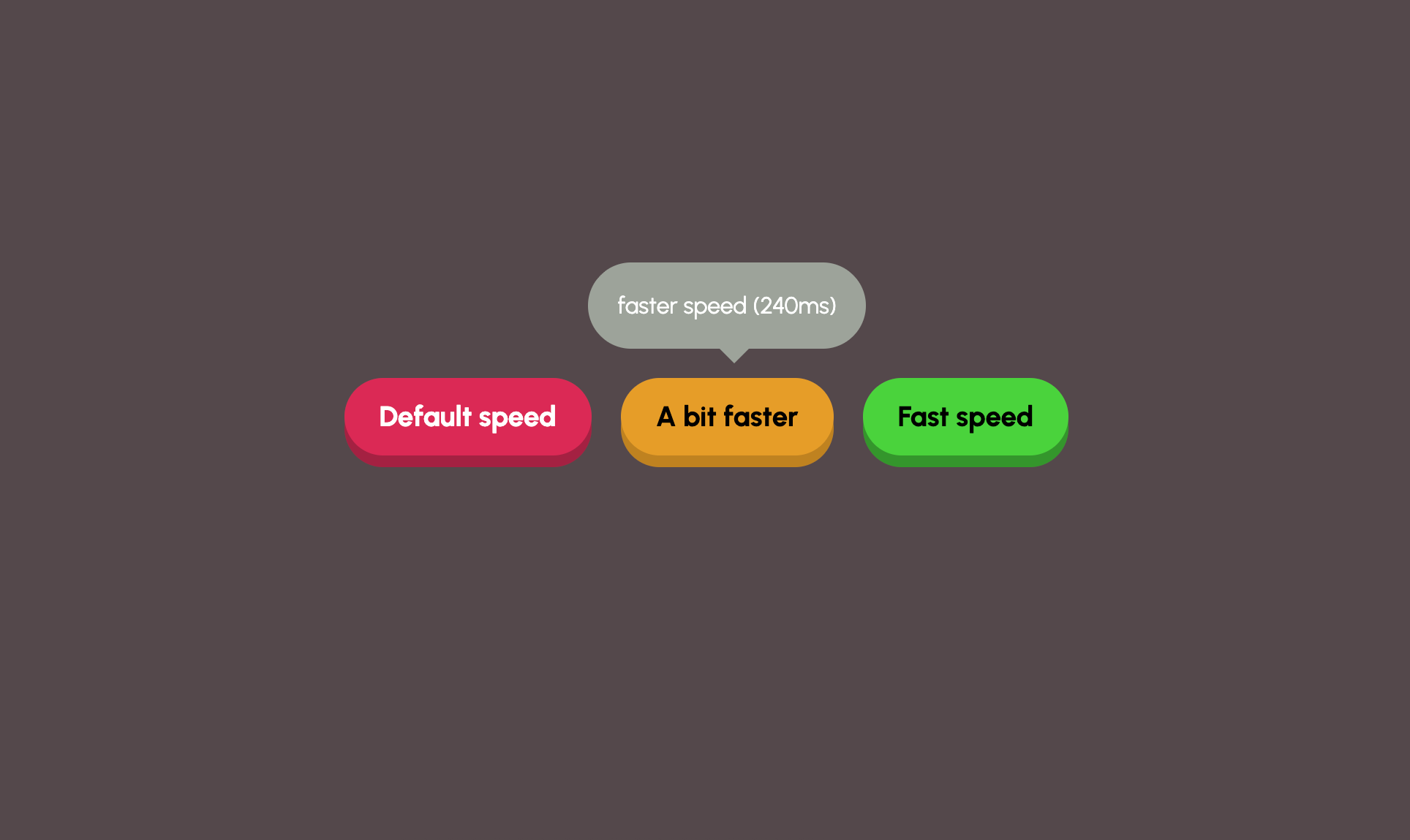
<button interestfor="my-popover">Default speed</button>
<div id="my-popover" popover="hint" role="tooltip">Hi! I'm a popover</div>
These popovers get triggered on hover, and you can update the delays by using CSS:
[interestfor] {
  interest-show-delay: 0.24s;
  interest-hide-delay: 0.44s;
}
If you want the same delay for both entry and exit, you can even write a shorthand:
[interestfor] {
  interest-delay: 0.24s;
}
Both of these actions would be possible on <a> and <button> elements.
Accessibility/UX hot take
I created a little demo, playing around with the delay parameters. At first, I found the default speed too slow, but to be honest, I think it matters on your use case. If you have a lot of these popovers and a person is tabbing through them using a keyboard, it can get really frustrating and thus not a good UX. In those cases where popovers would just keep jumping up, a bit of extra delay doesn’t hurt. If you only have one or two of them, feel free to ramp up the speed a bit. As in a lot of cases… it depends. Put the user central. So yes.. I kind of like the default speed to be a bit slower as a good default.
Here is that delay demo:
I also added a video if you don’t want to check in Canary:
Also note that in this example, I used a role="tootlip" in the popover. This is still a bit opinionated, and I don’t consider myself an expert on this, so use with care. I came across an interesting thread on this tooltip role (Also whether tooltips should or should not contain interactive elements).
About popover hint
There are more nuances than this, but popover="hint" is used as a new stack of popovers, allowing you to have an auto popover open while toggling between different hints. Think of an example where you would have tooltips inside of an auto popover.
I created a little playground that you can use in Chrome Canary to illustrate these differences. (I didn’t bother to create actual “tooltips” from the popover hints with anchoring, to keep the demo on point)
There is a bit more information (and a cool example!) to be found on Una’s blogBut what about touch devices…
I know for a fact that the Chrome DevRel team has been reaching out to developers at conferences and has done a couple of surveys on the possible solutions to do this. I am quite opinionated on those, but let’s review some of the options first.
I’m going to do a quick version on this, but a full version can be read on the Open UI website; the animated gifs images I’m using are also from that page (but a bit more compressed). I will summarize them and add some of my thoughts on this. I do hope you read the whole thing at Open UI to create your own ideas! We need more input on this.
Note that the following part will have some animated GIFs in them; They do not pause, but I’ve hidden them in collapses so you can toggle them if you find them too distracting.
Option 1a: do nothing
Although this is not in the explainer of Open UI, it is an option that was discussed at CSS Day. Not showing it on mobile devices is one of the options, and I am completely against that idea… But I should at least add the arguments I heard:
Arguments:
- Tooltips shouldn’t contain important information from a UX standpoint, so it’s not needed
- It makes things easier as we only need to think about one sort of implementation.
The reason I don’t think the argument adds up is that we don’t know which information the authors will put in there. Yes, there shouldn’t be important info in there, but that doesn’t mean there can’t or won’t be. I applaud the argument as it was clearly by a person with good UX intentions, but bad UX is still a thing that will happen - and that is why - I believe that if something is written in a well-structured HTML, it should be accessible by default on every web-capable device. The main benefit of writing some solid and smart HTML fixes most of the accessibility problems we see today. I don’t like the idea of something not visible/accessible by default in just HTML.
Take into account translation labels provided in a CMS, where non-technical, non-UX people might have a final say. Before you know it, labels such as “Will increase final price” will be added to that popover.
Option 1b: Let the UA handle it
Let each browser vendor figure this out by themselves might seem like the easy solution here. However, as someone who started in the Internet Explorer 5 era, I’m always a bit scared of these kinds of solutions.
Argument
- Will speed up initial development
- Behavior can be tailored to the UI/UX direction of the device
Even though I love to see features ship fast, I’d rather have a uniform way of how these interest popovers work. Fewer caveats and author confusion should be important
Option 2: Long press = show both context menu and popover at the same time
This idea came initially from open UI. The idea is that the popover and the context menu would both be visible when long pressing an <a> element, and only the popover on a <button> element:
View example

Argument:
- There is a lot of native behavior on touch devices where people use a long press
I agree with the idea in general, an author could, for example, add an icon on the link to indicate a tooltip is behind it (for example, using an ::after pseudo-element with an info icon). The downside I see is bigger popovers, as we can’t always control what authors put in there.
Option 3: Long press = Include “view more info” action in context menu
Here it is using the long press again, which keeps it the same for buttons, and it would work out of the box. However, for links, the long-press gesture already brings up a context menu. This option proposes adding a “View more info” item to the existing menu.
View example
Arguments:
- It doesn’t alter any existing user experience and is easy to implement.
- Popovers are not bound to a limited space
I personally like this idea (for me it’s certainly one of the favorites). The biggest downside is that it will take some time for people to get acquainted with this added item in the context menu and that the “view more info” is a fixed label that can’t be altered by the author (I think…).
Option 3.5: Long press and add an opt-in “info” button pseudo-element
So the idea here is basically the same, but instead of context menu an optional pseudo-element could be added next to the invoker. That pseudo-element alone would trigger the option.
View example
Argument:
- clean?
It could look like this:
@media (any-pointer: coarse) {
  .my-link::interest-hint {
    content: '' / 'profile preview';
    background-image: url('icon.png');
  }
}
I personally think this is a really clean idea, of course people will have to add correct sizing of the icon for the thumb action.
But here is that optional part again, and once again, I don’t really like this to be optional by default. I’d rather have the pseudo-element on by default with a UA chosen icon if this would be the way to go. At least then, the author needs to explicitly remove or alter it in CSS.
But I recently came to a new proposal in Open UI which will be discussed: an Alternative HTML-only version of the ::interest-hint feature, via command invokers.
Just to show, we are not there yet which is exactly why feedback at this stage is extra important.
Option 4: Single-tap interest
Instead of using a long-press, this option suggests that a single-tap on an element with interestfor would show the popover. A second tap (perhaps within a set time) would then activate the link or button.
View example
Argument: Since a single-tap is used for the popover, the user can still long-press to access the standard context menu.
But the downside here is something called “tap uncertainty”. Users won’t know if a single tap will navigate to a new page or just show a popover, which could be confusing and discourage link-tapping, maybe even create dark-patterns.
Option 5: Do not show the context menu
With this option, long-pressing an element with interestfor would immediately trigger the popover, but the standard context menu would not appear.
View example
Argument:
- Direct and clear action
The downside is simple: but what if I want to copy text, open in new tab,… There is loss of functionality here.
Option 6: A new gesture and alternatives
I don’t have anything here for gestures 🙂 Think about it.
Did I pop your interest?
Which option to choose, that’s the question, right? I did not hide that I have my favourites, but that doesn’t mean they are the best ones. I don’t have the direct answer here on which on of the options should be provided. I know for sure it will be a hassle to get every user agent on board for a single solution.
But if you read this, I do want you to share your opinion on this. For me, it needs to tick the following boxes:
- Make it accessible on a mobile/touch device by default, as we don’t know the content (it’s fine if an author can turn it off)
- Make it a uniform way between user agents, so that there isn’t any author confusion
- Make it clear to users that something else will happen (can be partially by author, such as adding an icon)