CSS grid is a lot of fun and I find myself using it far more often than I used to. Goodbye to the Flexbox grid and hello to all things grid. Here are some of the fun things you can do with the CSS grid module.
First things first: The problem with the CSS Grid module
Using CSS grid is a blast, and I have been playing around with it from time to time, but for some reason, I never found the time to actually take a deep dive in it and it never felt like a natural thing to use. The main problem with it is that it never got the hype that Flexbox had a few years back. People were able to use grids, Bootstrap and many other libraries had a brilliant integration of a Flex grid and so, a lot of developers just didn’t find the need for it.
I am one of those developers, the syntax seemed a bit hard, I didn’t find a reason to make the switch. But from the start of 2021 till now, I started doing a bit of effort to use it from time to time and suddenly, it just clicked. I noticed my code getting shorter, my HTML more read-able and before i knew it, I was hooked. So now I’m using the CSS grid layout for more things and here are some of the fun ones I played around with. After all, sharing is caring.
Buttons with CSS Grid
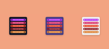
I created a few buttons with the module. The idea was to keep my HTML as short as possible. By using pseudo elements, we can actually make them a part of the grid and style them. So here is the HTML we start with.
<button>This is my button</button>Very simple indeed, what we need next is a bit of styling of our button. So here the trickery starts, let’s make our button a grid and add some basic styling to it.
button {
  display: grid;
  grid-template-columns: 1fr auto 1fr;
  align-items: center;
  padding: 5px;
  font-family: 'Lato', sans-serif;
  font-size: 1rem;
  font-weight: 600;
  text-transform: uppercase;
  letter-spacing: .08em;
  line-height: 1.5;
  color: #FEFEFE;
  background: #C200FB;
  border: 0;
  border-radius: 30px;
  cursor: pointer;
}
We now have a button that is a three column grid, and the center column has an auto width. We can now start adding our pseudo elements and create those “punch out holes” or dots.
/* style the button to have holes in it, the pseudo element is a part of the grid */
button::before, button::after{
  content: '';
  width: 15px;
  height: 15px;
  margin: 0 10px;
  box-shadow: inset rgba(0, 0, 0, 0.2) 0px 0px 3px;
  border-radius: 50%;
  box-shadow: 0;
  background: var(--container-background);
}
/* to make sure the right "column" stays aligned to the end */
button::after {
  justify-self: end;
}
And there you have it, a very simple button that looks like it has a lot more HTML going on, but in fact, it’s so clean and simple. You might have noticed that in the teaser image above, the punch out holes have the same color as the background. This is by using a little CSS variable trick based on the container. By adding a variable color to the container background and using that same variable on the pseudo element’s background.
You can see the full example on codepen.Styling a title with lines on both sides
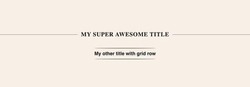
Chances are big that during your career you had to style a title that kind of looks like the one above. You might remember having a hard time with this, maybe writing some extra spans or other tags just to get the desired result. The technique used for this, is pretty much the same one as the button example but now we just keep it simple with a simple <h1> tag:
<h1>My super awesome title</h1> And once again, we use our grid and pseudo elements to create the lines and the column gap for the spacing.
h1 {
  display: grid;
  grid-template-columns: 1fr auto 1fr;
  align-items: center;
  column-gap: 20px;
  margin: 10px 0;
  font-family: 'Merriweather', serif;
  font-size: 2.2rem;
  color: #000;
  line-height: 1.2;
  letter-spacing: .05em;
  text-transform: uppercase;
  text-align: center;
}

h1::before, h1::after {
  height: 1px;
  background: #000;
  content: '';
}
This way of working really helps the workflow and keeps your HTML nice and clean. You can also use grid rows to create other effects. Click here to see the other examples.
Using Grid to make a list span over multiple columns
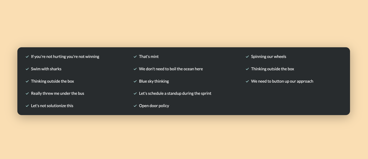
This is a neat little trick I found out recently. When you want a list (<ul> or <ol>) to jump to another column after a few items, you can use the grid-auto-flow property to make this dynamic. It’s not a 100% failsafe when content is being entered by a CMS because it will keep creating columns until infinity. However, if you have a little bit of control, this might be the perfect solution for you.
<ul role="list">
  <li>If you're not hurting you're not winning</li>
  <li>Swim with sharks</li>
  <li>Thinking outside the box</li>
  <li>Really threw me under the bus</li>
  <li>Let's not solutionize this</li>
  <li>That's mint</li>
  <li>We don't need to boil the ocean here</li>
  <!-- add a bunch more here -->
</ul>
ul {
display: grid;
grid-template-rows: repeat(5, auto);
grid-gap: 30px;
grid-auto-flow: column;
}By using a combination of rows and auto-flow, we created something that would’ve cost us a lot more hassle in the past. This of course is just the basics of this integration, the fully styled example can be found on my codepen.
Angry manga face

I won’t place the css of this on the blog because truth be told, it’s a little bit messy. I don’t have any awesome drawing skills but I always wanted to “paint” a cartoon with CSS. However, instead of using position absolute to style the little manga face, I decided to use CSS grid to align the eyes, nose and mouth. Click here for the demo :)
Bonus round: Masonry

I’ve already written a blogpost about using masonry in CSS and I’m still hoping for this to roll out on all major browsers somewhere in 2022. As for now, there are tricks on how you can achieve a lightweight solution by using a CSS grid.
At the moment this is only available in Firefox Nightly after a flag. By using the following syntax:
.grid {
  display: grid;
  gap: 5px;
  grid-template-columns: repeat(3, 1fr);
  grid-template-rows: masonry;
}
I Hope some of these demo’s helped you out. I plan to play around with this a lot more and am looking forward to learning many new techniques. Happy Gridding!