You might remember the days when Masonry grids were all the rage. Every website wanted to have the Pinterest-inspired layout. Well overdue, but there is something in the works at the W3C.
Attention: This article, dated 2021, presents information from its experimental phase. The masonry feature has garnered increased attention of late. I intend to produce a fresh article once the trajectory of this CSS feature becomes definitive. My aim is to ensure readers avoid outdated information. In May 2023, consider the following articles for updated insights:
For now, this article is kept the same as originated for historic reasons:
Recently, I read this article by Rachel Andrew. When I see that Rachel posts something about new CSS features, I tend to bookmark the article so I can read it later with my full attention. If you haven’t heard of her, I strongly encourage you to do some research as she is one of the best speakers when it comes to everything HTML and CSS.
I’m not going to copy / paste her article on my blog. But when reading it, I couldn’t wait to try out the CSS Grid Masonry feature. Here are some of the things I tried and some thoughts that came to mind. I encourage you to read her article nevertheless.
Masonry, is that still a thing?
The term “Masonry” probably came from the o-so-popular jQuery plugin that I worked with in the early days. It has come a long way since then with native JS support and a lot of alternative libraries to choose from. I’m truly happy that they chose the name “Masonry” for this CSS based version as well. The name has become something so defining that we use it to describe this type of layout, no matter which library is used.
Let’s be honest here. Although the Masonry layout with CSS is an amazing feature, it comes a little too late. The huge hype isn’t what it used to be anymore, a lot of designers have the “it’s been done” feeling when designing a grid.
But who knows, there are a lot of things that come back like 80’s music had a revival in the 2000’s, so I’m sure that we might get a Masonry revival if we don’t need to load a big JavaScript library for it. And really, it’s easy.
Support for Masonry in CSS-only.
For now, we’ll have to try it out with Firefox nightly with the layout.css.grid-template-masonry-value.enabled flag enabled. To find out if it’s enabled go to about:config in the browser. All installed? Flag enabled? Ok, let’s go and see how to achieve this.
How to get a Masonry grid in CSS?
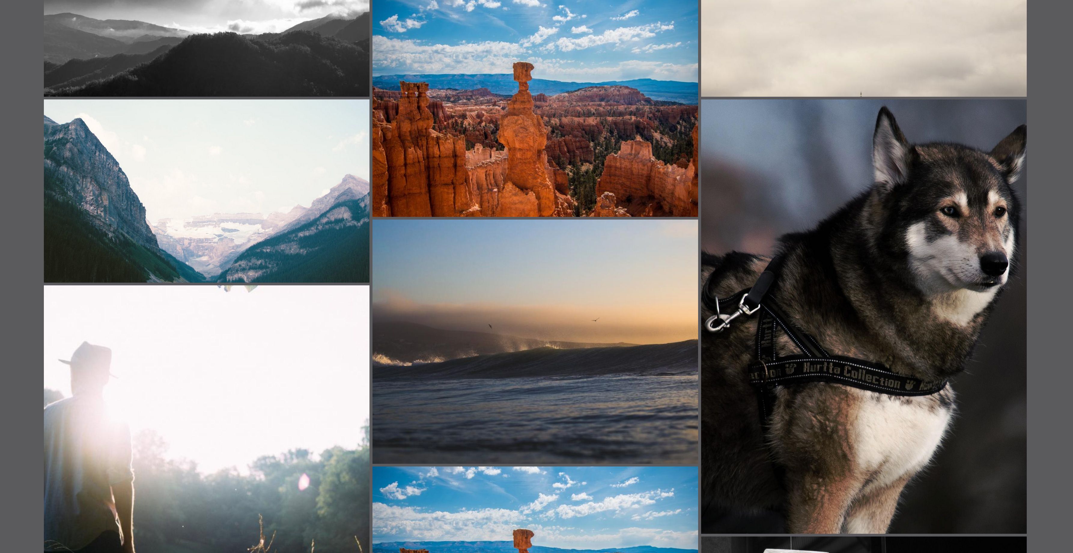
Let’s add some basic HTML for our grid.
<section class="grid">
  <main class="text-box">
    <h2>Just a test with firefox nightly</h2>
    <p>
      Lorem ipsum dolor sit amet, consectetur adipiscing elit. Cras convallis
      sodales erat vel accumsan.
    </p>
  </main>
  <figure>
    <img src="https://unsplash.it/800/600/" alt="" />
  </figure>
  <figure><img src="https://unsplash.it/800/600/" alt"" /></figure>
  <figure>
    <img src="https://unsplash.it/900/600" alt="" />
  </figure>
  <figure>
    <img src="https://unsplash.it/800/600/" alt="" />
  </figure>
  <figure><img src="https://unsplash.it/800/600/" alt"" /></figure>
  <figure>
    <img src="https://unsplash.it/900/600" alt="" />
  </figure>
</section>
Now let’s add the CSS.
.grid {
  display: grid;
  gap: 5px;
  grid-template-columns: repeat(3, 1fr);
  grid-template-rows: masonry;
}

figure {
  margin: 0;
  display: block;
  line-height: 1;
}

figure > img {
  display: block;
  max-width: 100%;
}
There it is, a 3 column CSS Masonry grid, now isn’t that easy? :)
Playing around with CSS Grid order.
One of the things that always was a hassle when using the Masonry JavaScript was changing the order based on a viewport. So naturally, this was one of the first things I wanted to try out. I added a bit of text at the start of my grid to have it at the top of my screen when watching on mobile. However, when viewing it on a large viewport, I wanted the text to sit nicely in the middle. So I tried the following:
figure:first-of-type {
  order: 1;
}

.text-box {
  order: 2;
}

figure {
  order: 3;
}
It worked as expected and I love it!
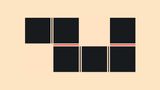
Adding some grid-column spans.
This is where it got a bit more tricky. I wanted to highlight some images by making them 2/3th of the size inside the grid. Doing that works like a charm but for some reason I wanted the grid to nicely close the items together and make it so that the masonry always gets a good fit. Of course this might be taking things too far.

I created a lot of gaps this way
Just an idea to make the items fit.
Maybe we could have a property that makes it so that the order isn’t necessarily respected, but it respects the gutter instead. I know this might be taking things a little too far, but imagine how cool it would be if we could do something like this:
.grid {
  grid-template-rows: masonry-fit;
}
It’s nice to make the grid work with every type of content.
As sort of a final little test, I wanted to try it out with different cards, sort of like a news overview and add different sizes of images. We all have been there… Getting content by a third-party API where you have no control whatsoever.
Using it now with a fallback (@supports).
You can actually use it right now in any browser if you add a decent fallback. It’s a little bit of a hassle but it will pay off when more browsers start to support it. I might update my own photography pages as well to have decent support with fallback later on.
You can test support by putting this in your CSS or JavaScript with the following:
    @supports (grid-template-rows: masonry) {
    	/* Masonry content here */
    }


    const supportGrid = CSS.supports("grid-template-rows", "masonry");

    if (!supportGrid) {
    	//add the js fallback here
    }
I added a small example of this on my codepen, I loaded Masonry with jQuery and only initialised it when CSS Masonry is not supported. Would be even better if you didn’t include the libraries in that case. You can optimise this a lot better.
Conclusion and concerns.
Just as Rachel describes in her article: Masonry is a great tool to visualise content but it should be handled with care, especially when it comes to accessibility and screen readers. When we start changing orders, things might get messy so tread carefully. That aside, I think this type of layout is still beautiful for photography / design portfolios. It might not be the best choice for news overviews, but that’s up to you.
Another concern I have is browser differences when it starts to roll out and partial support. Even though websites do not need to look exactly the same in every browser, it’s still hard to explain to a client why image A is in another location (yes, I’m looking at you Safari…).
I think this feature might bring a revival of the Masonry layouts, I can only hope they get implemented with correct accessibility and don’t get over-used. Because in the end: there is nothing wrong with a basic beautiful grid.
I haven’t found any issues with the implementation so far, but if I find any…
If you run into problems or can’t do something you were able to do in your previous implementation, please let the CSSWG know by raising an issue.