While experimenting with CSS, you sometimes discover a technique you want to do more of. This is one of those discoveries for me... I love how we can now animate clip paths on scroll with CSS. From animating an image into a star to creating Polaroid-like images on scroll. In this article, I’d like to demo some techniques we can use to create these interesting effects using clip paths, @property, and even container units to create visually pleasing scroll-driven animations.
There are a lot of features coming in CSS and one of the things I often think about is how to combine all of them. How can I create some practical use cases for all this stuff? So, in this article, you will see a lot of things: Scroll-driven animations, @property, container units, clamping, and other goodies. Time to write some modern CSS
Clipping and animating on scroll
Before we get to the big demo, let’s start with a smaller one to showcase some of the basic techniques we’ll be using later on and since I’ve already written about the basics of scroll-driven animations, let’s dive right into animating clip paths on scroll. This is the first effect we’re going to create:
In this demo, we have an image set fixed to the center of our screen. For demo purposes, let’s give the <body> a height of 300vh to have some overflow to play around with. This is the CSS attached to the image, the bottom three properties are the ones we’ll be working with:
img {
  position: fixed;
  top: 50%;
  left: 50%;
  transform: translate(-50%, -50%);
  display: block;
  width: 100%;
  max-width: 50vmin;
  height: auto;
  aspect-ratio: 1;
  object-fit: cover;
  border: 5px solid deeppink;

  clip-path: circle(20% at 0% 0%);
  animation: rotateOrb linear both;
  animation-timeline: scroll();
}
When we want to animate clip-paths there are two options we can go for.
Option 1: Just animate the property
The easiest way to do this would be to just animate that property again and again. When choosing that route, this would be the animation for what we want to achieve:
@keyframes rotateOrb {
  0% {
    clip-path: circle(20% at 0% 0%);
  }
  25% {
    clip-path: circle(20% at 100% 0%);
  }
  50% {
    clip-path: circle(20% at 100% 100%);
  }
  75% {
    clip-path: circle(60% at 0% 100%);
  }
  100% {
    clip-path: circle(150% at 0% 0%);
  }
}
Now, before I get a whole bunch of hate: Yes, this will be the shortest amount of code needed to create that effect, but for me, this always felt bloated, especially when using bigger animations. Circles are quite easy to understand because there are only 3 values involved, but when using polygons, it gets tricky. We could benefit from using something more understandable. Which brings us to the next part.
Option 2: Using custom properties
Let’s make all of this a bit more readable by using custom properties. This would make it a bit easier to tweak as well. So let’s change our code to set this up. First up, let’s update our code to animate variables instead of the clip-path property:
img {
  /* positioning properties */
  clip-path: circle(var(--scale) at var(--move-x) var(--move-y));
  animation: rotateOrb linear both;
  animation-timeline: scroll();
}

@keyframes rotateOrb {
  0% {
    --move-x: 0%;
    --move-y: 0%;
  }
  25% {
    --move-x: 100%;
    --move-y: 0%;
  }
  50% {
    --move-x: 100%;
    --move-y: 100%;
  }
  75% {
    --move-x: 0%;
    --move-y: 100%;
    --scale: 60%;
  }
  100% {
    --move-x: 0%;
    --move-y: 0%;
    --scale: 150%;
  }
}
One might think that the only thing left to do is to set up our basic variables inside of the root (spoiler alert, this won’t work):
:root {
  --move-x: 0%;
  --move-y: 0%;
  --scale: 20%;
}
This results in the following “jumpy effect”:
So, why doesn’t this work?
At this point, the browser has no idea that it should animate these properties as a percentage, as custom properties can contain anything you want. Thankfully, we have something available in every major browser that could help with that issue, which is the @property syntax.
Instead of just adding the custom properties inside the root, let’s add them using @property:
@property --move-x {
  syntax: "<percentage>";
  initial-value: 0%;
  inherits: false;
}

@property --move-y {
  syntax: "<percentage>";
  initial-value: 0%;
  inherits: false;
}

@property --scale {
  syntax: "<percentage>";
  initial-value: 20%;
  inherits: false;
}
Now our demo will fully work. Here is the CodePen of this:
So, as a conclusion to this: Yes, the code is a bit bigger, but it feels a lot smarter and I do think it creates a bit more control and easy tweaking. In the CodePen above, you could give the image a class .square-in which would trigger a new animation, using those same custom properties. So, yes, for a small demo like this, it might be a bit too much But looking at the bigger picture, it will be a lot easier to maintain, especially when using multiple animations in a project.
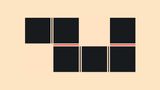
Another quick example of this is animating a polygon star:
I have no idea why I created this, but now, if you need it, you don’t have to :) I’ve also written another article if you’d like some extra information about @property.
Alright, believe it or not, this was the intro. Now that we’ve seen this technique, buckle up, and let’s create the actual demo:
Animating a CSS Journal with scroll-driven animations, @property, and clip-paths
In this step-by-step tutorial, we’ll be making a sort of CSS Journal. As I’ve recently been playing with the idea of keeping a journal in real life, I felt a bit inspired so, that’s kind of where this idea came from. The intake is to have a picture and a quote next to each other and we’ll be giving them a cool entry into the viewport. In the final demo, there will also be a little intro to notify users to scroll, but that’s a bit beside the point of the demo. Here is the final result of what we’ll be making:
Setting up the HTML of our journal
Let’s start with setting up the HTML, we will alternate the image and text in the DOM for now as we’ll play around with that bit later on. So, without the actual content, this is our HTML:
<section>
  <article>
    <figure>
      <img src="..." alt="..." />
      <figcaption>...</figcaption>
    </figure>
    <div class="entry">
      <p>...</p>
    </div>
  </article>
  <article>
    <div class="entry">
      <p>...</p>
    </div>
    <figure>
      <img src="..." alt="..." />
      <figcaption>...</figcaption>
    </figure>
  </article>
  <!-- this gets repeated a few times -->
</section>
Let’s get over the function of our HTML elements for this demo:
- The
<section>will hold our articles, displaying them in a flex column - The
<article>will be used as a wrapper for our items and add a grid layout - The
<figure>will hold the image and will rotate a bit when entering the viewport - The
<img>will get an animatedclip-pathto create the Polaroid film effect - The
<figcaption>will be used as a description on the bottom of the polaroid - Then
.entrywill fade in a bit when entering the viewport, first the lines of the text, followed-up by the text itself.
The basic layout - a reset and organizing our entries
First of all, we’ll need a little reset, let’s get that out of the way right now. I also added a custom Google font for presentational reasons:
body {
  margin: 0;
  font-family: "Annie Use Your Telescope", cursive;
  background: radial-gradient(ivory 70%, transparent 30%),
  radial-gradient(ivory 70%, transparent 30%), #f5f3f3;
  background-size: 5px 5px;
}

figure {
  padding: 0;
  margin: 0;
}

img {
  display: block;
  width: 100%;
  max-width: 100%;
}
Next up, let’s create a flex column out of our section and give the items a bit of a gap, this will help the scrolling experience later on, we can also provide a padding-block: 50vh; to make sure there is enough spacing to view the scroll animations of all the items:
section {
  display: flex;
  flex-direction: column;
  gap: 40vmax;
  margin-inline: auto;
  padding-inline: 10vmax;
  padding-block: 50vh;
  max-width: 1400px;
}
Now let’s turn all of our <article> elements into a grid (I used a breakpoint of 750px for this, but choose freely). Our image will be set to be 2/5 of the width. By using :has() we can check where the image is located and change our grid based on that:
article {
  display: grid;
  align-items: center;
  gap: 8vmax;
  @media (min-width: 750px) {
    grid-template-columns: 2fr 3fr;
    gap: 10vmax;
  }
  &:has(.entry + figure) {
    @media (min-width: 750px) {
      grid-template-columns: 3fr 2fr;
    }
  }
}
Styling and animating the entry fade
This is where our first scroll-driven animation gets triggered, we’ll want to slightly animate the entry upwards into place while also changing the text color from transparent to black. We will animate the color instead of the opacity, because we’ll want to use the opacity property for the lines, as stated before: “The .entry will fade in a bit when entering the viewport, first the lines of the text, followed-up by the text itself.”
.entry {
  animation: revealEntry linear both;
  animation-timeline: view(block);
  animation-range: cover 20% contain 40%;
}

@keyframes revealEntry {
  from {
    color: transparent;
    transform: translateY(20%);
  }
  to {
    color: black;
    transform: translateY(0%);
  }
}
One of the things you might be wondering is how we can find the perfect animation-range for these effects. For that, I usually open a tab and play around with the ranges tool created by Bramus. He made a Chrome plugin for it as well, but I like this one a bit better in my workflow, the choice is yours of course.
Next up, is to create the lines for our text and slightly make those appear a bit earlier, this will just be a simple basic fade-in animation. This is the complete code:
.entry p {
  font-size: clamp(1.25rem, 0.9891rem + 1.3043vi, 2rem);
  background-image: repeating-linear-gradient(
    to top,
    #95d9c3 0 0.125rem,
    transparent 0.125rem 1lh
  );
  background-position-y: 0.8lh;

  animation: fadein linear both;
  animation-timeline: view(block);
  animation-range: entry 10% contain 10%;
}

@keyframes fadein {
  0% {
    opacity: 0;
  }
  100% {
    opacity: 1;
  }
}
The lines are created with a repeating-linear-gradient using the lh unit, a relative CSS unit based on the line-height of the current font. This is easy for re-sizing the text, especially if you’re using a bit of fluid typography with clamp(). I recently wrote a series about relative length units in CSS if you want to read a bit more about these techniques. But for this demo, I’m just adding it as a sweet bonus.
For the moment, you should be having something like this:
Rotating our figures as they enter the screen
Before we get to the clipping, let’s start with the rotation of our <figure>. To do this, we’ll add some default styling, and give the figure an aspect-ratio: 1;. This makes perfect sense because these kinds of pictures are usually in a square aspect ratio:
figure {
  --rotate: 20deg;

  position: relative;
  aspect-ratio: 1;
  background: white;
  box-shadow: rgba(0, 0, 0, 0.1) 0px 4px 12px;

  animation: rotate linear both;
  animation-timeline: view(block);
  animation-range: cover 20% contain 30%;
  @media (max-width: 749px) {
    max-width: 350px;
    align-self: center;
  }
}
We also added a custom property --rotate to handle the rotation of our figure, we’ll be using that custom property in our keyframes:
@keyframes rotate {
  entry 100%,
  exit 0% {
    opacity: 1;
    rotate: var(--rotate);
  }
  exit 100% {
    opacity: 0;
    rotate: 0deg;
  }
}
Pretty sweet! If you’re actually following along with the demo, you might notice that all our figures are rotating in the same direction. It’s :has() to the rescue! Remember the following line in our article, and let’s update it:
&:has(.entry + figure) {
  @media (min-width: 750px) {
    grid-template-columns: 3fr 2fr;
  }
  figure {
    --rotate: -20deg;
  }
}
This will ensure that the image will rotate in the other direction when placed after the entry…
:has() is so freaking awesome!
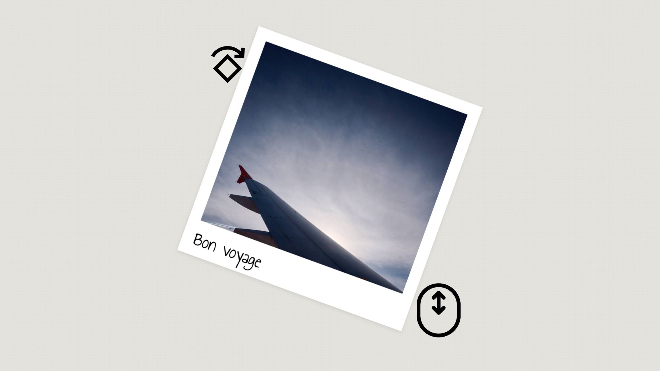
Creating our image to Polaroid effect with clip-paths and @property
To create our frame, we will only need to animate two values, as our frame has 3 equally sized sides and only the bottom part is wider. Let’s create two custom properties for the clipping and set the initial-value to 0%:
@property --clip-1 {
  syntax: "<percentage>";
  initial-value: 0%;
  inherits: false;
}

@property --clip-2 {
  syntax: "<percentage>";
  initial-value: 0%;
  inherits: false;
}
For our image, we’ll add the default styling, giving it an aspect-ratio: 1; while also clipping it with inset. The values of inset clipping are familiar, it’s the same as margins: top, left, bottom, and right. So this will translate to:
inset(var(--clip-1) var(--clip-1) var(--clip-2) var(--clip-1));
Here is the full styling of our image:
img {
  aspect-ratio: 1;
  object-fit: cover;

  clip-path: inset(var(--clip-1) var(--clip-1) var(--clip-2) var(--clip-1));
  animation: createFrame linear both;
  animation-timeline: view(block);
  animation-range: cover 15% contain 40%;
}
In the animation, we will update these values and add a shadow:
@keyframes createFrame {
  to {
    --clip-1: 5%;
    --clip-2: 15%;
    box-shadow: rgba(50, 50, 93, 0.25) 0px 6px 12px -2px,
        rgba(0, 0, 0, 0.3) 0px 3px 7px -3px;
    }
}
You should now have something like this:

We’re getting close, two steps remain.
Animating the caption into the frame
We will be absolute positioning the <figcaption> while also giving it a max-width with a text-overflow: ellipsis. But since our frame changes depending on the width of the window, It might be interesting to size and position the caption based on its container.
To do this, let’s create a container out of our figure:
figure {
  container: frame;
  container-type: size;
  /* previous code... */
}
Now, in normal cases, it would be a problem to set the container-type to size because when using a block axis, this container needs to have some sort of defined height. Luckily, thanks to the aspect-ratio, this has been set.
figcaption {
  position: absolute;
  inset-inline: 5cqw;
  bottom: 1.2cqh;
  font-size: 8cqh;
  text-overflow: ellipsis;
  white-space: nowrap;
  overflow: hidden;
  z-index: 1;
}
So all that is left for us to do, is to make that text appear, once again, using an inset clip-path where we will animate that one custom property that we already created:
figcaption {
  --clip-1: 100%;

  /* previous presentational styles */
  clip-path: inset(0 var(--clip-1) 0 0);
  animation: revealText linear both;
  animation-timeline: view(block);
  animation-range: cover 25% contain 35%;
}

@keyframes revealText {
  to {
    --clip-1: 0%;
  }
}
Be weary of user preferences and browser support
One last thing to end this demo, is that you should always think about user preferences and browsers support.
As a best practice, you should do this as a progressive enhancement. But for demo reasons, I decided to use the not operator in a support flag, mostly to not overly pollute the demo:
@supports not (animation-timeline: view(block)) {
  .intro {
    animation: none;
  }

  section * {
    animation: none;
  }

  figure {
    rotate: var(--rotate);
  }

  figcaption {
    --clip-1: 0%;
  }
  img {
    --clip-1: 5%;
    --clip-2: 15%;
    box-shadow: rgba(50, 50, 93, 0.25) 0px 6px 12px -2px,
        rgba(0, 0, 0, 0.3) 0px 3px 7px -3px;
  }
}
You could use the same approach for users that prefer reduce motion. In this case, the same code can be inside of it:
@media (prefers-reduced-motion) {
    /* Same as the support query content */
}
The final result
If you followed along with the article, you should have ended with a similar result as the demo I’m embedding to this page.
In this final version, I also added some cascade layers into the mix for easy grouping and a little intro, but that’s the only difference.
I do hope you enjoyed this little showcase of modern CSS features, I had a blast creating this demo and looking forward to seeing what other magical things people will be making with scroll-driven animations combined with clip-paths. After being busy with mostly HTML and web components, it was nice to return to CSS a bit. I really enjoyed it. One question remains: Will I start creating a real physical journal and start “journaling”, I’m still not sure, but at least, this little demo sprouted from that idea.