One thing I’ve learned over the last year is to deal with changes in explainers and specs and that naming things is hard. In this update on Invokers, I will cover the new syntax and the new name: Invoker Commands. Once again giving you some control over interaction with HTML from opening dialog elements to creating custom counter buttons and video controls.
A note of warning
What I’m writing about is still experimental. The invoker commands feature is being made available in multiple browsers, however, I tested my demos in Chrome Canary. If you want to play around with them you’ll have to enable the Experimental Web Platform features after going to chrome://flags
- This article was slightly updated with the latest syntax
- In Chrome 135 invoker commands will be available for dialogs, popovers and custom commands, more info on the Chrome blog
- At current state, Chrome Canary needs to be launched with the following flags for the video, picker and stepper examples:
--enable-features=HTMLInvokeActionsV2,HTMLCommandActionsV2 - I plan to write some updated information on this later on, but most of this article still adds up for the future of invokers
Why care about an experimental feature?
The reason you should be interested in this feature is that talking about it does help to move things forward. If we notice a big interest from people, it gets placed on top of the pile by the different working groups out there.
I will be re-using some of the older demos I created and will add a new one as well. I’ll once again cover some of the basics while also adding a few differences compared to the previous explainer. If people land on this page, they don’t need to go back and forth on demos, so it seemes like the correct thing to do.
The basics: Creating a button and adding a command
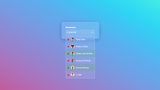
For the basic example, let’s take a look at how we could trigger a dialog by just using HTML:
<button commandfor="my-modal" command="show-modal">Trigger dialog</button>
<dialog id="my-modal">This is my dialog</dialog>
This opens the dialog element in the top-layer with the ::backdrop pseudo-element attached. The only thing needed is the commandfor referencing an id and the command attribute specifying the showModal action.
One new thing compared to the old explainer we need to take into account is that when the command attribute is missing it will default to an invalid state. There will be some exploring to enable implicit command and/or commandfor values where the value can easily be inferred. (but probably after the initial shipping of the feature)
Taking it one step further, what happens when you want to create your own little close button? Well, you could just add the following inside of your <dialog>:
<button commandfor="my-modal" command="close">
  Close
</button>
Most of the time, when creating these kinds of experiences, we want a click on the ::backdrop to trigger a close event of the dialog. For that, we can write a bit of extra JS. This should be fine for that:
const dialogs = document.querySelectorAll("dialog");

dialogs.forEach(function (el) {
  el.addEventListener("click", ({ target: dialog }) => {
    if (dialog.nodeName === "DIALOG") {
      dialog.close("dismiss");
    }
  });
});- At the moment, Chrome recently gained support for the
closedbyattribute. <dialog closedby=“none”>: No user-triggered closing of dialogs at all.<dialog closedby=“closerequest”>: User pressing ESC (or another close trigger) closes the dialog.<dialog closedby=“any”>: User clicking outside the dialog, or pressing ESC, closes the dialog. This is similar topopover=“auto”behavior.
For the animations in and out of the top-layer we can rely on @starting-style. If you haven’t heard about that, I created an article about that a little while ago and the good news is that it’s part of Interop 2024.
It’s nice that this controls so easily, here is that CodePen demo (remember, tested in Chrome Canary)
A note on popovers
The commandfor attribute can also be used to target popovers, this will be added with the initial release of the attribute. If an element has both a popovertarget and commandfor attribute, then popovertarget is ignored, or simply put: commandfor takes precedence.
The command attribute for popovers will handle the following options:
toggle-popoverhide-popovershow-popover
These are the equivalent of the attribute popovertargetaction with options: toggle, show, and hide.
In case you need to add other methods for closing, such as certain hardware buttons, do take a look at the CloseWatcher API. This API gets used under the hood for popovers and dialogs and is already available in Chrome 120 and has a polyfill.
What I love about these attributes is that we have so much that can be used straight out of the browser. Something that could only be achieved with custom scripting or libraries just a while ago. This is a great win for performance, but there is (potentially) a lot more to come… Let’s take a look at the potential next phases for invoker commands.
The future phase of invoker commands
Currently planned for a future phase in the invoker plan is to give the ability to invoke the <details> element and even form controls such as the <select> or certain <input> types.
The basics are still the same, for a <details> element we could add the following:
  <button commandfor="my-details" command="toggle">
    This will toggle the details
  </button>

  <details id="my-details">
    <summary>This is a summary</summary>
    This is the content
  </details>
With command having the following options:
toggleopenclose
Details were originally added to phase 1, but have been delayed. Let’s take a closer look at the input elements because those could potentially be a lot of fun.
Showing pickers with the command showPicker()
Imagine you want to create an <input type="date" /> with a custom icon, It would look something like this:

Now unless you do some hacks for the icon to be clickable (I’ve done some before), it could be nice to have this as an actual button just by using HTML and CSS. In that case, this could be our markup:
<label for="date">Pick a date</label>
<div class="input-group">
  <input id="date" type="date" />
  <button commandfor="date" command="show-picker">
    <!-- add an icon here -->
  </button>
</div>
And by just adding a bit of styling…
/* Remove the default date calendar picker */
[type="date"] {
  &::-webkit-calendar-picker-indicator {
    display: none;
  }
}

/* Style the input group with invoker */
.input-group {
  display: flex;
  [type="date"] {
  /*  Presentational styles here */
  }
  [commandfor] {
  /*  Presentational styles here */
  }
}
This could be a result:
(This demo does not work well inside the CodePen iframe, view it in debug mode)
The same technique could be used to trigger a <datalist> with a separate button. Note that we need to trigger the <input> element’s id, not the one from the datalist:
<label for="food">What would you like?</label>
<div class="input-group">
  <input list="foods" name="browser" id="food">
  <button commandfor="food" command="show-picker">
    <!-- icon -->
    Open input picker
  </button>
</div>

<datalist id="foods">
  <option value="🍙 Onigiri"></option>
  <option value="🍜 Ramen"></option>
  <option value="🍣 Sushi"></option>
  <option value="🥟 Dimsum"></option>
</datalist>Isn’t it great how natural this feels? The CSS also seems less hacky this way instead of doing some workaround. Giving us the option of using the browser’s built-in date or datalist option picker with a custom button. (That’s just lovely…)
This showPicker() action can be used on a numerous of elements: <input type="color" /> or <select> elements, or even <input type="file" />:
<label for="fileinput">Upload some files?</label>
<button class="uploadzone" commandfor="fileinput" command="showPicker">Click this huge square to upload</button>
<input type="file" id="fileinput" />
Here is a demo of that:
Truth be told, you could probably create this effect with the label itself, but this being an actual <button> element could be a handy tool.
Number inputs with custom steppers
A feature that would be welcome for people who create a lot of webshops ( I am such “people” ) is the ability to add custom stepper buttons on an <input type="number" />. There is a possibility to do this with invoker commands and this is how it works:
<div class="counter">
  <button commandfor="num" command="step-down">-</button>
  <input type="number" min="1" id="num" value="1">
  <button commandfor="num" id="btn" command="step-up">+</button>
</div>
Using the stepDown and stepUp events for the command, we can control the number of the input type. This takes into account any of the extra attributes on the input as well such as min, max, and step.
Using the HTML above and some extra styling this is something I created with it:
While still a big “if” when speaking about this feature (because, well.. Experimental and such), I love the idea of implementing this with invoker commands. It seems that this invoker idea is fantastic when it comes to consistency, and I can only applaud that.
There are a few caveats at the moment of writing. For the moment a "change" event doesn’t trigger when clicking our stepper buttons, this is something that has been discussed and is still in the works.
While we’re not done yet with all the things you can do with invoker commands, let’s take a little detour as events just came to mention:
Custom commands
Invoker commands will dispatch events on the Invokee element. Using a double dash as the start for the command allows for custom JavaScript to be triggered without having to wire up manual event handlers to the button. By listening to the command event listener we can attach our action to it:
<div class="counter-button">
  <input id="my-counter" type="number" value="0" />
  <button commandfor="my-counter" command="--add-num" value="10">+10</button>
  <button commandfor="my-counter" command="--add-num" value="50">+50</button>
  <button commandfor="my-counter" command="--add-num" value="100">+100</button>
</div>

<script>
const counter = document.getElementById("my-counter");
counter.addEventListener("command", (e) => {
  if (e.command === "--add-num") {
    counter.value = Number(counter.value) + Number(e.source.value);
  }
});
</script>There are more examples to be found at the Open UI explainer
Custom video and audio controls with command
I’ve been showing some short demos of this while presenting about the future of UI and this is one of those things where I notice people gasping and getting a smile on their faces. Seems like people really had some struggles when it comes to custom controls for video and audio. Well, I hear you and Invoker actions might just make all of these things a bit more easy.
This is how we could create a custom play button:
<video id="custom-video">
    <source src="..." type="...">
</video>
<button commandfor="custom-video" command="play">
    Play
</button>
Keeping the consistency going (love this!), we can create a command="play" attribute and this will fire that play event for the video. This works with a whole bunch of events such as:
playplay-pause(toggle between play and pause)pausetoggle-mutedtoggle-fullscreenrequest-fullscreenclose-fullscreen
A bit of styling and you could create something like this:
The only bit of JavaScript needed for this example is to add a class when the video is playing. This would not have been necessary if the :playing pseudo-class was supported everywhere, but unfortunately that isn’t the case at the moment.
In case you were wondering, the same kinds of things can be achieved for audio as well.
For more goodies and information about invoker commands, check out the following links:
- The Open UI invoker commands explainer
- Invoker comands polyfill by Keith Cirkel
- The HTML PR for phase 1
Only the tip of the iceberg
I am only scratching the surface here, but if you want to read the full list of built-in commands being suggested, do check out the full list here.
As a conclusion to this update, I know that these things might change once again, but I do feel it’s important to talk about them. I feel this feature leads to more consistency and readability in code, and I’m a sucker for that sort of thing.
It’s more than a little quality-of-life update to HTML, but even if you think of it in that regard, imagine how many tedious tasks will get removed on a day-to-day basis.
Open UI is a group effort but once again, I do want to give a shoutout to Keith Cirkel and Luke Warlow, who really have put a lot of effort into this feature and are continuing to do so. After this explainer update, the experimental implementations in browsers are already being handled for an update as well, absolutely legendary.
Do remember that all of this is a work in progress. But if you like this and want to support this, create demos, provide feedback and make some noise.
Note that some of my examples in this article might not be the perfect accessible examples at the moment. Keep in mind, that the group is working on improving accessibility, it is a topic that is highly rated.
I do hope that by sharing these features people go check them out and give them a spin. I also hope that by writing this article and speaking about this, I can project a bit of my enthusiasm to others. Always feel free to tag me if you create something with them, I’d like to create a little collection on CodePen as well.