One of the frustrating things when animating elements was not being able to transition to and from display none. Related to that, it also wasn’t an easy feat to use transitions for elements entering the DOM. In Chrome 117 we have the release of @starting-style, which will make animating or transitioning those cases a lot more convenient.
Situating the problem - transitioning and animating display: none
Animating from and to display none was something we could only achieve in a hacky way. We could play around with JavaScript to change classes or use some other hacks. However, we do have number of reasons why we want animation to work with the display property:
display: none;is not the same as a full transparency with opacity, because with display none, it’s hidden for all users and devices (including screen readers)- We don’t want the elements to keep the space when fading out, but instead be completely gone.
- We might want to make it easier for users to understand what is happening on the page. For example, you could animate a loading spinner popping in while a page is loading, or animate a success message in when a user completes a task.
So, why was this so hard? The CSS transitioning spec:
In Level 1 of this specification, transitions can only start during a style change event for elements which have a defined before-change style established by the previous style change event. That means a transition could not be started on an element that was not being rendered for the previous style change event
Quote from CSS Transitions Level 2 spec
In simple terms, this means that you cannot start a transition on an element that is hidden or that has just been created.
Entering CSS transitions level 2 and @starting-style
This is a quick (simplified) deciphering of the “before-change style” explanation of the CSS Transitions Level 2 spec.
The @starting-style rule can be used to define the starting style for an element. The starting style is the style that a transition will start from when the element does not have a previous style.
The @starting-style rule is only applied to elements that were not rendered or not a part of the DOM during the previous style change event. For example, if you add an element to the DOM and then start a transition on that element, the transition will start from the element’s initial style, defined in the @starting-style rules.
Note: I thought for this article, it could be interesting to dig a bit into the spec, so that’s why I wanted to summarize it a little. It’s a real “down the rabbit hole” feeling when digging in these specs. But let’s get started with some of those demo’s now, as a bit of code can say more than a thousand words ;)
Using keyframes from and to display none
Prior to writing this article, I didn’t realize that animating to and from display: none with CSS keyframes was already supported in Chrome 116. That’s great!
A simple zoom out animation that ends with a display: none can be achieve by just doing the following (nothing extra needed):
.zoom-out {
    animation: zoomOut 0.3s linear forwards;
}

@keyframes zoomOut {
    from {
      opacity: 1;
    }

    50% {
      opacity: 0;
      transform: scale3d(0.3, 0.3, 0.3);
    }

    to {
      opacity: 0;
      display: none;
    }
}
That way, you get a great animation, while still keeping the benefits of display: none.
Using transitions from and to display none with @starting-style
Taking things a bit further let’s re-create this example but use transitions to animate our cards and create a slow fade-out.
For the HTML, we create a simple grid structure that has three types of cards:
<div class="grid">
  <div class="card card-error">
  </div>
   <div class="card card-warning">
  </div>
  <div class="card card-success">
  </div>
</div>
At the top of the page, let’s add three checkboxes that will control which cards are hidden:
<div class="controls">
  <label>
    <input class="hide-error" type="checkbox">
    Hide errors
  </label>
  <label>
    <input class="hide-warning" type="checkbox">
    Hide warnings
  </label>
  <label>
    <input class="hide-success" type="checkbox">
    Hide success
  </label>
</div>
Now all that remains for us, is to fade out the cards based on a selection using CSS transitions and also make sure they are actually set to display: none; at the end.
To do this, two things are necessary, we will need to define the @starting-style but also tell our CSS that it should allow discrete properties to be transitioned. There is a new property for that called transition-behavior.
Sidenote: What are discrete properties?
Discrete properties in CSS are properties that cannot be interpolated, or smoothly transitioned, between two values. This means that when a discrete property is animated, it will jump abruptly from one value to the other at the end of the animation.
(or at least, they used to, we can fix this now)
In the following CSS we set transition-behavior: allow-discrete;, allowing our display property to be transitioned. This can also be added inside of the transition shorthand property, but remember that it should come in last. We will set the @starting-style for our grid items to have an opacity of 0 using CSS nesting.
.grid > * {
    transition: opacity 0.7s ease-out, display 0.7s ease-out;
    transition-behavior: allow-discrete;

    @starting-style {
      opacity: 0;
    }
  }
The transition-behavior: allow-discrete property is necessary because the display property is a discrete property. As mentioned before, this means that it cannot be interpolated, or smoothly transitioned, between two values. The transition-behavior: allow-discrete property tells the browser to allow discrete properties to be transitioned.
Now that’s a lot of power with just a single property! To actually toggle the states of our checkboxes, we can use the :has() pseudo class, checking the state of the checkboxes (as this was just for demo purposes), for example:
:root:has(.hide-error:checked) .card-error {
    opacity: 0;
    display: none;
  }
You can play around with it right here:
Transitioning an element entering the DOM with @starting-style
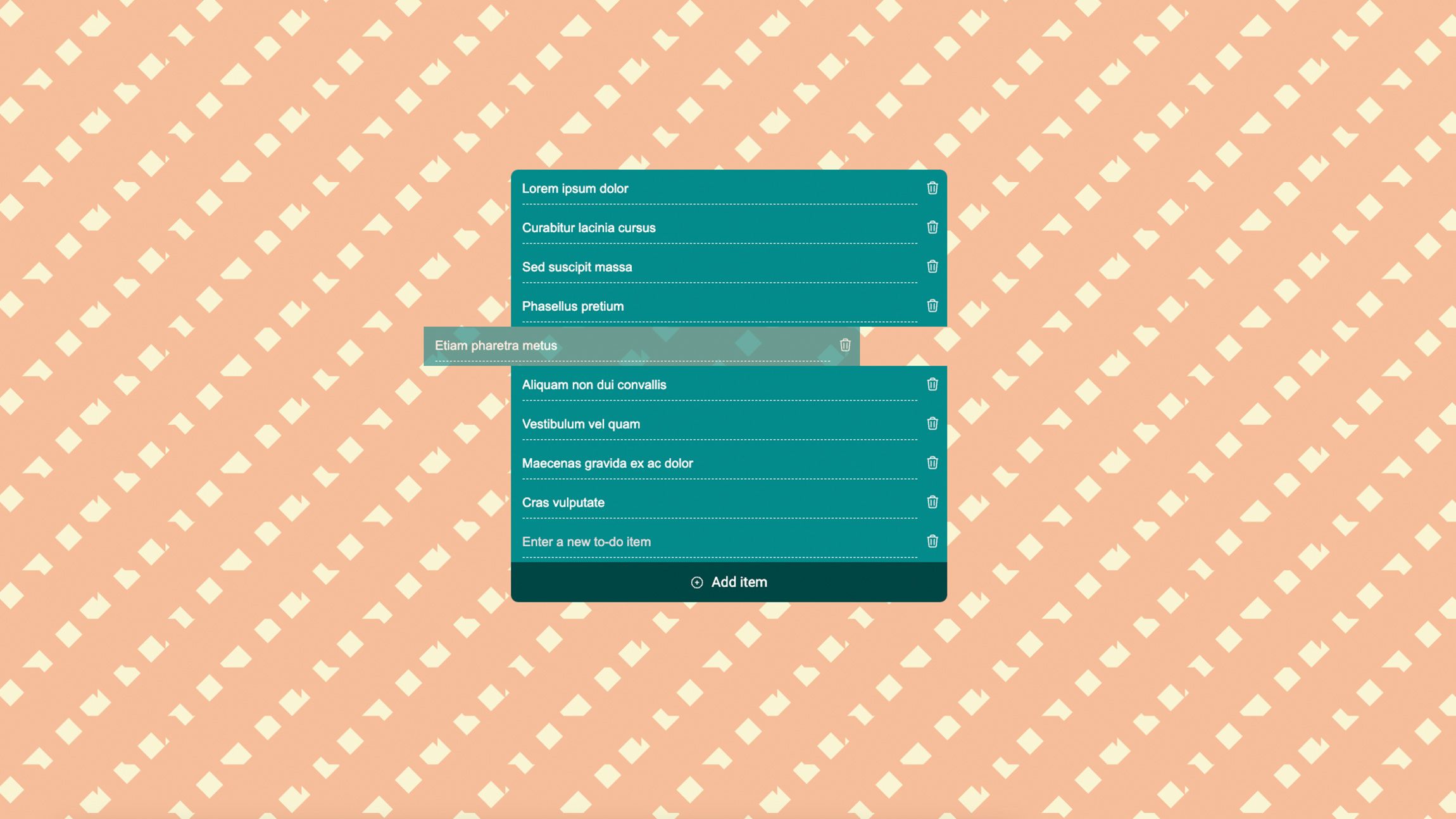
A nice benefit of @starting-style is that we can also take control of transitioning elements entering our DOM. Something we do a lot when using JavaScript frameworks.
I created a little static todo list where list-items get added with the click of a button. Handling the transforms and opacity purely with CSS transitions. In short, this is how I did it:
li {
  opacity: 1;
  transform: translate(0, 0);
  transition: transform 0.5s ease-out, border-radius 0.5s,
    opacity 0.3s linear, background-color 0.3s ease-out;
  @starting-style {
    opacity: 0;
    transform: translate(0, 50%);
  }
  &.removing {
    opacity: 0;
    transform: translate(-100%, 0);
    ~ li {
      transition: translate 0.5s ease-out;
      translate: 0 -100%;
    }
  }
}
When entering the DOM, the starting style will be taken into account. For this, we do not have to allow discrete properties and just let @starrting-style do its magic. One thing that we can’t do yet is transition to DOM removal, unfortunately. I had to add a bit of custom JS for this adding the “removing” class for half a second before removal:
removeButton.addEventListener("click", () => {
    // Remove the list item from the list
    listItem.classList.add("removing");
    setTimeout(() => {
      listItem.remove();
    }, 500);
  });
Still, I think it’s pretty neat what we can achieve with just some basic transitioning now, take a look at the demo to find some hidden transitioning gems I added:
Transitioning from and to the top-layer
There is another place where something is entering and exiting, which is the top-layer. Mostly used for popovers and dialogs for now. For these cases, we can actually handle the entry and exit animations using transitions. For a dialog, the open state is defined with the [open] attribute, while popovers have the :popover-open pseudo class.
Without the presentation style, for popovers, it can look like this:
[popover] {
    --transition-time: 0.5s;
    /* End of animation (on close) styles */
    opacity: 0;
    transform: translateY(-30px);
    transition: opacity var(--transition-time),
      transform var(--transition-time) ease-out,
      display var(--transition-time) allow-discrete;
    &:popover-open {
      /* Open styles */
      opacity: 1;
      transform: translateY(0);
      @starting-style {
        /* Right before open styles */
        opacity: 0;
        transform: translateY(-30px);
      }
    }
  }
Here is a quick demo:
A great thing to have
These starting styles and the ability to animate from and to display: none; are a great thing to have. Personally, I never thought this would be possible some day, so I got pretty adjusted to workarounds by now, so it might take some time adjusting into using this. Unfortunately only on the latest Chrome (117) version for now, but I’m really looking forward to more browser support. Especially in combination with elements in the top-layer it’s a must-have for everything that pops.