Scroll Driven Animations are set to be released in Chrome 115, giving us the chance to animate elements based on a scroll instead of time, increasing our toolset to create some fun interactions. I’m sure many great tricks and articles will be found, as this feature opens a lot of possibilities.
Scroll driven VS scroll triggered
You heard that right, we’re talking about scroll driven animations, which is not completely the same as scroll trigger animations. In this case the animation gets played while the user is scrolling the page, using the scrollbar as its timeline. Although there are some tricks on how you can achieve a scroll triggered animation by using some modern CSS, you might still want to use an intersection observer in JS for this. These animations can be blazingly fast when using transforms as they run on the compositor in contrast to popular JS methods which run on the main thread increasing the chance of jank.
The basics to create an animation on scroll
I’ve already written an article which covered the basics on scroll driven animations, but let’s repeat the basics really quick. It starts off with a basic animation in CSS but instead of giving it a timing, we add an animation-timeline:
div {
  animation: reveal linear both;
  animation-timeline: view(inline);
}

@keyframes reveal {
  0%,
  100% {
    translate: 0 -25%;
    scale: 0.7;
    opacity: 0.2;
  }
  50% {
    scale: 1;
    translate: 0;
    opacity: 1;
  }
}
A few pointers to add about this:
- Do not add a timing to your animation
- The animation-timeline is not part of the animation shorthand
I’m really happy that the CSSWG decided not to add this in the animation shorthand, because - let’s be honest - this shorthand is a bit of a mess and I always seem to forget the correct order for “animation” (luckily, browsers do forgive us most of the time when using this)
Combining scroll driven animations with scroll snapping
One of the things I love about all these new nifty CSS features is how well they go hand in hand. It seems only yesterday since we had scroll snapping in CSS and now we can already think about combining it with scroll driven animations… It’s pretty wild.
As an easy example, I created a Legend of Zelda game timeline with a horizontal scroll.
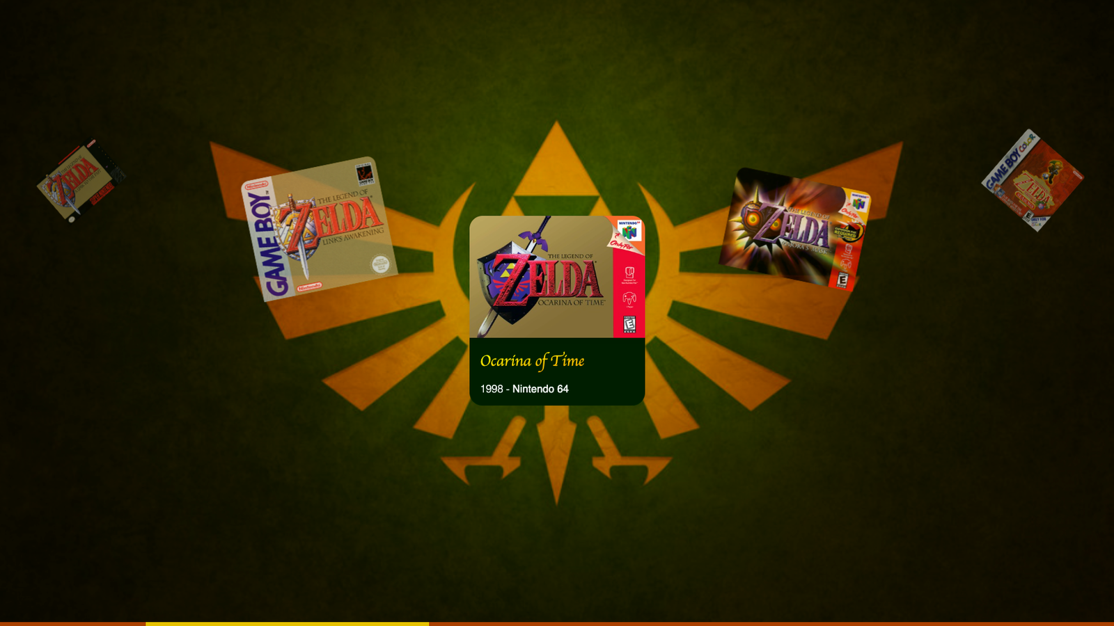
It basically is a timeline with articles inside of it that has some scroll snapping in the center, the HTML build-up is quite simple:
<section class="timeline">
  <article>
    <img src="..." alt="" />
    <div>
      <h2>The legend of Zelda</h2>
      <time>1986</time> -
      <strong>NES</strong>
    </div>
  </article>
  <!-- and a lot more articles for each game -->
</section>
Next up we have some basic styling by adding the articles next to each other with flexbox and add some general look and feel which I will leave out of the code example in order to stick to the essentials:
.timeline {
  position: relative;
  display: flex;
  gap: var(--gap);
  overflow-x: scroll;
  scroll-snap-type: x mandatory;
  width: 100%;
  padding-inline: calc((100vw - var(--item-size)) / 2);
}

.timeline article {
  scroll-snap-align: center;
  scroll-snap-stop: always;
  animation: reveal linear both;
  animation-timeline: view(inline);
}

@keyframes reveal {
  0%,
  100% {
    translate: 0 -25%;
    scale: 0.7;
    opacity: 0.2;
  }
  50% {
    scale: 1;
    translate: 0;
    opacity: 1;
  }
}
So, what happened here? We created a centered horizontal scroll snap and added a “reveal” animation to the parent scroll in the inline axis. The animation itself will place the article to its “active” state at 50%, which will be the 50% of its scroll distance and also the place where it snaps.
To avoid throwing insane chunks of code in this article, there is a lot more CSS going on for the styling, but when it comes to the scroll animations: The exact same animation technique was used for the images and the info panel that pops out to create the following little demo:
View Timeline Ranges
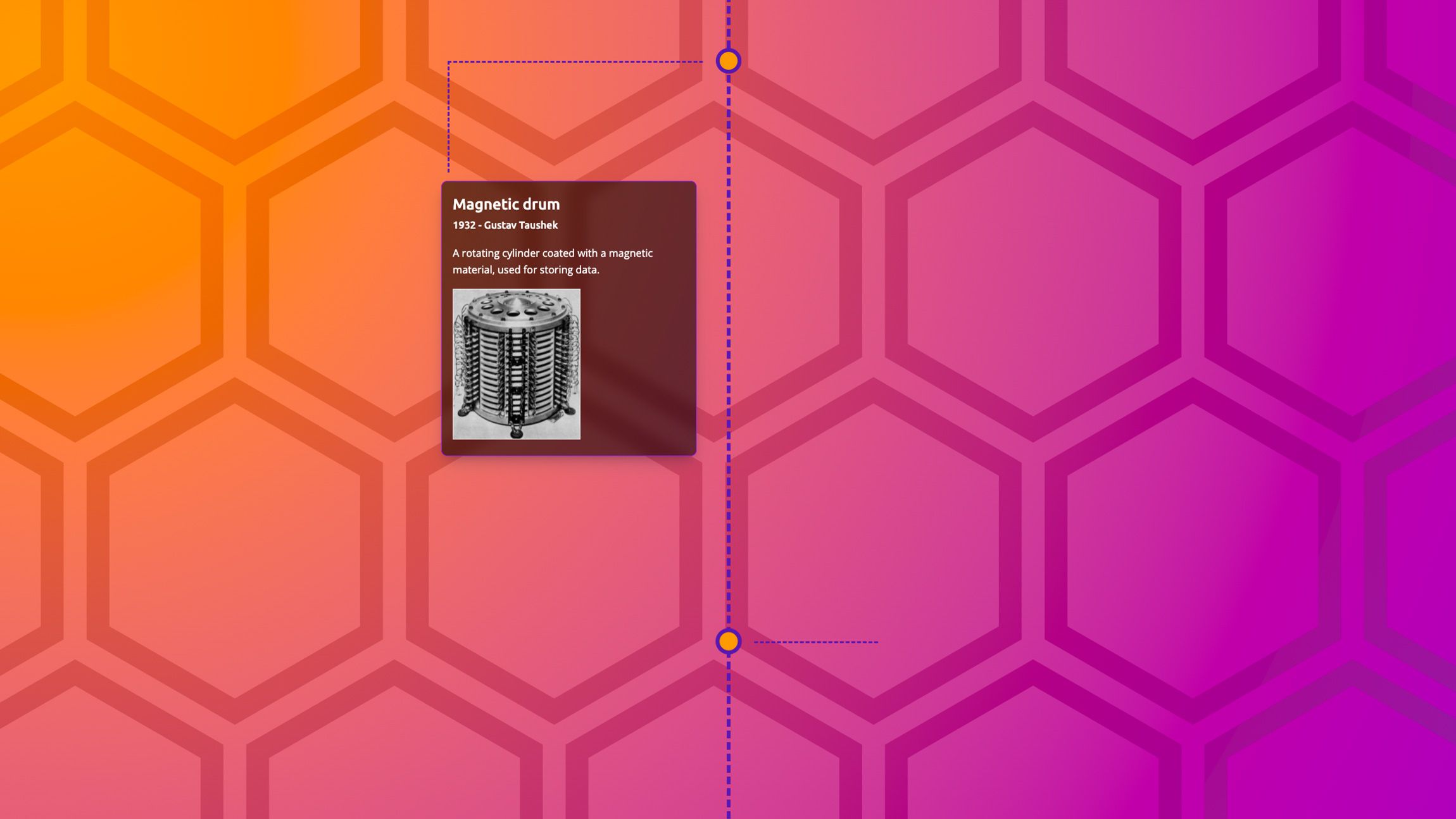
Another great feature that comes together with scroll driven animations is the ability to specify ranges of where the animation should play.
Current options for these are:
cover: Represents the full range of the view progress timeline.- entry: Represents the range during which the principal box is entering the view progress visibility range.
exit: Represents the range during which the principal box is exiting the view progress visibility range.entry-crossing: Represents the range during which the principal box crosses the end border edge.exit-crossing: Represents the range during which the principal box crosses the start border edge.contain: Represents the range during which the principal box is either fully contained by, or fully covers, its view progress visibility range within the scrollport. This depends on whether the subject is taller or shorter than the scroller.
(list from developer.chrome.com/
You can change the range of where the animation should play by defining a range-start and range-end by giving each of them a name and an offset (percentage, of fixed).
div {
  animation: reveal linear both;
  animation-timeline: view();
  animation-range: contain 0% entry 80%;
}
To be completely honest, I find the naming of these ranges quite hard to memorize and I’m really looking forward to DevTools updates to work with them.
For now, there is a nice little helper created by bram.us with the fantastic title: The Scroll-driven Animations View Progress Timeline Ranges and Animation Progress Visualizer (say it 10 times, I dare you)
Jokes about the title aside, this tool really helped a lot in creating this little timeline demo:
Few things to note about this demo:
- I used @property to animate the clipping path for my timeline branches and to animate the gradient in the background on scroll
- Using different animation-ranges to play around with the timing of the scroll animation
Multiple View Timeline Ranges in keyframes
Instead of using the animation-range property, we can also declare multiple ranges inside of our keyframes. Syntax looks like this:
@keyframes inAndOut {
  entry 0% {
    opacity: 0;
    transform: translateX(-50%);
  }
  entry 100% {
    opacity: 1;
    transform: translateX(0);
  }

  exit 0% {
    opacity: 1;
    transform: translateX(0);
  }
  exit 100% {
    opacity: 0;
    transform: translateX(-50%);
  }
}
For me this feels a bit more natural because it’s actually inside of our keyframes. I would prefer to use this method more than a separate property, but that might just be me.
I went a bit over the top with the effect, but created a little demo with this technique as well:
Learning scroll driven animations
I know that this article wasn’t much of a tutorial, but more some sort of teaser to get you hyped into this new feature. Creating these demo’s was fun but also didn’t take too long to be honest and that’s a good thing.
Although the view timeline ranges are a bit hard to memorize, the basics of working with these scroll driven animations are quite easy to learn (but as many things with CSS, probably hard to master)
So where should you start when learning about this spec:
By bram.us (who contributed a lot to this spec):
- scroll-driven-animations.style
- The original article on the Chrome blog
- Talk on CSS-Day
- His blog for further tricks and tips
Other reads:
- Scroll progress animations in CSS - Michelle Barker
- Fit-to-Width text - Roman Komarov ( one to follow for experimental / sometimes hacky usages!)
I’m really looking forward to all the creative demo’s using these techniques in the future. The best part of this feature is that it can be easily implemented as a progressive enhancement. Just adding that little extra touch of animation for an upcoming project. Looking forward to it.