Oh, how I wanted to write this title for some time! I have Googled these questions before when working with sticky positioning and scroll snapping. It looks like we are finally getting an answer to these questions in the form of CSS state queries and I have been eagerly waiting to play around with this since CSS Day 2023. In this article, I want to show a few first impressions and demos I created with state queries in CSS and Scroll Snap events in JavaScript.
For this article, I’d like to start by showing how we could use state queries in Chrome Canary for now, following up with the scroll snap events in JS. But first, a small warning that these are still experimental features at the moment of writing. To view the demos, you should be using Chrome Canary, go to chrome://flags, and enable the Experimental web platform features. To support some quick reading of the article, videos of the demo will be provided as well.
The basic syntax of a state query
The current implementation of a state query re-uses the container-type property in pretty much the same way as container queries. So to check the state, we need it to set that container-type in order to query the children inside of it.
<div class="the-container">
  <div class="the-query">
  </div>
</div>
For now, the state queries are all about scroll-state but this might change in the future. The first thing we’d have to do is set the container-type accordingly:
.the-container {
  container-type: scroll-state;
}
Now that this is set, we can use a state query:
.the-container {
  container-type: scroll-state;
  .the-query {
    @container scroll-state(<scroll-state-type> : <scroll-state>) {
	/* Do something with this based on .the-container state */
    }
  }
}
Ok, that’s enough high-level information, let’s get practical.
State queries for sticky positioning
Is the sticky thing stuck? A lot of us have been there, we have a header navigation that should remain sticky and should only show a shadow from the moment it gets stuck. It always involved some sort of extra scripting to get this working, or we just put the shadow on there by default. But with state queries, all of this is over and we could just use CSS for it.
Let’s set up the basic HTML:
<div class="topbanner">
  <!-- A top banner, non-sticky -->
</div>
<div class="header-container">
  <!-- header-container will be sticky -->
  <header>
    <div class="container">
      <h1>Some title</h1>
      <nav><!-- nav items --></nav>
    </div>
  </header>
</div>
<div>
  <!-- A lot of content with main and aside -->
</div>
Let’s set up the container-type and the sticky positioning:
.header-container {
  container-type: scroll-state;
  position: sticky;
  top: 0;
}
We want things to go a bit smoothly so let’s also set the header to have a transition for the box-shadow:
header {
  transition: box-shadow 0.5s ease-out;
}
Now that our container-type is set, all, that is left to do is to create our state-query and add a box-shadow tot the header when the .header-container is stuck:
.header-container {
  container-type: scroll-state;
  position: sticky;
  top: 0;
}

header {
  transition: box-shadow 0.5s ease-out;
  @container scroll-state(stuck: top) {
    box-shadow: rgba(0, 0, 0, 0.6) 0px 12px 28px 0px,
      rgba(0, 0, 0, 0.1) 0px 2px 4px 0px,
      rgba(255, 255, 255, 0.05) 0px 0px 0px 1px inset;
  }
}
It’s nice that we can use some nesting for this as well. Do note that if this lands Chrome-first we might want to provide this as a progressive enhancement. We can do this with a feature query, and for this example, it might be a good idea to just handle this with a bit of CSS nesting to not repeat ourselves too much:
.header-container {
  position: sticky;
  top: 0;
  @supports (container-type: scroll-state) {
    container-type: scroll-state;
    header {
      transition: box-shadow 0.5s ease-out;
      @container scroll-state(stuck: top) {
        box-shadow: rgba(0, 0, 0, 0.6) 0px 12px 28px 0px,
          rgba(0, 0, 0, 0.1) 0px 2px 4px 0px,
          rgba(255, 255, 255, 0.05) 0px 0px 0px 1px inset;
      }
    }
  }
}
If you are wondering about the other values for the stuck query, they handle all directions, including logical property variants.
All the query values for stuck:
- none
- top
- left
- right
- bottom
- inset-block-start
- inset-block-end
- inset-inline-start
- inset-inline-end
With a few more bells and whistles, this is the final demo, I created:
State queries for scroll-snapping
Is the snappy item snapped? From the moment Adam Argyle gave his “Oh Snap!” presentation at CSS day 2022 it was one of the things missing. How can we know if an item is snapped? There was a great workaround with IntersectionObserver, but let’s be honest, it wasn’t the thing we wanted, there just wasn’t a better alternative. But now there is, in two forms actually, one JavaScript solution planned to be shipped in the next Chrome release that gives a lot more than just the snapped item, but also state queries.
Since I started with state queries, let’s tackle that one first. The setup is pretty much the same as before, but let’s first create a scroll snap situation:
<div class="list">
  <ul role="list">
    <li><span>1</span></li>
    <!-- And a few more of these list items -->
  </ul>
</div>
Let’s set up some quick and easy CSS to create our scroll-snapping situation:
.list {
max-width: 90vw;
scroll-snap-type: x mandatory;
overflow-x: auto;
padding-left: 40vw;
}
ul {
display: grid;
grid-auto-flow: column;
gap: 1vw;
}
li {
scroll-snap-align: end;
width: 29vw;
height: 470px;
span {
display: flex;
align-items: center;
justify-content: center;
width: 100%;
height: 100%;
background: slateblue;
transition: background 0.4s ease-out;
}
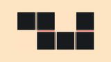
}I know that this is a bit of a quick and dirty way to create the scroll-snapping situation, but this will create a good setup for our demo, you should have something like this:

Now we want the item at the end to change background-color when it gets snapped.
For this, we will add the scroll-state container query and set the scroll-state type to “snapped” followed up with the direction we want to snap, in this case, “inline”.
li {
   /* previous things */
  span {
    /* default span styling */
  }

  @supports (container-type: scroll-state) {
    container-type: scroll-state;
    @container scroll-state(snapped: inline) {
      span {
        background: lightcoral;
      }
    }
  }
}
By setting the container-type to the list-item we can check inside of its children whether this container is snapped or not, when we do that, we can do all sorts of things to those elements such as changing the background-color.
With a bit of presentation styles, this is that demo:
The query values for snapped are pretty straightforward:
- inline
- block
Taking it a step further and combining it with CSS anchor positioning
A few months ago, my daughter started to show interest in Pokémon. She then started watching the first Indigo League series.
I felt inspired by this and wanted to create something fun for her based on the previous demo. The setup is pretty much the same as the previous demo, but let’s take a look at the result first:
So quite a few animations are running when the item gets snapped, but the special case here is the frame that moves over the snapped item. To create this effect, we can use the newly available CSS anchoring positioning API. Here is how that works:
We re-use the .list we had before, but as a sibling to the ul, a .frame is placed:
<div class="list">
  <ul role="list">
    <!-- List items -->
  </ul>
  <div class="frame"></div>
</div>
Next up, set the .list to a position: relative and the .frame as position: absolute:
.list {
  position: relative;
}

.frame {
  position: absolute;
}
We’re going to set the position of the frame based on the snapped item, to do this (and remember, the basic setup is almost the same as the previous demo), we add the following to our state query:
li span {
  @supports (container-type: scroll-state) {
    @container scroll-state(snapped: inline) {
      anchor-name: --active-item;
     }
  }
}
Each time that our item gets snapped, the item gets an anchor-name, and all that is left for us to do is to position our .frame based on that anchor-name as well as set the sizing. We also add a little transition for the delay effect:
 .frame {
  position: absolute;
  top: anchor(--active-item top);
  left: anchor(--active-item left);
  width: anchor-size(--active-item width);
  height: anchor-size(--active-item height);
  transition: left 0.2s;
  border: 10px ridge slategray;
 }
And that’s pretty much all it takes. If you’re unfamiliar with anchoring, I wrote an intro to CSS anchor positioning a few months ago that you can check out.
Keeping that Pokémon inspiration going, It’s time to talk about some net JavaScript events.
Scroll-snapping JavaScript events
Expected to come in Chrome 129, we are getting some new events for scroll-snapping:
scrollsnapchangingscrollsnapchange
This means that we will get these before state-queries in CSS. Let’s break them down:
I re-created a list of Pokémon just as before, this time adding an id on my .list:
<div class="list" id="pokedex">
  <ul>
    <!-- bunch of list items -->
  </ul>
</div>
The list itself is what contains the scroll-snap-type property, this is important. In this demo though, we’re scrolling the Y-axis:
.list {
  position: relative;
  max-height: 60dvh;
  scroll-snap-type: y mandatory;
  overflow-y: auto;
}
Scrollsnapchanging
The scrollsnapchanging event is dispatched multiple times while a user scrolls as new snap points are selected by the browser. At this moment the actual snap hasn’t occurred yet.
Scrollsnapchange
The scrollsnapchange event is dispatched once a scroll completes, indicating the newly snapped element. Thus, the actual “snap” has occurred.
Visualizing the difference
In the video below, you can see my demo at work. I open up the Pokéballs on scrollsnapchanging, and reveal the Pokémon on scrollsnapchange.
Here is that code in a nutshell:
const listItems = pokedex.querySelectorAll("li");

pokedex.addEventListener("scrollsnapchange", (event) => {
  setTimeout(() => {
    listItems.forEach((listItem) => {
      listItem.classList.remove("active");
    });

    event.snapTargetBlock.classList.add("active");
  }, 200);
});

pokedex.addEventListener("scrollsnapchanging", (event) => {
  listItems.forEach((listItem) => {
      listItem.classList.remove("changing", "active");
  });
  event.snapTargetBlock.classList.add("changing");
});
And here is that demo for you to play around with:
As a fantastic extra resource: A great demo by web.dev can be found here, a great visualizer for scroll snap events
Some closing thoughts on state-queries and the lack of a pseudo-class
So, state queries do pretty much what I hoped them to do, they certainly are a lot more versatile than adding pseudo-classes such as :snapped or :stuck. There is however one thing, especially for scroll snapping where I thought a pseudo-class might’ve been handy.
A combination with :has() would’ve been handy to target the previous siblings of the snapped item for some visual effects, Eg:
li:has(+li:snapped) {
  /* Might've been handy */
}
But of course, there are ways around that in the future with style-queries, especially if we go beyond custom properties for those, and let’s not forget that scroll-driven animations can help us a lot with visual effects.
Even though I think it would’ve been a nice addition, I like this a bit better because it’s more multi-purpose, and updating the container-type for more purposes seems to make perfect sense.
This is of course still experimental, but this is a real quality of life improvement I’m really looking forward to use, starting as a progressive enhancement.