A full evergreen browser support for CSS subgrid is just around the corner. Time to have a look on how we can create some interesting implementations in our design systems. This article will be focussing on grid-template-rows with subgrid.
What is this CSS subgrid?
Subgrid is part of the level 2 CSS Grid Layout specification and is a value that can be applied to grid-template-columns and grid-template-rows. When you add display: grid; to a container, the direct children become grid items and everything inside of those gets displayed in the normal flow again.
By adding this new value to the direct children of our parent grid, we can make the elements inside of our grid items follow the tracks of a parent. A handy feature indeed.
That’s enough theory from my side, A fully, better technical explainer can be found on MDN.
What is all the fuss about?
To be honest, there are a lot of people that are way more hyped about subgrid than I am, but I did run into a few cases where it can be really handy and it’s especially one of those cases I want to highlight.
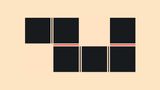
Let’s take a look at the following grid:
This could be a bit better, right? When we have cards like this, a preferred presentation could be to have the heading, images, paragraphs and buttons aligned on the same track. All in good time, let’s get started with our basic grid utility.
The CSS grid utility class
This is one of my favorite ways to add a grid utility class. This idea was shown to me at CSS Day, by an amazing talk by Stephanie Eckles. I suggest you check that out for a full picture. In order to explain how I got to the idea of my subgrid utility, it’s important to understand the basics of this method first.
It all start with a utility class in your HTML
<section class="grid">
    <article>grid item</article>
    <!-- bunch of other grid items -->
</section>
Now, the following bit of CSS code will create a grid layout where the number of columns adjusts automatically based on the container’s width. Each column has a minimum width of 400 pixels (or 100% if the container is narrower) and shares the remaining space equally. This is a responsive grid layout that ensures the columns are not too narrow on smaller screens while utilizing available space efficiently on larger screens. This way, you get a fluid grid, without having to write a container or media query.
.grid {
  display: grid;
  grid-template-columns: repeat(
      auto-fit,
      minmax(min(400px, 100%), 1fr)
    );
    gap: 24px;
}
Pretty cool right?
But it’s not really a utility yet, to achieve this, we need to add some custom properties into the mix. In the example by Stephanie, she created two layers for this, a theme layer for :root custom properties and a layout layer which will include the .grid itself to inherit some of those :root properties.
@layer theme {
  :root {
    --layout-column-min: 400px;
    --layout-gap: 24px;
  }
}

@layer layout {
  .grid {
    --grid-min: var(--layout-column-min);
    --grid-gap: var(--layout-gap);
    display: grid;
    grid-template-columns: repeat(
      auto-fit,
      minmax(min(var(--grid-min), 100%), 1fr)
    );
    gap: var(--grid-gap);
  }
}
The benefit of this is that we now have a flexible utility class. If we - for example - would want to make another product grid, which derives from the default. We could just add the following to our HTML and CSS
<section class="grid grid-products">
	<!-- bunch of items  -->
</section>
.grid-products {
--grid-min: 500px;
--grid-gap: 16px;
}This is only the beginning. In the presentation by Stepanie, there is a great idea on how to add a flex utility class based on this as well. But as we’re talking about grid, I’m going to end it here. Here is a codepen of her full approach to grid and flex:
One thing I do need to mention is that in this system, all the grid (or flex) items are set to be a container, by adding the following:
:is(.grid, .flex) > * {
    container: var(--grid-item-container, grid-item) / inline-size;
  }
This allows for some really modern web development! But there is a gotcha about this later on.
Creating our subgrid utility class
Our grid is set, but now we want to have a subgrid inside of this. We will need to adjust our markup a bit, because our grid-items on which we want our subgrid on need to be direct children of the parent grid.
Subgrid is powerful, but not flexible
This is one thing about subgrid that’s important to know. It is pretty powerful, but it’s not very flexible. Our grid-items on which we want to put the subgrid value on need to be direct children of a grid. More importantly, we need to know the number of children of our subgrid as well. But let’s not give up on creating a utility class for this.
Let’s add a new class to our grid to tell we want the rows to be in a subgrid:
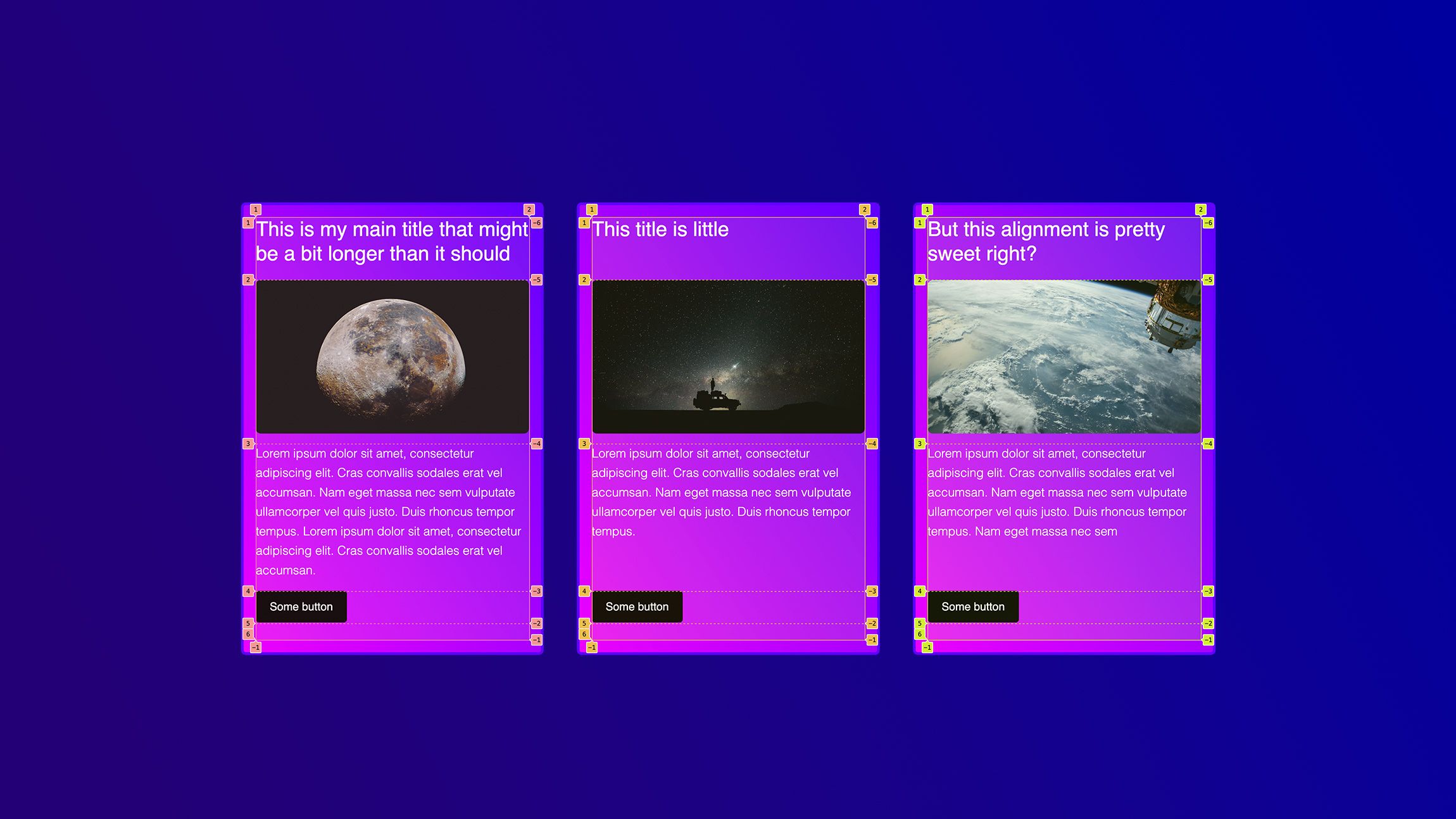
<section class="grid subgrid-rows">
<article>
    <h2>A title</h2>
    <img src="..." alt="" />
    <p>Lorem ipsum dolor sit amet, consectetur adipiscing elit…</p>
    <footer>
      <button>Some button</button>
    </footer>
  </article>

<!-- more of those article elemnts  -->
</section>
As you can see, our article on which we want to add the subgrid has 4 direct children (h2, img, p, footer). Based on this, let’s create the default of our utility. At the bottom of our layout layer (or in a separate one behind it) let’s add the following to our CSS:
.subgrid-rows {
    > * {
      display: grid;
      gap: var(--subgrid-gap, 0);
      grid-row: auto / span var(--subgrid-rows, 4);
      grid-template-rows: subgrid;
    }
  }
This time, I already provided some custom properties which could be overwritten based on the use case, especially for the amount of tracks (children) and the gap.
And here is an example of this (spoiler, it doesn’t work)
You can’t combine container-type with a subgrid
The container-type property is used to control how a grid item is laid out in its parent grid. The subgrid value of the grid-template-rows property tells the nested grid to use the tracks defined on the parent grid. However, the container-type property can only be applied to grid containers, not grid items. Therefore, we cannot combine the container-type property with the grid-template-rows: subgrid value.
So, we could update our default selector that declared that direct children of a grid should be a container. We could overrule it in our utility, or use :not(). I chose the second option.
  :is(.grid:not(.subgrid-rows), .flex) > * {
    container: var(--grid-item-container, grid-item) / inline-size;
  }
Making our CSS Subgrid utility flexible
The question that remains is how can we make this utility as flexible as possible and there are two methods that came to mind when I was creating this:
- Adding an inline
styleattribute to our grid to set--subgrid-rows - Using
:has()and create a bunch of defaults
Method 1 is pretty straight forward, we already added the custom property for this. We could update our HTML with a custom property:
<section class="grid subgrid-rows" style="--subgrid-rows: 4;">
 <!-- items -->
</section>
Method 2 does create some unneeded CSS, but on the other hand it can automate some things in the future. You could add the following lines of code into your CSS file
.subgrid-rows {
    &:has(> :nth-child(1):last-child) {--subgrid-rows: 1;}
    &:has(> :nth-child(2):last-child) {--subgrid-rows: 2;}
    &:has(> :nth-child(3):last-child) {--subgrid-rows: 3;}
    &:has(> :nth-child(4):last-child) {--subgrid-rows: 4;}
    &:has(> :nth-child(5):last-child) {--subgrid-rows: 5;}
    /* and you can keep going... */
    > * {
      display: grid;
      gap: var(--subgrid-gap, 0);
      grid-row: auto / span var(--subgrid-rows, 5);
      grid-template-rows: subgrid;
    }
  }
This will count the exact number of children up to 5 and pass this as a custom property to the subgrid.
I think it might be dependent on the project or use case to pick a favorite. But I think these are a few valid first drafts.
Here are the two examples in action:
Method 1 with inline style
Method 2 with :has()
Conclusion of CSS Subgrid
I think subgrid is a fantastic addition to CSS. It however, lacks a bit of flexibility and it might get overwhelming if we have projects full of subgrid tinkering. I do mostly see a bigger benefit in using it for rows than columns, but that’s purely subjective. Surely there are many use cases out there on which it could be handy for columns. I’ll write about it when i need it.
It has been a feature that I didn’t use as progressive enhancement because of the big market share of Chrome and Edge. But since it’s just around the corner for both of them, It’s time to do some implementations and further experiment with it.
Keep tinkering on those grids, y’all