For a long time, if you wanted to style the space between items in a grid or flex layout, you had to fake it. Borders on child elements, extra pseudo-elements, background tricks, extra markup, etc. It worked... until it didn't. Responsive changes could break illusions, it always felt hacky, and in a few cases we'd end up polluting the DOM structure for something purely visual (Which I hate doing). An update that is long overdue, CSS is filling those gaps in our grid systems.
I have a small obsession with clean layout lines. The kind of lines that look obvious when you see them, but are annoying as hell to build in code. There is a solution for this on the rise, a way to finally “just” style a gap. At the moment of writing this is still new in Chromium set to release in the next Chrome version (and available in Safari TP). Here is one of the clever techniques that were available to us by Ana Rodrigues
A basic feature playground can be found here. However it only demonstrates the tip of the iceberg. Do read on to learn more about the feature and how to use it 😉.
So what’s new?
column-rule has been extended to work in grid and flex containers. It was already a thing for multi-column layouts, so it’s not a brand new property but more of a welcome expansion. But don’t be fooled, this is just the starting point as it comes paired with a bunch of new capabilities and other properties for fine-tuned control. One of the new additions is row-rule, the counterpart for horizontal gaps.
Think of them as: “draw a line in my column gaps” and “draw a line in my row gaps”, without touching your item markup.
Let’s start with the smallest possible setup:
.grid {
  display: grid;
  grid-template: repeat(3, 1fr);
  gap: 20px;
  column-rule: 3px solid oklch(58% 0.22 25);
}
Easy peasy lemon squeezy.
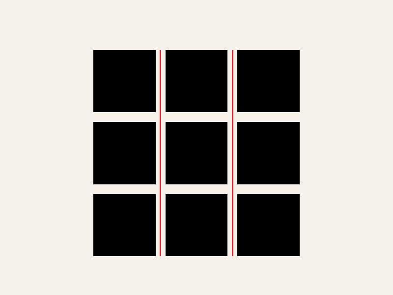
Add row-rule, and you cover both axes.
Longhands and shorthand
You get the full longhand set you’d expect:
column-rule-width,column-rule-style,column-rule-colorrow-rule-width,row-rule-style,row-rule-color
And there is rule, the shorthand that sets both row and column rules at once.
So if you simply want some dividers, shorthand. If you need different behavior per axis, go longhand.
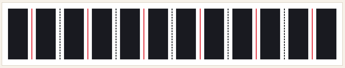
repeat() for alternating rule styles
Setting column-rule and row-rule is just the starting point. There is a way that you can vary rule values per gap with repeat(), and it stays readable. I think it’s great to see this function being re-used here:
column-rule-style: repeat(auto, solid, dashed);
column-rule-color: repeat(auto, vermilion, ink);
Alternating solid and dashed, cycling through your colors. Pretty neat for adding visual rhythm without writing a giant explicit list.
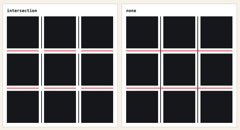
Junction behavior with rule-break
When row and column decorations cross each other, rule-break decides what happens at those intersections.
normal: default behavior, depends on the layout contextnone: rules run straight through intersectionsintersection: rules stop and break at crossings
For clean interface grids, intersection tends to feel cleaner. If you want something more bold and continuous, none is your pick. This is one of the things I love about he feature and hope to be using in a project soon.
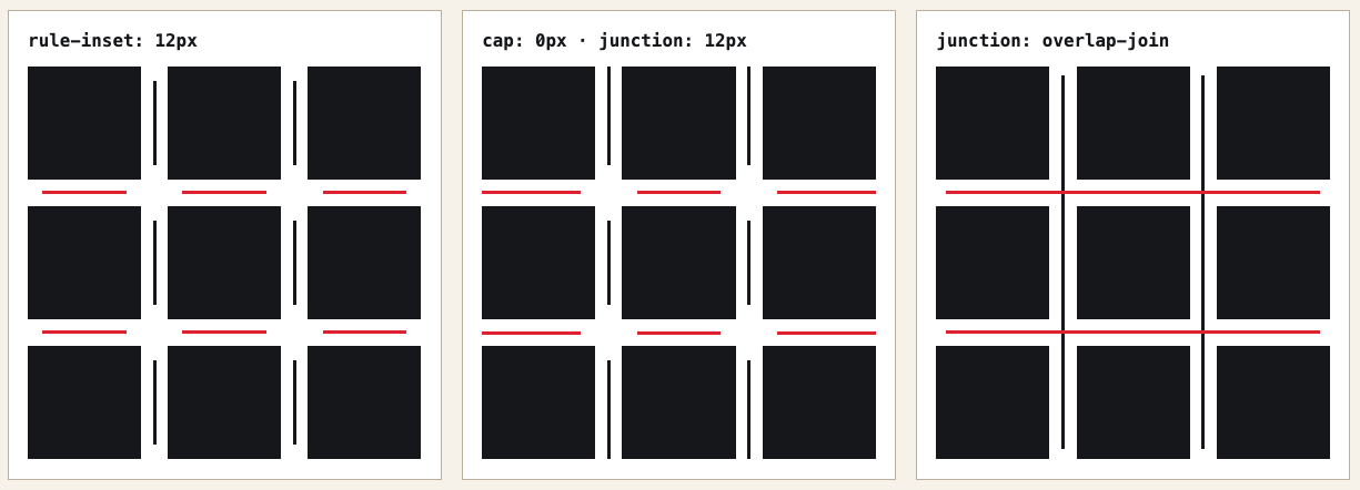
Inset controls: rule-inset, cap, junction
This is the one I had the most fun with. You can control how far each decoration segment extends within its gap. (I also sneakily added this to my Bluesky feed on the homepage)
rule-inset: shorthand for trimming all segments inwardrule-inset-cap: the inset at container edges (where there is no crossing gap)rule-inset-junction: the inset at crossing points
There is also an overlap-join keyword for when you want corners to connect differently.
Setting rule-inset-cap: 0px and rule-inset-junction: 12px gives you lines that are flush at the container edges but have breathing room around every crossing. It’s a subtle touch that makes a grid feel a lot more intentional. And since these values are animatable (more on that below), hovering a panel to collapse the junction to zero makes for a satisfying little micro-interaction.
Note: At the moment of writing I still found some difference in the spec. The article I’ll post at the bottom seems more recent. I might revisit this later.
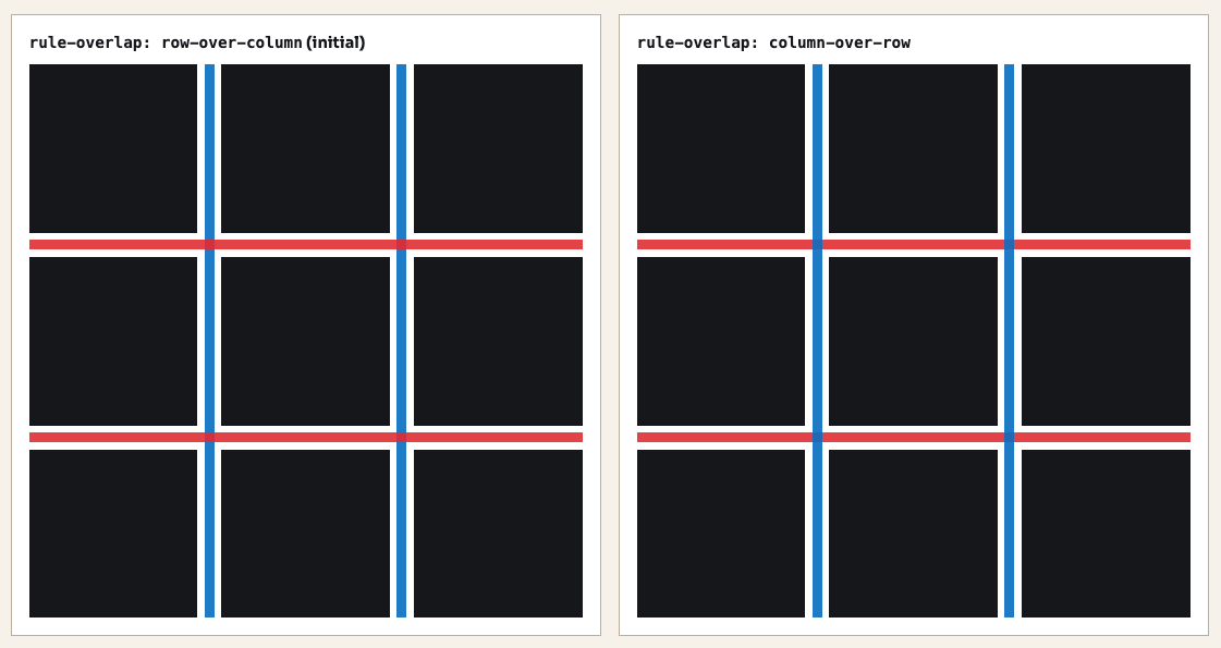
How to overlap a rule with rule-overlap
By default a when a column-rule and row-rule overlap the rows are on top of a column. You a change that with rule-overlap.
.grid--row-over-column {
  rule-overlap: row-over-column;
}

.grid--column-over-row {
  rule-overlap: column-over-row;
}
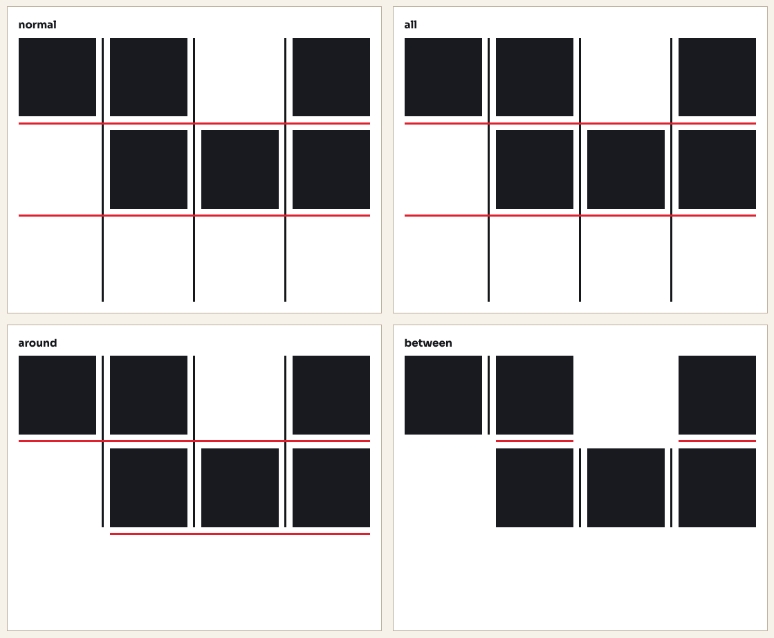
When should a rule show? rule-visibility-items
rule-visibility-items controls whether a rule appears based on what items are adjacent to it.
normal: defaultall: rules appear in every gap, even empty onesaround: rules appear wherever there is at least one adjacent itembetween: rules only appear between two items that are both present
If you only want separators between actual neighboring content, between is the one and will probably be my go-to for most cases. all is useful when you want structure lines even in empty cells.
Yes, this stuff animates!
Rule width, color, and insets are all animatable. You can transition them on hover or any state change without reaching for outline tricks or JavaScript.
.grid {
  column-rule-color: #fbbf24, #34d399;
  rule-inset-junction: 10px;
  transition: column-rule-color 0.4s, rule-inset-junction 0.4s;
}

.grid:hover {
  column-rule-color: #3b82f6, #3b82f6;
  rule-inset-junction: 0px;
}
Hover the container, the colors shift and the junction inset collapses to zero. It’s a small detail, but I’m quite the fan of those.
Playground time
I also made a playground where you can tweak all the values yourself and get a feel for how everything fits together. By no means is this a full GUI for creating all the options, but I thought it would be nice to give some basics. Just added it in CodePen for now as I already have enough side-project piling up at the moment.
A few “designy” experiments
Once you understand the properties, you start finding spots to push them, I still have the feeling like I haven’t pushed this enough, but hey, here are some early try-outs. Can’t wait to see what people will build with this.
Postcards on a shelf
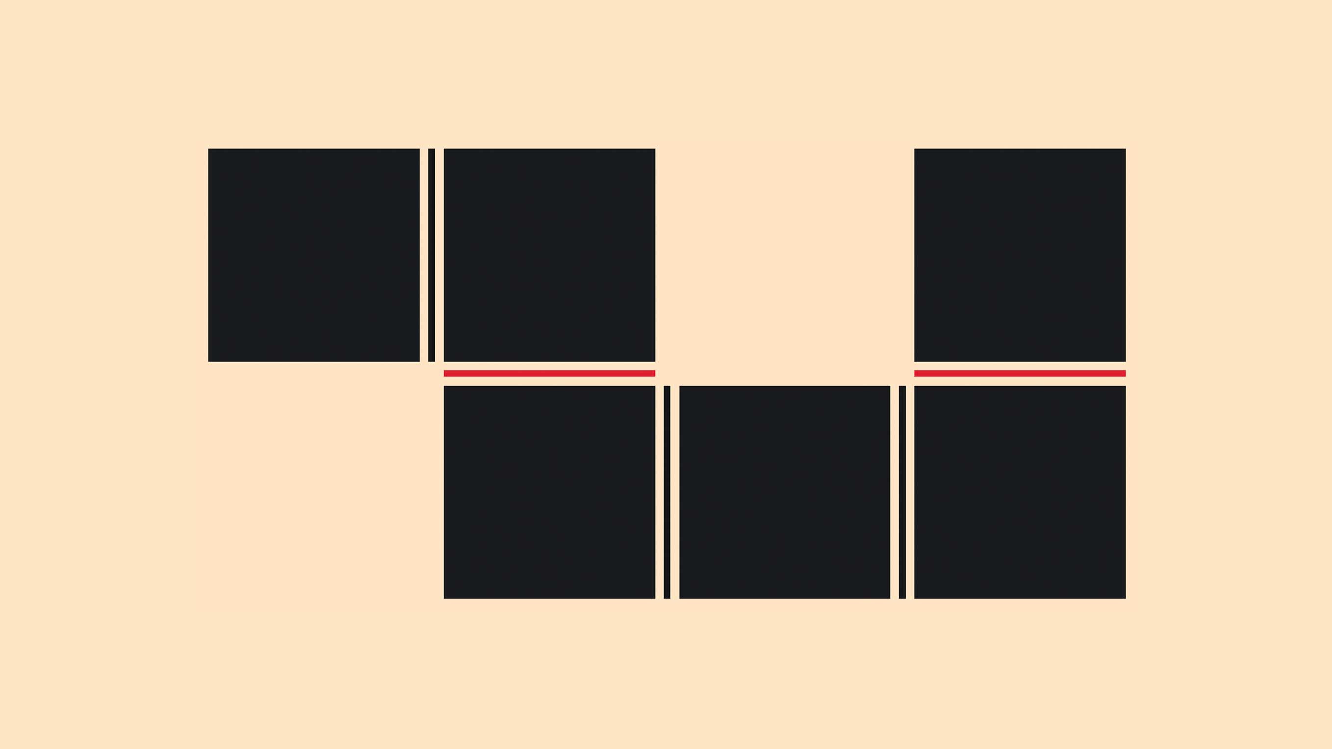
A horizontal scrolling shelf of travel cards, with vertical separators in the gaps between them. By pushing the rule-inset value high enough, the line only paints in the middle section of each gap rather than spanning the full card height. I love how easy this has become, simple and elegant… This is what I also used on my homepage after creating this demo. The trick is simple: Just column-rule and rule-inset on the flex container.
.shelf {
  column-rule-width: 1px;
  column-rule-style: solid;
  column-rule-color: oklch(70% 0.14 235);
  rule-inset-cap: 10px;
  rule-inset: 130px;
}A festival bill poster
Last month, I went to Beyond Tellerrand, a fantastic conference that I heartily recommend. I was a bit inspired by all the design I saw there and wanted to try something. For this one I mixed rule widths and styles to create hierarchy in a lineup grid. The column separators switch between a thin line and a thicker double rule. Which is just two values passed to column-rule-width and column-rule-style.
The decorative strip at the bottom uses a repeating color list to cycle through four colors per gap.
.bill {
  column-rule-width: 1px, 3px;
  column-rule-style: solid, double;
  column-rule-color: oklch(18% 0.01 60);
  row-rule: 1px solid oklch(72% 0.16 70);
  rule-break: intersection;
}

.strip {
  column-rule-width: 4px;
  column-rule-style: solid;
  column-rule-color: repeat(
    auto,
    oklch(48% 0.18 30),
    oklch(18% 0.01 60),
    oklch(18% 0.01 60),
    oklch(72% 0.16 70)
  );
}A scroll-driven type piece
Can’t do a demo about stuff that animates without adding some scroll-driven animations, right? The rules start invisible with a large inset, and as you scroll they grow wider, the colors shift, and the insets shrink toward zero. At full scroll, you get an intersecting grid.
The whole thing is pure @keyframes on column-rule-width, row-rule-width, rule-inset, and the rule colors, tied to animation-timeline: scroll(root). I feel like there is more here.
Adding the animation to a scroll timeline:
.grid {
  rule-break: intersection;
  column-rule-style: solid;
  row-rule-style: solid;
  animation: rules-evolve linear both;
  animation-timeline: scroll(root);
}
Keyframes:
@keyframes rules-evolve {
  0% {
    column-rule-width: 0px;
    row-rule-width: 0px;
    rule-inset: 50%;
    column-rule-color: oklch(72% 0.22 320);
    row-rule-color: oklch(72% 0.22 340);
  }

  20% {
    column-rule-width: 3px;
    row-rule-width: 3px;
    rule-inset: 32%;
    column-rule-color: oklch(70% 0.24 290);
    row-rule-color: oklch(70% 0.24 310);
  }

  45% {
    column-rule-width: 8px;
    row-rule-width: 8px;
    rule-inset: 10%;
    column-rule-color: oklch(72% 0.22 220);
    row-rule-color: oklch(72% 0.22 250);
  }

  /* etc... */
}I wanted to try pac-man with a dotted rule, but currently lacking time.
Steal this idea :)
A quality-of-life improvement and progressive enhancement
If gap decorations are not supported in a browser, your layout just renders normally. Empty gaps, no lines. That is progressive enhancement working as it should, once again added it to my own blog:
.bluesky-posts {
  @supports (column-rule-color: red, red) {
    column-rule: 1px solid
      color-mix(in oklab, var(--s-color-text), transparent 80%);
    rule-inset: 160px;
  }
}
Combination with grid-lane
I tried to find a way to combine this with display: grid-lanes but unfortunately that didn’t seem to work. Maybe I’m missing something.