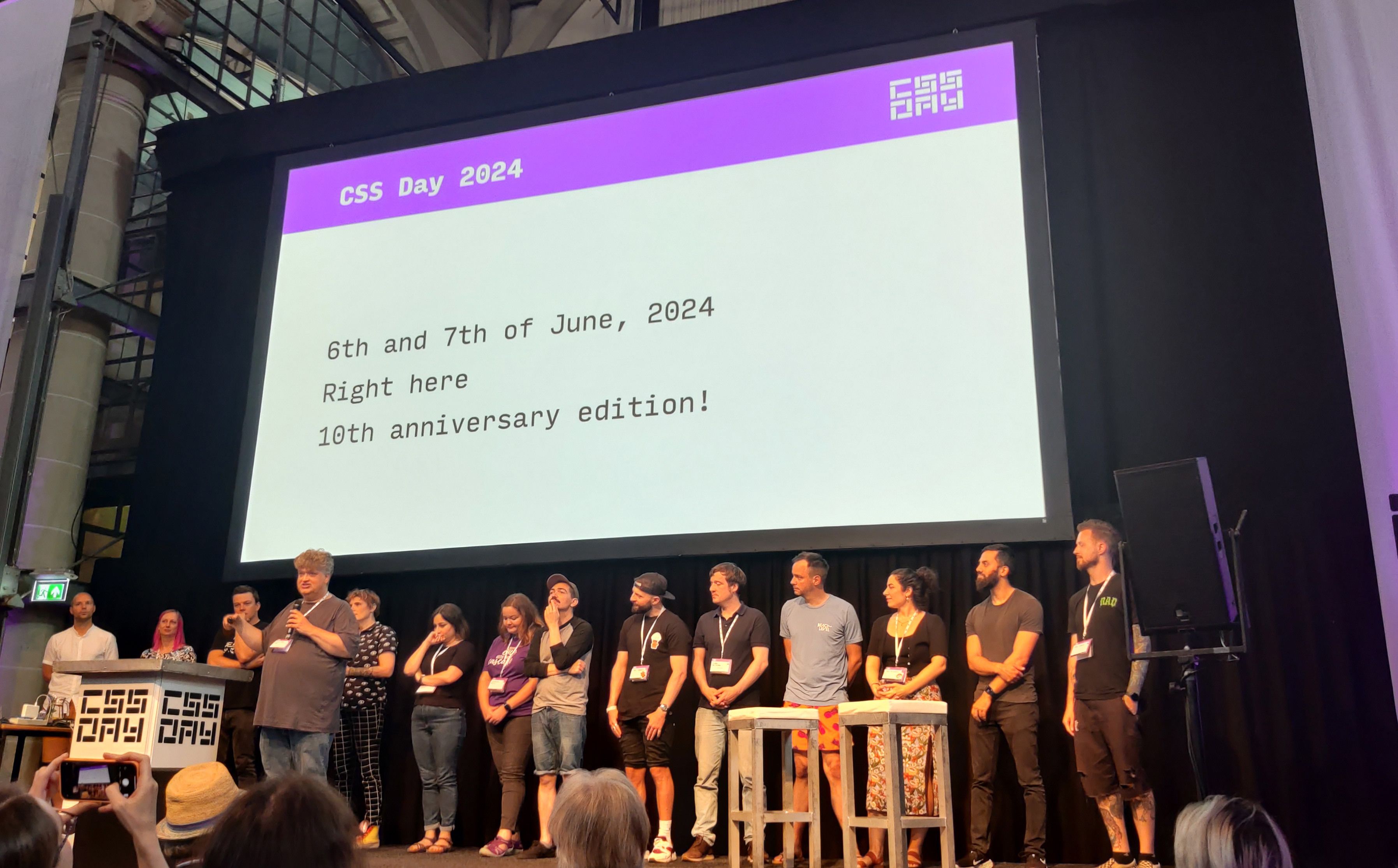
Another year, another CSS day. I'm not joking or exaggerating that this conference has and always will be one of my highlights of the year. Welcoming, top speakers accompanied with just totally geeking out with other CSS people around food and drinks. This was CSS day 2023 - a short summary.
This year, I did things a bit differently, by going to the iO offices in Amsterdam to get a full day of work in and meeting some of the people who I’ve only been talking to online for now. Meeting some awesome people such as Dave Bitter and Sander de Jong. Although I was very tired of a 3 hour drive (waking up around 5 a.m. to get there in time). It sure was fun to see them and walk around the Amsterdam office.
But CSS Day did something different as well this year, starting off with a pre-conference event at the Kohnstammhuis in Amsterdam at 4 p.m. I was very late to the party and unfortunately missed all the talks there. Still It was great to join in with some of the speakers for a good chat. I was dead tired, so I was more listening than talking for the most part. But I was happy to join in with Adam Argyle and get some “Chrome swag”. The view of this building on the ninth flour alone was totally worth it to quickly hop over there!

So, after a well-deserved good night’s sleep, it was time to start the conference. With Adam Argyle setting it off as the MC (CSS! CSS! CSS!). Last year, I met him as a speaker, and I kinda knew he would nail it as an MC as well. After a quick intro and announcing his colleague Una Kravets, it was time to start the show and dig in for CSS Day 2023!
Una Kravets - State of the CSS Community
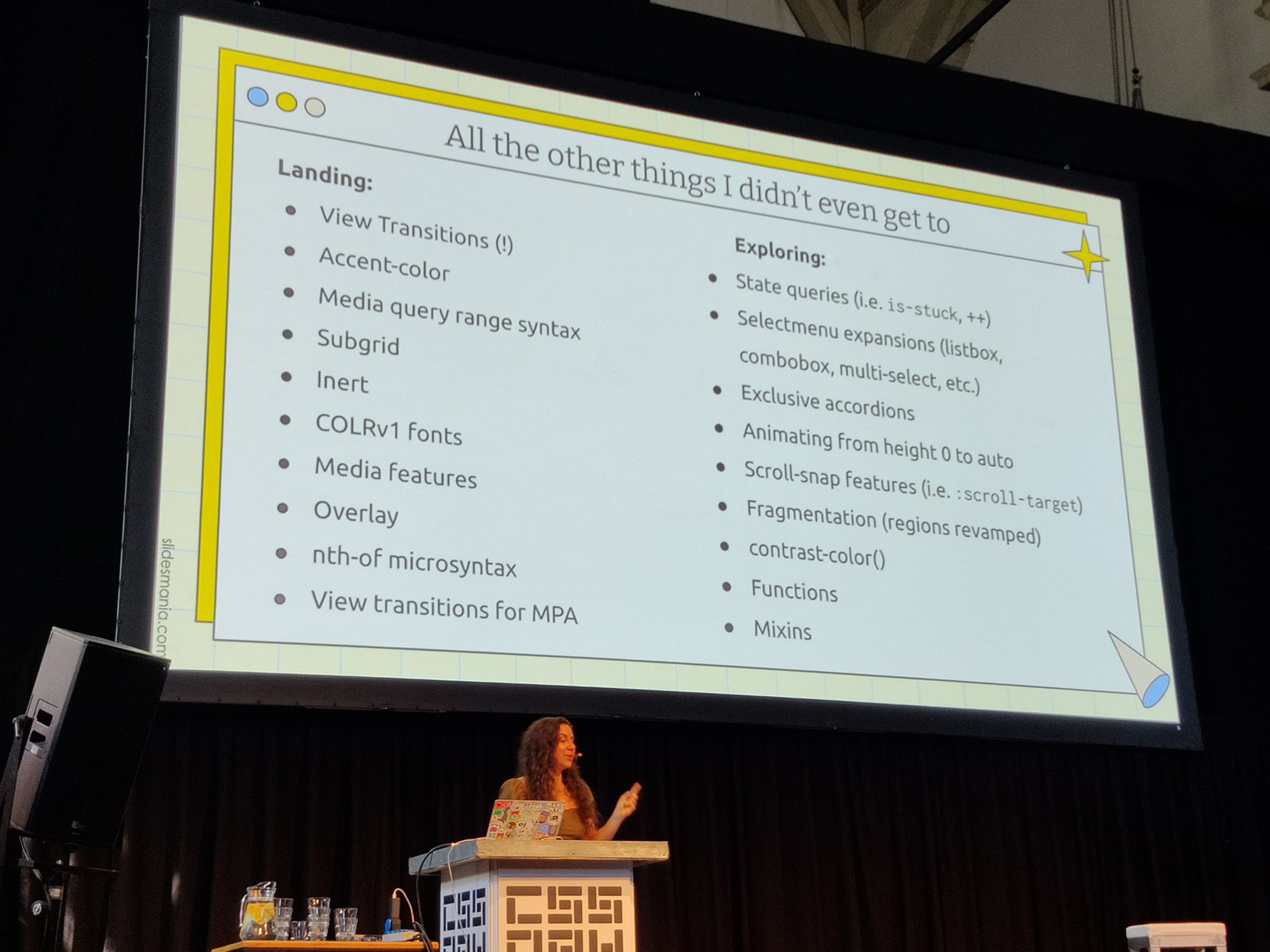
Perfect start of the day with a quick recap of which new goodies are now available, spread across browsers and some of the things to look forward to. I’ve been following along with the newest trends in CSS for some time now but it still amazes me how much work is actually being done at the moment when it comes to making the language better. Someone actually asked me if this was “just a recap” for me and my answer was “hell no”. An interesting 40 minute talk showcasing feature after feature and some insiders on the new ideas around targeting state via container queries for position sticky (and potentially position-fallback?). It’s amazing how Una can explain these features so correctly and simply at the same time. Well done Una! Unfortunately, I didn’t take a picture of the “one less dependency” slide, But I was able to take a picture of all the features she didn’t get a chance to talk about, can you imagine? CSS is on fire!
As an added side bonus we got to see the CSS podcast live for a few minutes, how awesome is that? If you don’t know the show and you’re into CSS, you must check it out!
Hidde de Vries - Dialogs & Popovers
I’ve met Hidde a few times as well during the Open UI telecoms so I was really excited for this one as well (He even helped me in reviewing one of my articles, thanks again for this mate!). When to use a dialog and when to use a popover will be a question that developers should be asking in the future. So I’m really glad that Hidde is taking it upon him to share some insights on when to choose which tool early on. With his background in accessibility and working for the Dutch government it was great to see these insights being shared. The popover UI will really change the way in how we handle some of our daily web UI in the future. UI considerations, Semantics and positioning will be key to defining which tool to use. When this gets shared on YouTube (I will of course update this article), you really should check it out! In the meantime, he wrote a bunch of great articles about it on hidde.blog.
Léonie Watson - CSS Speech
I was really looking forward to this one and - it seems - rightly so. When we use CSS to style the web we’re always thinking about the visuals, but why is it that we can’t control the speech of content pages? I love the fact that she didn’t really go into the “aria of things” but rather about designing for speech such as choosing a voice on how a page should be read by assistive technology or choosing the tone and pitch. There are some great ideas there and most importantly, there used to be a spec for this that didn’t get enough attention. So now is the time! Maybe we should all think about the possibilities this could give in the future. So yes, share her article, comment on it, do whatever we can to make this possible ( https://tink.uk/why-we-need-css-speech/ ) I am skeptical on a corporate level on how we can take clients on board to invest extra time (money) for us to create these experience. Nevertheless, it would be nice if we can do it (or as a developer secretly put in the extra effort).
Lunch breaks and breaks in between
I haven’t really talked about this, but this version of CSS day gave us the chance to talk to some of the people working on Chrome DevTools and the even had a CSS helpdesk. Geeky as I am, I found it very refreshing and interesting to have a chat with Ergün Erdoğmuş. Had a great little chat with him about the position-fallback possibilities and also talked a bit about animations later in the day with his team members from DevTools. Great opportunity, well done CSS day and Google! Maybe more on that soon in a future article ;)
Sanne ‘t Hooft - Tinkerer by Night
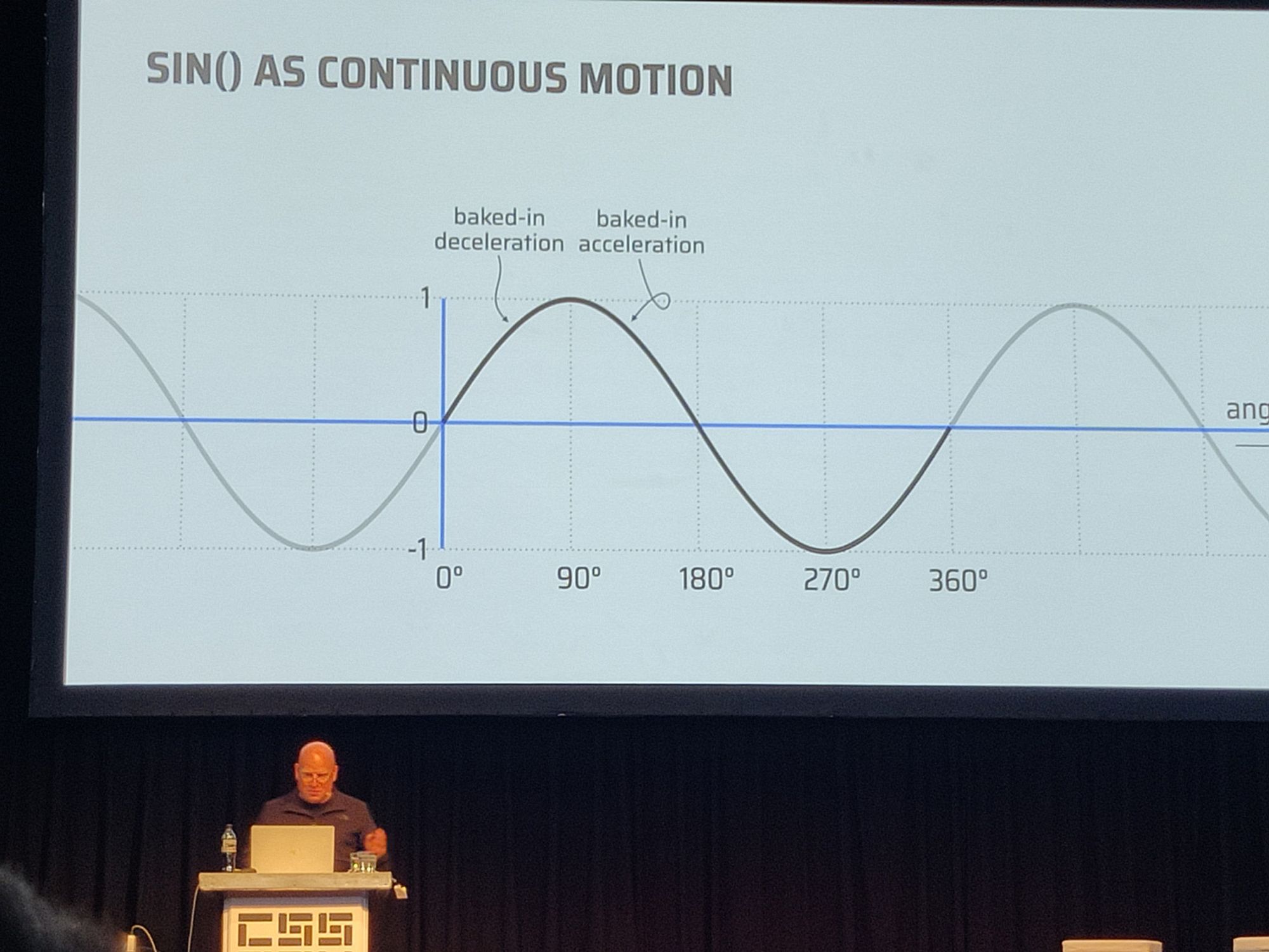
And OMG what a Tinkerer he is. A”light talk” after lunch sprinkled with a lot of mathematics, but I wasn’t bored at all. Using techniques such as :has() and a minimum of JavaScript to replicate the Dock effect from a Mac. But more importantly, using a lot of trigonometric functions in CSS ( which I’m still really bad at) to create some amazing effects. It really became clear that we need something to count the number of children of an element in this presentation. A great showcase of demos of which I took a lot of pictures and will need to study a bit more. I’m sure as hell going to geek off on this stuff in the next couple of weeks.
Patrick Brosset - Selector Performance
Performance is an important topic, so how about selector performance? Does using a wildcard (*) in your styles create some issues? Patrick already started his talk by telling us that there are probably a lot of other concerns that we will have to tackle before thinking about the performance of our CSS selectors. But all reassuring aside, there was an example on how it could potentially create some massive delays because of the changes that get triggered by using one selector. I especially enjoyed the explanation of the “purple bars of death” that are hard to fix when testing performance in DevTools (because they are about the browser and so - kinda - out of our hand. Some really interesting insights on how you can measure it. I’m not much of an Edge user but seeing some of these demos really makes me want to try some things out when it comes to testing performance and finding potential pitfalls. This talk was important, as we constantly try to make rules such as “this is bad for performance, don’t use it” while the truth is usually far more nuanced when it comes to being creative with selectors.
Heydon Pickering - Scope in CSS
Why isn’t CSS scoped? Sounds like a crazy question right? CSS is always scoped but we just try to create global patterns as much as possible for consistency (as it should be). But hearing Heydon speak really showed how much he understood the daily struggles of a front-end developer vs some of the strategists, marketeers and designers, who seem to be evil by nature. This was a lighter talk which went hand in hand with a few laughs, but I really enjoy these as they create a sense of community. And all of the things were recognisable such as why we don’t just write CSS? Do we really need to use all these crazy things in order to have multiple .button classes and just fix that by some dirty hash getting placed right after it ( .button_xlj23j ). Writing CSS can be so simple and elegant and readable, but after showing us a bit of @scope , we all know that this will be a handy feature and change the way we write CSS. There were so many good speakers this year and I wouldn’t be able to pick a favorite, but for day 1, Heydon definitely wins the “slide of the day award” by showing how to create a global style in CSS versus Styled Components:
Sophie Koonin - Personal Websites
Bring back the personal website! - Like -, yes! I took that jump a few years ago and really loved how it opened my mind and created some opportunities. And we should be proud about the personal stuff we create, I even bought myself some stickers with my website logo “just because”. She showed us her road from starting off with books to styling MySpace. I can really relate to this and especially loved the shout out to Neo Pets! Her talk definitely inspired me to create more personal stuff and maybe something just silly and stupid and place it on some free hosting. She also said that she wasn’t all that creative but don’t undersell yourself Sophie, I really love the things you created and wish I had a bit more of those creative juices in my brain!
Start of day 2
The second day of CSS Day we were welcomed by a new MC: Michelle Barker. Last year, I was happy to see a talk from here and now she’s the MC, there is a theme going on here. A bit of a different style of presenting than Adam, a bit more toned down but I just can’t help to love her enthusiasm and lovely British accent. She started of with a warm welcome, the general code of conduct and of course announcing the speaker, which was no one else but…
Miriam Suzanne - Container Queries
If you heard about Container Queries (or Susy, if you’re a fossil like me) you probably have heard about Miriam. A spec writer and what a powerful speaker on the subject. Instead of just showing us container queries and how they worked, she took a different and in my opinion far better approach by telling us why things don’t work, or at least didn’t used to work. Some powerful insights here on how containment actually works and why it was so hard to get this spec going, why containers don’t have the data we need, or it’s just dangerous to get it out of them. Still in the end, things got rolling and we have them supported in all major browsers. That is, for container queries that calculate inline-size and for the future: Style queries are on the way (already available in Chrome for custom properties). Last but not least, in the future there might be state queries avialable, seeing if an element is “stuck” when using position sticky or checking which fallback is used in position-fallback. That last one for me (creating some tooltip demo’s for Open UI recently) is a feature I’m rooting for. She even showed us a little demo by my colleague from Eindhoven: Maarten Van Hoof. It’s hard to keep myself from turning this into a technical article by hearing this talk. But as promised, this is just a small recap and I’m going to let all the things I heard sink in a bit further.
Umar Hansa - Tooling & Workflows
I recently did a shoutout to the mailing list with DevTools tips by Umar. I knew I was in for a wild ride about tooling. Umar showed us so much fun stuff to increase our workflow from snippets in VSCode, to browsersync, AI tools such as copilot and bloop, ghosttext, jumpy and of course some awesome DevTools tricks. I will be checking out some of these tools in the upcoming weeks for sure! Yes, this might look like a small paragraph, especially for all the tools he shared with us. But oh my… let me do a bit of further research first, okay?
Stephanie Eckles - Building Components
How do we handle a reset in CSS in 2023? There were some really powerful tips & insights here especially when it came to creating a “general” sort of grid and flex layout, powered with custom properties and declaring a container on the html element. I noticed that some people were getting hungry for lunch, but honestly, I was still hungry for more. It was a bit more technical but very practical for the people who actually work on different projects on a day to day basis and I loved every bit of it. It’s a bit of a shame that I didn’t really get a chance to talk with her afterward, i would’ve loved to share some of my ideas around working with custom properties, oh well, maybe next time, but for now, I’ll surely follow her on twitter.
Jhey Tompkins - Creative Coding
There is no way to describe all the cool creative demo’s from Jhey in this article. To the CSS Day organization: Perfect fit for after lunch, just sit back and enjoy the ride. Also a part of the Open UI community and ex Google DevRel, he just shows some amazing stuff with :has(), form elements and of course popover and the selectmenu. I create some practical demo’s for the selectmenu which are semi-creative, but Jhey really just cranks the creativity of these things to 11. If you haven’t heard from him or viewed some of his work, you should definitely check out his codepens. Creating a lot of demos makes you better, creating “useless stuff” makes you think deeper and helps you understand how CSS works and that’s probably the main take on it. Keep practicing, stay creative and yeah, “just flip it”.
Cassondra Roberts - Styling Web Components
Cassondra’s talk was a bit different, at least for me as I’m not the biggest user of web components out there. I loved how she presented her material with some “nerdy spacey jokes”, but the topic itself wasn’t something I use on a day to day basis. That being said, I really should be working on these web components a lot more often. Maybe this talk was just a bit too hard for me because of all the new things and the brain overload kicking in from two days into CSS day. But I did talk to some people later that day that really work a lot with web components and they seemed to have picked up a lot of things about it. One thing though, it made me want to learn more and when the videos come out, I’ll be sure to revisit.
Bramus Van Damme - Scroll-Driven Animations & View Transitions
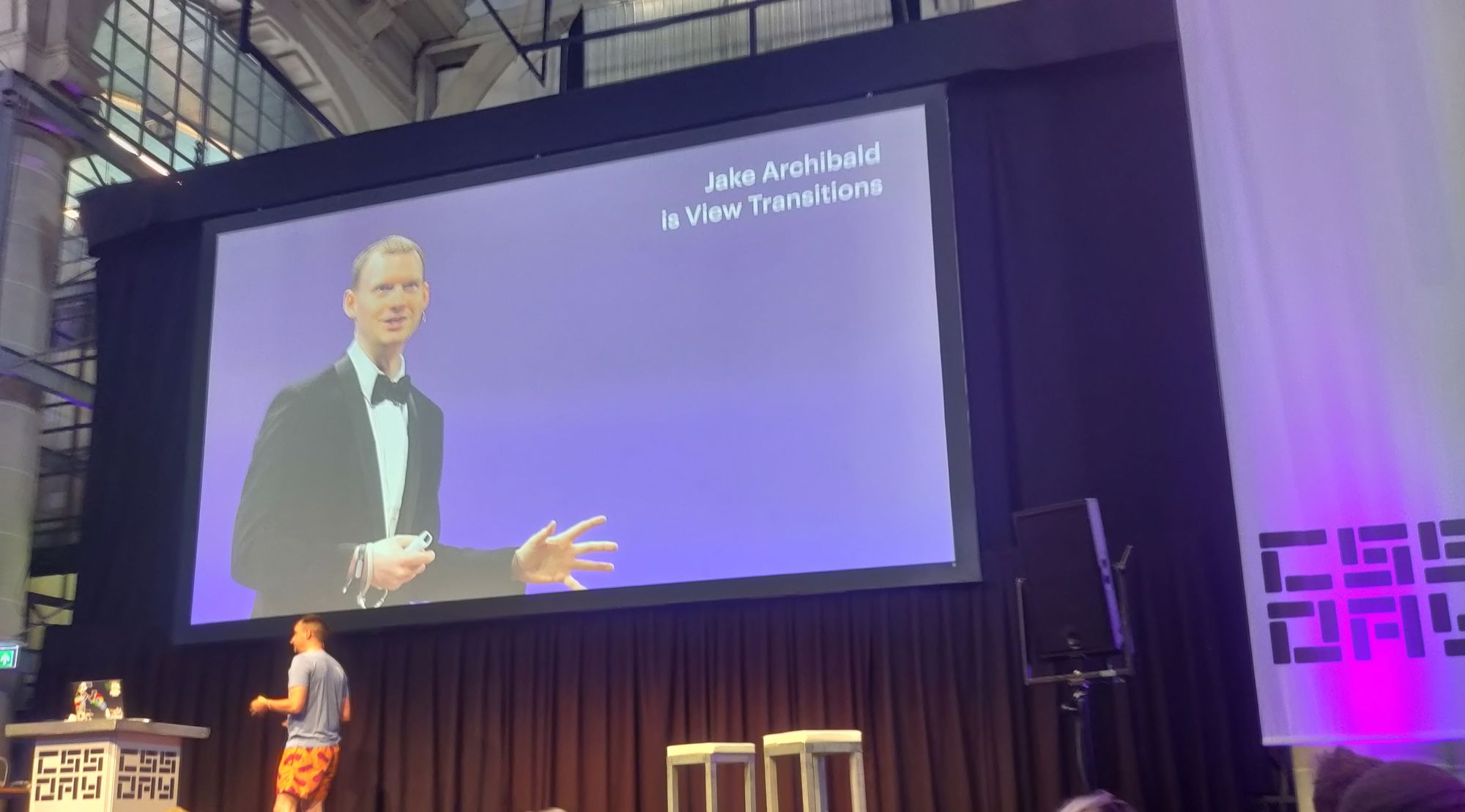
Pfoeh, this is hard… What can I say about Bramus? He supported and motivated me so much for a year, I can’t thank him enough. He’s such a friendly guy, but let’s keep it about the things he brought to CSS Day. Taking over the View Transition talk from Jake Archibald and adding a bit of that scroll-driven animations sauce, we got two talks for the price of one. So let’s start with view transitions. This is something I haven’t explored enough, but such a powerful tool for creating immersive experiences. For the moment only available for single page applications and a more experimental implementation available for multi page applications (which is another fancy name for “websites”). I loved how he explained this topic so visually by showing us some 3D examples of the “pictures” that get taken from your DOM nodes and how they move while the transitioning is happening. Also clearly explaining how these things work so that we don’t try to do things like animating the color while the page is transitioning (that won’t work, it’s a screenshot, not a dom node anymore…). It really made the topic easy to understand and I’ll sure be playing around with it a bit more later on. He really can’t hide his past as a teacher and believe me, that’s a good thing! Understanding how these things work by showing it on a visual level is important.
So, scroll driven animations… I really need to update my own demos on that spec (added to the todo list, and yes, he warned me on Twitter… and yes, I always forget to do it, my bad). It’s so interesting to see this spec is really growing up. At first, we just had the ability to change our animation from a duration standpoint to a scroll driven one, but now with the inclusion of timeline ranges, it’s really going to be a tool in our CSS bag to have “one less dependency” (cfr Una). If you want some more demo’s be sure to use Chrome Canary and visit some of his collection and tools at scroll-driven-animation.style
Manuel Matuzović - Structuring & Restructuring
Manuel was banned from Twitter and got a bit lost in all the new things happening in CSS, and who can blame him. There is A LOT of CSS. So he did a crazy thing, a 100 day challenge where each day he learns something new. I sometimes struggle to write one article each month so, massive respect for that!. But by the end of those 100 days he learned so much and showed us some of his favorite things about the new ways we can write out CSS. Using the power of custom properties and using inline styles to create some smart web component design systems. Even using the (only available in Chrome and Edge) style queries to create some sort of a Mixin. His talk was perfectly balanced between jokes and serious information and in my opinion was the perfect talk to end this year of CSS Day.
Drinks, talking and a summary
I had a blast talking to so many of the speakers and meeting some people IRL of the Open UI community, giving some thanks to people who reviewed some of my articles in the past. I learn a lot from these people and just being able to have a little chat with them is inspirational and just simply pleasant. Now if you reached the end of this article and haven’t yet yelled out to me saying “You didn’t actually show code or shared stuff in this article!” First of all let me thank you for reading this and I absolutely will be taking some inspiration from these talks for future articles and demos. But I need to process, and read a bit more on the subjects covered. Call this a “fanboy article”, or even “clickbait”, I really don’t care. But if you’re thinking: “Oh, CSS day seems cool, full of quality and I want to go”, then I achieved my goal here. Next year will mark the 10th edition of CSS Day. And last but not least a very special thank you to the organization once again! Thank you for providing some ice cream on the second day as it was hot as hell and very welcome. And as for me, I’ll do anything in my power to return to this amazing conference next year!
( And now I need to run to the CSS Cafe post-conference event. On a Saturday? yep, i’m that geeky )

