Some HTML5 elements seem to have the tendency of not being picked up by developers. Although widely supported, we still seem to use collapses with the use of a JS library instead of using a native element. In this little post, I want to highlight the details element a bit.
Support of the details element.
Let’s start with the good news, apart from Internet Explorer and some older Edge browsers from pre-2020, the details element has great support. For simple content it is accessible, has outstanding keyboard navigation and doesn’t require any JS to create a collapse. However, there seem to be some issues when adding interactive elements inside of it such as links or input elements. Read more about this in the article of Geoff Graham
The basic HTML
In case you didn’t know, the basic HTML for this is simple:
<details>
  <summary>Here is a Title</summary>
  And here you can find the content
</details>
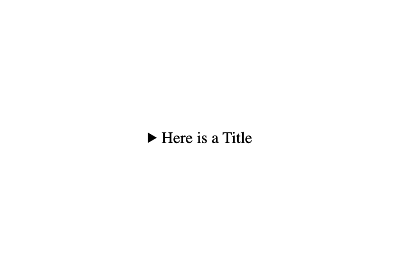
The <summary> element lets you give a title on which the extra information will be toggled.
On default, the details element is closed, but can be opened by adding the open attribute:
<details open>
  <summary>Here is a Title</summary>
  And here you can find the content. I am open by default.
</details>
Styling the details element.
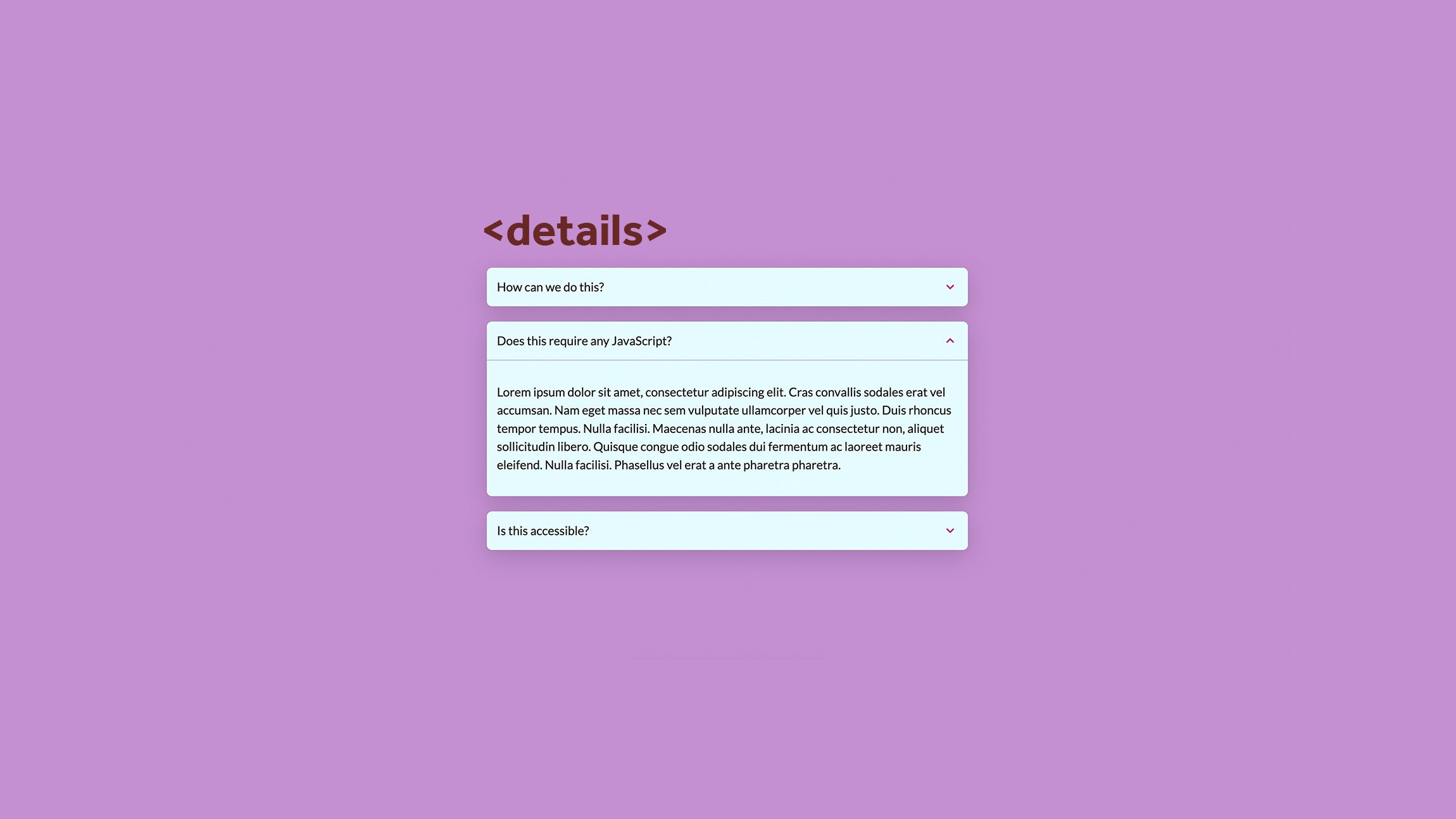
Let’s be honest, the default look & feel of the details element looks a bit boring. Let’s create something very known and easy:
<!-- This is repeated 3 times in the example -->
<details>
  <summary>
    A little title or a question
    <svg xmlns="http://www.w3.org/2000/svg" class="icon" viewBox="0 0 20 20" fill="currentColor">
      <path fill-rule="evenodd" d="M5.293 7.293a1 1 0 011.414 0L10 10.586l3.293-3.293a1 1 0 111.414 1.414l-4 4a1 1 0 01-1.414 0l-4-4a1 1 0 010-1.414z" clip-rule="evenodd" />
    </svg>
  </summary>
  <div class="details-info">
    <h2>Lorem ipsum dolor sit amet</h2>
    <p>Lorem ipsum dolor sit amet, consectetur adipiscing elit. Cras convallis sodales erat vel accumsan. Nam eget massa nec sem vulputate ullamcorper vel quis justo. Duis rhoncus tempor tempus. Nulla facilisi. Maecenas nulla ante, lacinia ac consectetur non, aliquet sollicitudin libero. Quisque congue odio sodales dui fermentum ac laoreet mauris eleifend. Nulla facilisi. Phasellus vel erat a ante pharetra pharetra.</p>
  </div>
</details>
First we add some basic styling of the element.
:root {
  --collapse-bg: #e5fcff;
  --collapse-color: #1a1a1a;
  --collapse-line-color: #acacde;
  --collapse-icon-color: #b8336a;
  --collapse-box-shadow: rgba(0, 0, 0, 0.16) 0px 10px 36px 0px,
    rgba(0, 0, 0, 0.06) 0px 0px 0px 1px;
}

details {
  background: var(--collapse-bg);
  color: var(--collapse-color);
  border-radius: 8px;
  margin-bottom: 24px;
  box-shadow: var(--collapse-box-shadow);
}

summary,
.details-info {
  padding: 1rem;
}

.details-info {
  border-top: 1px solid var(--collapse-line-color);
}
You might’ve noticed that I wrapped the content inside of a <div>. This is purely for styling reasons. To play around with a border and padding. In the end, I decided to remove the default marker and replace it with my own custom toggle icon.
summary {
  display: grid;
  grid-template-columns: 1fr auto;
  align-items: center;
  cursor: pointer;
  list-style-type: none; /* removes the default arrow */
}

summary .icon {
  display: inline-block;
  width: 24px;
  height: 24px;
  transition: transform 0.26s;
  color: var(--collapse-icon-color);
}

details[open] summary .icon {
  transform: rotate(180deg);
}
So why is it that we still tend to use JavaScript for this?
It’s mostly because of animating the collapse. While the default functionality is good, we like to animate things and that’s where a pure-css solution is hard to do. There are some workarounds to mimic that “bootstrappy collapse feel” but it’s not completely the same. There is a great article about this by Chris Coyier on how to animate the details element.
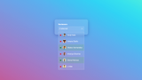
Creating an accordion with the details element.
Another thing that requires a bit of javascript is when you want to create an accordion. For example, when you have a group of FAQ items and only want one of them open. I’m not the biggest fan of accordions personally. But I created a very simple example on how to create an accordion with the details element.
The HTML of this is simple, I just grouped the elements by wrapping them, and as for the JS it’s as simple as removing the open attribute of the siblings when one of the details elements is clicked. I’m sure more advanced versions are possible, but it does the job.
<section class="accordion-wrapper" data-accordion>
  <details>
    <summary>
      Some title
      <svg xmlns="http://www.w3.org/2000/svg" class="icon" viewBox="0 0 20 20" fill="currentColor">
        <path fill-rule="evenodd" d="M10 3a1 1 0 011 1v5h5a1 1 0 110 2h-5v5a1 1 0 11-2 0v-5H4a1 1 0 110-2h5V4a1 1 0 011-1z" clip-rule="evenodd" />
      </svg>
    </summary>
    <div class="details-info">
    	Some content
   	</div>
  </details>
  <!-- add more details elements below -->
</section>
const accordionItems = document.querySelectorAll("[data-accordion] > details");

const siblings = (el) => {
  if (el.parentNode === null) return [];
  return Array.prototype.filter.call(el.parentNode.children, function (child) {
    return child !== el;
  });
};

accordionItems.forEach((el) => {
  el.addEventListener("click", () => {
    const others = siblings(el);
    others.forEach((sibling) => {
      sibling.removeAttribute("open");
    });
  });
});
And here is the CSS for that:
:root {
  --collapse-bg: #e6ebe0;
  --collapse-color: #1a1a1a;
  --collapse-line-color: #5ca4a9;
  --collapse-icon-color: #ed6a5a;
  --collapse-box-shadow: rgba(0, 0, 0, 0.16) 0px 10px 36px 0px,
    rgba(0, 0, 0, 0.06) 0px 0px 0px 1px;
}

.accordion-wrapper {
  margin-bottom: 2rem;
  box-shadow: var(--collapse-box-shadow);
  border: 3px solid var(--collapse-line-color);
}

details {
  background: var(--collapse-bg);
  color: var(--collapse-color);
}

details:not(:first-child) {
  border-top: 1px solid var(--collapse-line-color);
}

summary {
  display: grid;
  grid-template-columns: 1fr auto;
  align-items: center;
  cursor: pointer;
  list-style-type: none;
}

summary,
.details-info {
  padding: 1rem;
}

.details-info {
  border-top: 1px dashed var(--collapse-line-color);
}

summary .icon {
  display: inline-block;
  width: 24px;
  height: 24px;
  transition: transform 0.26s;
  color: var(--collapse-icon-color);
}

details[open] summary .icon {
  transform: rotate(45deg);
}
Now let’s use this details element a bit more shall we?
There are solutions for animating the collapse feel. It works out of the box and you don’t need to play around with aria attributes to “make it accessible”. Remember that every kilobyte you load on a website impacts the environment and your performance. So let’s at least think about using this instead of adding a complete library just to toggle some FAQ questions.