Recently, I've created a presentation named “so, you're still not using custom properties?” In this article, I want to highlight a part of that presentation. Custom properties have been available to us for quite some time now. And creating a smart button design system is just one of the many things where they can shine.
A bit of background: SCSS vs CSS
If you’re a front-end developer, chances are high that you’ve been using SASS or SCSS for quite some time. One of the things that really made an impact when SASS came along was the ability to use variables. CSS already has an alternative for this for quite some time in the form of custom properties, also known as “CSS3 variables”.
A small comparison, if you would style the background your body tag in “hotpink” by using a SASS variable, it would look something like this:
$color-primary: hotpink;
body {
  background: $color-primary;
}
The same could be achieved by using CSS custom properties by writing the following:
Note: Custom properties are always prefixed by a double dash.
:root {
  --color-primary: hotpink;
}
body {
  background: var(--color-primary);
}
There is quite a big difference here. Custom properties are something that the browser understands. Unlike SASS, which is a preprocessor, which means it will output a CSS file where your final code will look like the following if you use the SASS variable system:
body {
  background: hotpink;
}
So, why am I telling you the basics? Why is this important?
There is a lot more to custom properties than setting a variable in the :root and using it as a constant. The way custom properties are built, you can create some smart systems with them. A few of the benefits of using custom properties are the following:
- They can be scoped
- They can be overwritten
- They can have a fallback
- They can contain anything(!) you want
- They can be controlled with JS
An important note is that they do impact the overall performance of your CSS. It’s not going to have a lot of impact by just adding a few colors to your root, but be mindful when using them that you don’t overdo it with heavy calculations or endless overwrites on a root level.
That being said, it’s time to get to the main part of this article.
The button case - SASS variables vs CSS custom properties
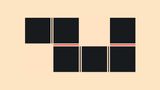
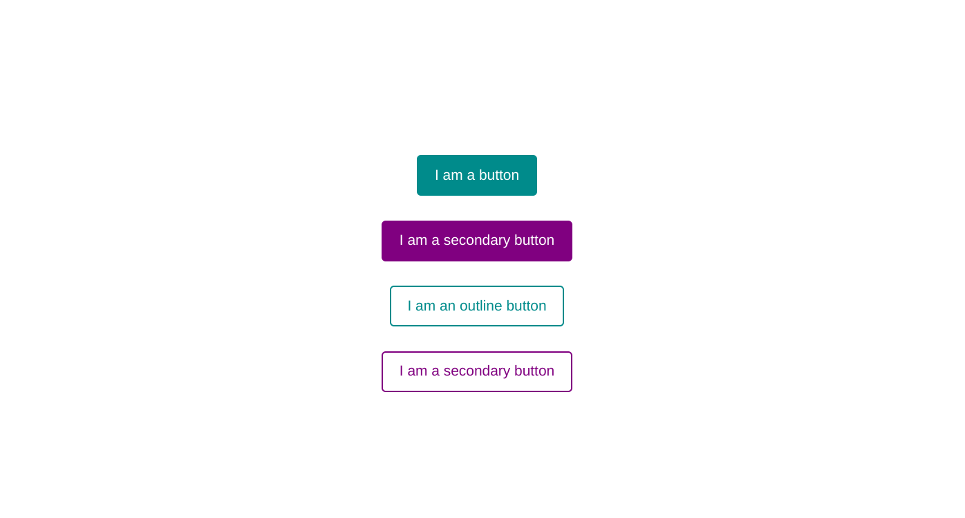
We will be styling buttons! 🥳 More specifically, these buttons:
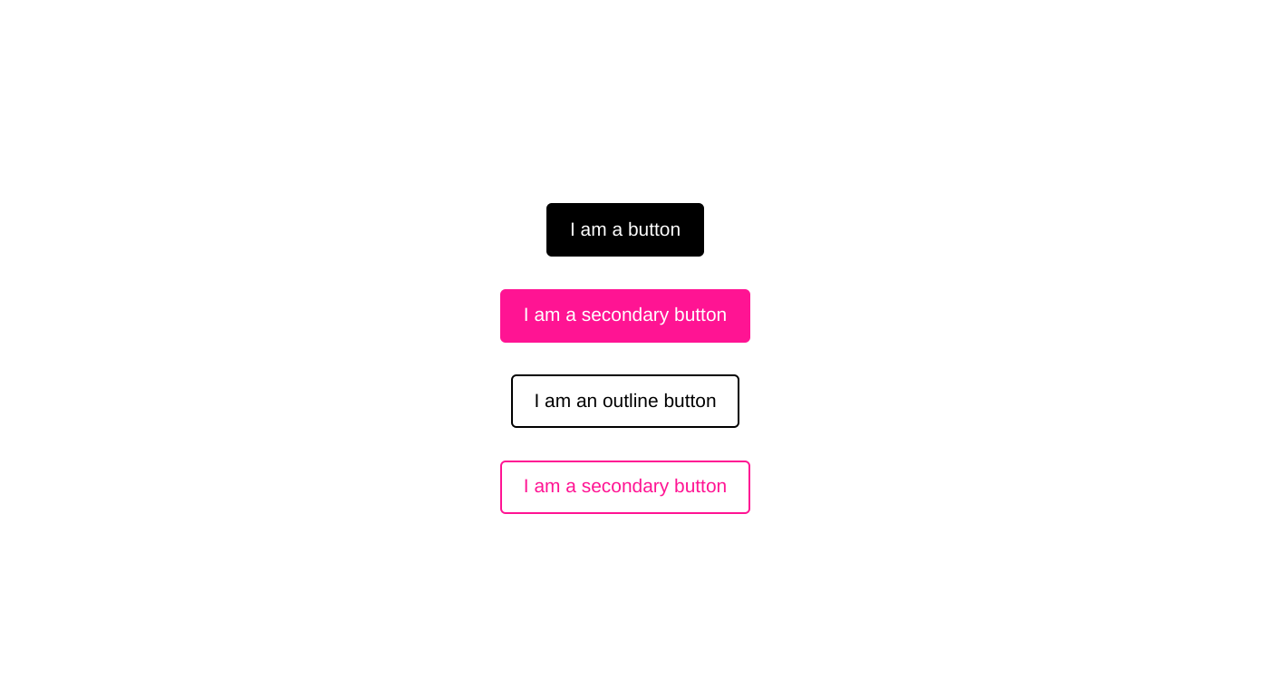
Nothing mind blowing here, no fancy designs as well, just four buttons like we have seen on the web quite a few times, a primary and secondary button, who each have an outline variant. They all have a hover/focus state as well:
For the sake of making my point in this article, the buttons have some basic styling for padding and border-radius that I won’t be repeating for the rest of this article:
button {
  padding: 13px 20px;
  border-radius: 5px;
  font-size: 1.1rem;
  cursor: pointer;
}
Using SASS variables to style our buttons
When using SASS variables for coloring our buttons, we’d probably use mixin of some sorts. But as this is not a “SASS tutorial”, I want to talk about the output it creates. If we would create these buttons by using SASS variables, the coloring of them would grant you the following output (big chunk of code coming up):
button {
  background: black;
  border: 2px solid black;
  color: white;
}

button:is(:hover, :focus) {
  background: DarkCyan;
  border-color: DarkCyan;
}

button.secondary {
  background: deeppink;
  border-color: deeppink;
}

button.secondary:is(:hover, :focus) {
  background: purple;
  border-color: purple;
}

button.outline {
  background: transparent;
  color: black;
}

button.outline:is(:hover, :focus) {
  border-color: DarkCyan;
  color: DarkCyan;
}

button.outline.secondary {
  color: deeppink;
  border-color: deeppink
}

button.outline.secondary:is(:hover, :focus) {
  background: transparent;
  border-color: purple;
  color: purple;
}
So although we might’ve used something smart such as a mixin, by using SCSS variables, our processed code looks very repetitive by constantly overwriting the colors and getting that specificity just right. We can do better! So let’s start fresh and apply the same styles, but this time by using custom properties. You can view this output example on CodePen.
Using custom properties to style our buttons
Let’s rewrite this by just using CSS instead of a preprocessor. If we look at our buttons, we notice they have one thing in common, they change color on hover. So let’s start using custom properties to create a smart system for our “filled buttons”
button {
  --color: black;
  background: var(--color);
  border: 2px solid var(--color);
  color: white;
}

button:is(:hover, :focus) {
  --color: DarkCyan;
}

button.secondary {
  --color: deeppink;
}

button.secondary:is(:hover, :focus) {
  --color: purple;
}
What did we just do? We created a custom property named --color and scoped this to our button element. Then we updated the background- and border color to read these custom properties. As custom properties can be overwritten, we will just update the custom property instead of re-declaring our border and background. This reduces our CSS size significantly.
We haven’t introduced a fallback yet, which in this case might not be needed, but for tutorial sake, let’s do this. Let’s update our default button by making it read the --color variable and fallback to the default color when it isn’t available. Instead of adding a fallback to each usage of var(), we can use a single custom property to handle that. I will prefix that custom property with an underscore for now, this is just a convention as it was used to indicate private variables in JavaScript before const and let were a thing (ah, the good old days). Feel free to indicate these things in a way that fits your style. Updated part of the code:
button {
  --_color: var(--color, black);
  background: var(--_color);
  border: 2px solid var(--_color);
  color: white;
}
Great! Now all we need to do is create our outline version of our buttons. We already have all the tools in play by using custom properties for our filled buttons, the only difference our outline buttons have is that they have a transparent background and change text color instead of background color. Now we can really take a shortcut to make this happen:
button.outline {
  background: transparent;
  color: var(--_color);
}
We have now styled our 4 buttons! Reducing our code significantly. Including white spaces, we started out with about 40 lines of code and by using custom properties, we turned that down to 19, which is more than a 50% reduction. Here is the version we just created:
The button case - enhanced usage of custom properties
If you’re like me, you don’t give up easily. I was wondering if we could somehow even make our code smarter. There is even a smarter way to create our four buttons by introducing a second custom property for the hover and focus color. Reducing our code to 17 lines and making new color variants even less redundant. This is the full code:
button {
  --_color: var(--color, black);
  background: var(--_color);
  border: 2px solid var(--_color);
  color: white;
}

button.secondary {
  --color: deeppink;
  --hoverColor: purple;
}

button.outline {
  background: transparent;
  color: var(--_color);
}

button:is(:hover, :focus) {
  --color: var(--hoverColor, DarkCyan);
}
So instead of re-declaring our hover states, we added a general hover for our button element which reads the --hoverColor custom property and has a fallback to the default button hover state.
This does come with some up- and downsides which we need to address.
On the upside…
If we would style our buttons like this, we could easily create a new color variant that both has a filled and outline version of the button. For example, if I wanted to add a new orange variant I could add the following next to the secondary button:
button.orange {
  --color: orange;
  --hoverColor: darkorange;
}
And the downside…
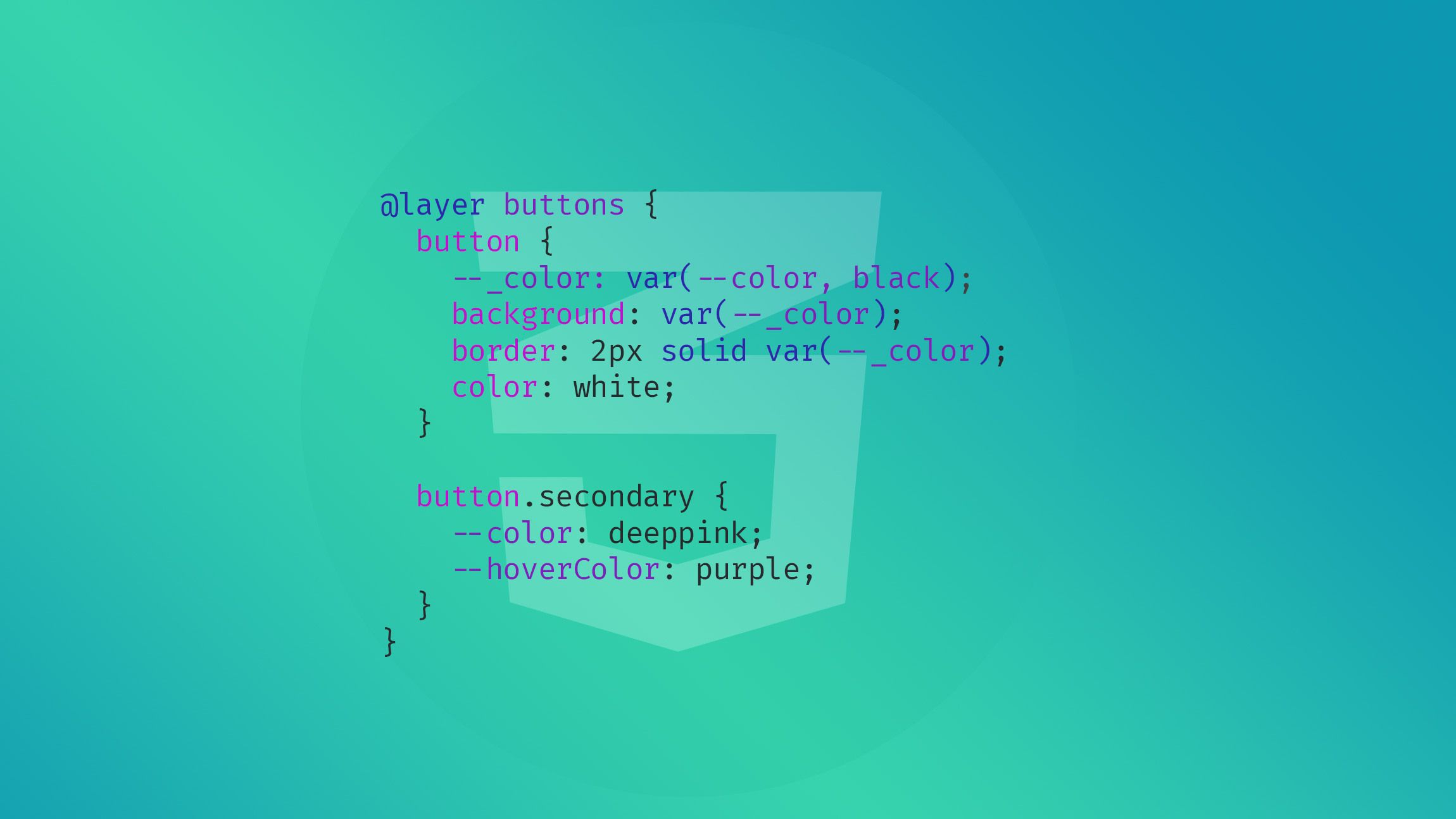
We are getting in a bit of a specificity danger zone here as the hover state of the button needs to come last in our stylesheet. There is a way to prevent this by adding our basic button styles inside of a cascade layer. Whether this is worth the effort really depends on how much of these buttons you’re going to style and is completely subjective. The reason I’m showing these different methods is that you have a choice and carefully plan the approach which suits you best.
/* default buttons layer */
@layer buttons {
  button {
    --_color: var(--color, black);
    background: var(--_color);
    border: 2px solid var(--_color);
    color: white;
  }
  button.secondary {
    --color: deeppink;
    --hoverColor: purple;
  }
}

/* Non layered styles come last */
button.outline {
  background: transparent;
  color: var(--_color);
}

button:is(:hover, :focus) {
  --color: var(--hoverColor, DarkCyan);
}

/* then in another file or lower in the file, you can add them to the layer */
@layer buttons {
  button.orange {
    --color: orange;
    --hoverColor: darkorange;
  }
}
So, you’re still not using custom properties?
I think custom properties can really help us in creating some smart design systems. And if you haven’t been using them a lot, I completely understand. I was late to the party as well…
But once you start to grow a habit of using them, it’s like a completely new world opens up into writing CSS. So I would strongly encourage you to play around with them. In my presentation, I go over a lot more ways on how to use them, including progressive enhancements and even using them as booleans by adding container style queries and :has() into the mix. They can greatly benefit our workflow by writing smart code that does more with less. I hope this little button case really helped you into “thinking custom properties” and will enhance your upcoming project.
I’m sure I’ll see some more awesome tricks involving custom properties during the course of CSS-day which I will be attending next month, can’t wait! 🥳