Browser support for @property nears completion, a great time to delve into some technical aspects of this CSS feature. While I've experimented with @property in demo settings before, I’ve never used it in a production environment. With the upcoming full browser support, let’s take a look at the inner workings and uncover some of the benefits.
Without going too much into the history about this technique of handling our custom properties, it might be nice to repeat just a little of the basics for those landing here and having absolutely no clue what I’m going on about.
What is this @property thing?
The @property rule is part of the CSS Houdini umbrella of APIs, which aims to provide more control and flexibility for authors. It was introduced in the CSS Properties and Values API Level 1 spec around 2019 and has had a long support in Chrome and Edge, followed up by Safari. I personally didn’t experiment that much with Houdini when it first came around as it never felt natural to me.
The Purpose of @property
The @property rule allows developers to explicitly define custom CSS properties (also known as CSS variables). This provides several benefits:
- Property type checking and constraining: We can specify the data type of a custom property, such as
<number>,<color>, or<length>. This helps prevent errors and ensures that custom properties are used correctly, a win for design systems and we all love typing these days, right? Find the full list of syntax types here - Setting default values: We can set a default value for a custom property declared this way with the
initial-valueproperty. This ensures that the property has a fallback when not set elsewhere in the stylesheet. - Defining inheritance behavior: We get to choose whether a custom property can inherit values from its parent elements or not. That way we can manage how our custom properties are applied in the cascade, more about that later on.
Basics of @property
The @property rule gives us a more structured and powerful way to create and use custom properties. This opens up new possibilities for customization and especially theming.
Here’s an example of how to define a custom property named --primary-color with a initial-value of #ea1ca5:
@property --primary-color {
    syntax: "<color>";
    inherits: true;
    initial-value: #ea1ca5;
}
This definition specifies that --primary-color is a color property, it can inherit values from parent elements, and its default value is #ea1ca5.
Once a custom property is defined, it can be used in CSS declarations just like any other property:
body {
  background-color: var(--primary-color);
}
This declaration sets the background-color of the body element to the value of the --primary-color custom property.
Now that we got the basics right, off to the fun stuff! Let’s talk about the opportunities this opens.
Property type checking and constraining
By using @property to define custom properties with clear types, we can easily maintain and update our code. This can make it less time-consuming and error-safe to modify custom properties as a project evolves. It’s even a bigger win when building a design system that gets used by third-parties, showing the users that something doesn’t seem right in DevTools.
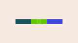
Just as the first example, let create a little playground with color:
At the top of our CSS we will add the following:
@property --color {
    syntax: "<color>";
    inherits: true;
    initial-value: #ea1ca5;
}
Our playground HTML will contain three div elements, each with a different class:
<div class="color-1"></div>
<div class="color-2"></div>
<div class="color-3"></div>
Now let’s set the default custom property on the <div> element, give it some width and height. Next up, we’ll overwrite this custom property for each of the classes:
div {
    display: flex;
    justify-content: center;
    width: 20vw;
    height: 100px;
    background: var(--color);
}

.color-1 {
    --color: #1a535c;
}

.color-2 {
    --color: rgb(100, 200, 0);
}

.color-3 {
    --color: #3e47db;
}
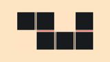
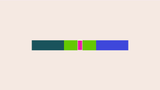
With a bit of extra styling, this is the result.
What happened here?
Notice that it doesn’t really matter how we write the colors when using the <color> type. For example, in .color-2, we chose to use the rgb() function and it still works.
So all of this is valid, but let’s take a look at what happens when we change .color-1 to an integer.
.color-1 {
    --color: 4;
}
We are now seeing our fallback color as the value is invalid. It’s handy to have a fallback system like this and personally, I love this.
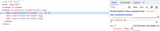
Debugging @property in Chrome DevTools
With Chrome version 118, DevTools provides useful information about typed custom properties. Let’s inspect the element with an invalid color value after setting the --color property to 4. A warning icon appears next to the custom property. Hovering over the icon reveals an error message stating that the property value is invalid and the expected type is <color>.
An anchor below the warning directs us to the custom property declaration.
When hovering over a valid custom property, we receive detailed information about the property:
- The current value
- The expected syntax
- The inherits boolean
- The initial value
- And an anchor to the declaration
This DevTools functionality significantly enhances the efficiency of using typed custom properties.
See it in action in this video by the DevTools team
Defining inheritance behavior
If the inherits property is set to true, the custom property value can be inherited by child elements. This means that if we set a value for the custom property on a parent element, that value will be applied to all of its child elements unless they have their own value set for the property. This is also the default for custom properties.
Let’s keep using our colors demo for this and add a new element inside of the div with class .color-2. This is now the updated HTML:
<div class="color-1"></div>
<div class="color-2">
    <div class="inner"></div>
</div>
<div class="color-3"></div>
Now let’s give this new div.inner a bit of styling. To see our element clearly, we’re going to give this a white border as well.
 .inner {
    background: var(--color);
    border: 3px solid white;
    width: 50px;
    aspect-ratio: 1;
}
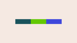
We are making it inherit the --color custom property for its background, this will result to the following:
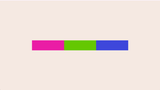
Now let’s update our declaration of the custom property and set the inherits to false.
@property --color {
    syntax: "<color>";
    inherits: false;
    initial-value: #ea1ca5;
}
The result:
Because the inherits property is set to false, the custom property value cannot be inherited by child elements. This means that each child element must explicitly set its own value for the property, thus in this case, showing the initial-value color.
Why set inherits to false?
Disabling inheritance for custom properties could be a good practice when we need to have more control over the styling of individual elements and avoid unintended overrides (for example, in design systems or web components). It can also simplify our CSS code and make it more maintainable. However, if we would want to maintain a consistent style across a hierarchy of elements, inheritance can be a useful tool. This why I believe that setting inheritance to false should come with a sense of caution to avoid confusion when working on a large project with multiple authors. But that’s just my 2 cents, and writing documentation can go a long way.
Unlocking new possibilities with @property
The introduction of @property opened up exciting possibilities for CSS, particularly in the realm of animations. One of the most popular demonstrations of @property is the animation of a hue rotation wheel.
Consider the following example:
:root {
    --hue: 0deg;
}

.item {
    background: hsl(var(--hue), 50%, 50%)
}

@keyframes {
	from {
        --hue: 0deg;
    }
    to {
        --hue: 360deg;
    }
}
This won’t work at all, because the browser has no idea on how to animate hue rotation. However, using @property, we can explicitly instruct the browser to interpret the --hue variable as an <angle> value, enabling smooth animation:
@property --hue {
    syntax: "<angle>";
    inherits: false;
    initial-value: 0deg;
}
Here is another example using that same technique in combination with some SVG:
Animating clip-path with custom properties
For a scroll driven animations demo I wanted a dotted line to appear in a timeline. To initially hide that line, animating a clip-path seemed like good idea, but we can’t just animate the percentages from a clip-path with a custom property. @property however, can be used to animate the dimensions of a clipping mask. For instance, to gradually reveal an element, we can define variables for the vertical and horizontal percentages of the clipping mask and animate them.
@property --clip-vertical {
  syntax: "<percentage>";
  inherits: false;
  initial-value: 95%;
}

@property --clip-horizontal {
  syntax: "<percentage>";
  inherits: false;
  initial-value: 100%;
}

.item {
  clip-path: inset(0 0 var(--clip-vertical) var(--clip-horizontal));
}
We can set the initial value to (almost) completely hide the element with a full clip-path.
To animate the removal of the clip-path, we can create an animation:
.item {
    clip-path: inset(0 0 var(--clip-vertical) var(--clip-horizontal));
    animation: showLine linear both;
}

@keyframes showLine {
  0% {
    --clip-horizontal: 100%;
    --clip-vertical: 95%;
  }
  60% {
    --clip-horizontal: 0%;
    --clip-vertical: 95%;
  }
  100% {
    --clip-horizontal: 0%;
    --clip-vertical: 0%;
  }
}
This example can be found in the following demo (In combination with Scroll Driven Animations):
Animating Background-Image Gradients
Animating the colors of a background-image gradient is unfortunately something that isn’t possible by default. However, by defining the gradient colors using @property, we can finally do this:
By animating the --from-color and --to-color variables, we can create visually appealing transitions between gradient colors, This would be that basic idea:
@property --from-color {
  syntax: "<color>";
  initial-value: #f0f;
  inherits: false;
}

@property --to-color {
  syntax: "<color>";
  initial-value: #0ff;
  inherits: false;
}

.item {
  background: linear-gradient(to right, var(--from-color), var(--to-color));
  animation: gradient 4s linear infinite;
}


@keyframes gradient {
  0%,
  100% {
    --from-color: #f0f;
    --to-color: #0ff;
  }
  50% {
    --from-color: #00f;
    --to-color: #ff0;
  }
}
Here is that in action:
Or take a look at the following example where I animate another gradient (with kudos to gradient.style)
It is a game changer
This is really going to be a fantastic addition for those of us that love creating design systems and fancy animations. Remember that these are just some basic examples. I’ve seen quite a few examples out there by far greater minds than myself where even numbers were converted to integers. Really looking forward to what this will bring, whether that is for animations or just really clever typed design systems.
I really went the extra mile with writing this as I hope that for some this can be a great entry point. To be honest, this was an entry point for myself as I was doing research while writing this article. Not bad for a first article of the year, not bad at all….
Let 2024 bring you lots of happiness, love and beautiful splashes of CSS once again. May you be joyful, playful and keep on coding the amazing things you do.