I've been hyped about the new container queries in CSS. The possibility to change the look & feel of elements based on the location they are presented instead of the viewport width will be a great addition to the front-end workflow.
It all started with a proposal by a few people including Miriam Suzanne who drew the first ideas into how containment should behave. With a lot of upvotes on the topic and more people backing it as a highly-needed feature, it’s finally available with a flag on Chrome Canary with many more browsers to follow soon.
We’ve all been there, you have a beautifully styled call to action in the main content section of a website, after some A/B testing or client feedback, there is a decision that the call to action would be better off in the sidebar. Most of the time we start adding some classnames to the card or its parent and change their look based on the media queries. It does the trick, we’ve done it for some while now, but what if we can make all of this a little bit more dynamic, readable and maintainable.
I created a little example to illustrate the mass use of media queries to get to a certain result. I’m pretty sure I could write this example with less code, but if we’re honest, when working with deadlines and project rushing, this isn’t far away from the truth.
I created this article when the container queries were still behind a flag. However. I updated the article on 30 september 2022 to be a bit more up to date with stable releases in Chrome and Safari
How will container queries with CSS help us?
First of all, if you want to view the demo’s provided in this blogpost, you
will have to use chrome canary for now, go to
chrome://flags and search for
Enable CSS Container Queries and enable it.
Container queries are getting a lot of support lately. Check if your browser can handle this new feature.
Rather than relying on the viewport, we will be able to change the behaviour of our component based on the way it’s contained. This basically means that we won’t have to provide extra classes and will be able to style component based, rather than viewport based. In short: CSS container queries will add many benefits to the fluid web.
How does it all work?
First of all we’ll need to specify the container for the parent(s) of our elements. This is done with the container property. The container property is a shorthand for the following:
container-type
Defines an element as a query container. Descendents can query aspects of its sizing, layout, and style.
container-name
Specifies a list of query container names for @container rules to use to filter which query containers are targeted.
container:
A shorthand property to set both container-type and container-name.
The container-type can have the following values:
size
Establishes a query container for dimensional queries on the block and inline axis. Applies layout, style, and size containment to the element.
inline-size
Establishes a query container for dimensional queries on the inline axis of the container. Applies layout, style, and inline-size containment to the element.
normal
The element is not a query container for any dimensional queries on the block and inline axis.
More information on this can be found on the MDN Web Docs.
Basic example of the container property.
Let’s say we want to style a card differently based on the width of its current container. In this example our sidebar is at least 400px wide and we want to style the card in a horizontal grid when it’s bigger than the sidebar’s width. We want to create the following:
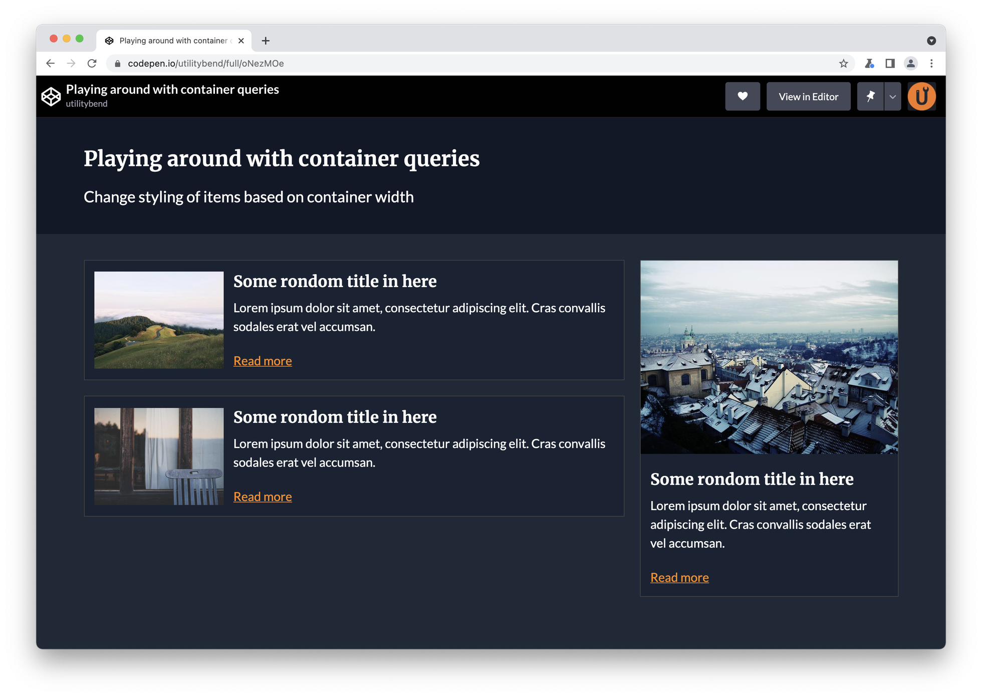
So the HTML might look something like this:
<section class="grid container">
  <main class="content">
    <article class="card">
      <img src="https://picsum.photos/800/600?random=1" alt="" />
      <div class="card-body">
        <h2>Some rondom title in here</h2>
        <p class="card-description">
          Lorem ipsum dolor sit amet, consectetur adipiscing elit. Cras
          convallis sodales erat vel accumsan.
        </p>
        <a href="">Read more</a>
      </div>
    </article>
    <article class="card">
      <img src="https://picsum.photos/800/600?random=2" alt="" />
      <div class="card-body">
        <h2>Some rondom title in here</h2>
        <p class="card-description">
          Lorem ipsum dolor sit amet, consectetur adipiscing elit. Cras
          convallis sodales erat vel accumsan.
        </p>
        <a href="">Read more</a>
      </div>
    </article>
  </main>
  <aside class="sidebar">
    <article class="card">
      <img src="https://picsum.photos/800/600?random=3" alt="" />
      <div class="card-body">
        <h2>Some rondom title in here</h2>
        <p class="card-description">
          Lorem ipsum dolor sit amet, consectetur adipiscing elit. Cras
          convallis sodales erat vel accumsan.
        </p>
        <a href="">Read more</a>
      </div>
    </article>
  </aside>
</section>
And then we handle the CSS container query:
/* Basic card styling */
.card {
  margin-bottom: 24px;
  border: 1px solid #444;
  background: rgba(25, 35, 51);
}

.card-body {
  padding: 15px;
}

/* container magic, make cards change look & feel based by their container width instead of the viewport */

.grid > * {
  container: card/inline-size;
}

@container card (min-width: 401px) {
  .card {
    display: grid;
    gap: 15px;
    grid-template-columns: 100px 1fr;
    padding: 15px;
    align-items: center;
  }

  .card-body {
    padding: 0;
  }

  .card-description {
    display: none;
  }
}
All done! I created an example which goes a bit more in-depth:
A few things to note
When this feature was still behind a flag, giving a name to the container was an extra option. After a lot of discussions at the W3C working group it has been made mandatory.
Inline-size vs block-size containment.
In the example above, I used the inline-size because I only needed to change the behaviour based on the container’s width. There has been talk about the possibility to use block-size as well, so that we can change the behaviour based on the height. Unfortunately, this is not yet supported. But the possibilities of this will be amazing. I already created a little template to start working on it as soon as it’s available.
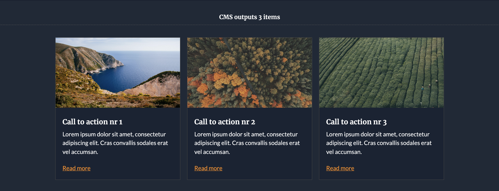
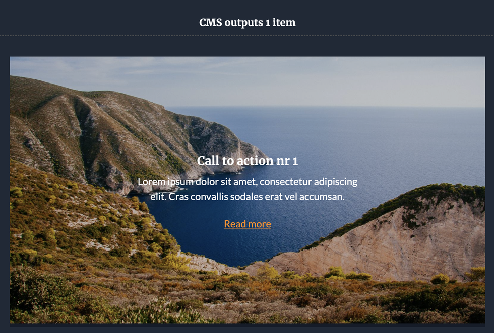
Benefits of “contain” with content provided by a CMS.
When writing and experimenting with new CSS features I always try to imagine real-life problems I had to deal with in the past. And this one is very common and something that others have experienced as well.
The case: When creating a homepage for a client, there might be a “in the picture” section. The client is allowed to add up to three items in the CMS. But from time to time they just want to add one big banner, or maybe two items. When this happens, we mostly rely on counting the items (through PHP or JS maybe?) so that we can add different class names based on the length of an array. Sounds familiar?
By using container queries such as the following we can handle this behaviour perfectly without relying on extra class names by providing a fluid CSS grid in combination with CSS container queries:
<!-- When the CMS gives 2 items as an output (feel free to change the amount of items) -->
<h2 class="subtitle">CMS outputs 2 items</h2>
<section class="container grid-cta">
  <div class="grid-cta-item">
    <article class="card-cta">
      <img src="https://picsum.photos/1600/900?random=1" alt="" />
      <div class="card-body">
        <h2>Call to action nr 1</h2>
        <p class="card-description">
          Lorem ipsum dolor sit amet, consectetur adipiscing elit. Cras
          convallis sodales erat vel accumsan.
        </p>
        <a href="">Read more</a>
      </div>
    </article>
  </div>
  <div class="grid-cta-item">
    <article class="card-cta">
      <img src="https://picsum.photos/1600/900?random=2" alt="" />
      <div class="card-body">
        <h2>Call to action nr 2</h2>
        <p class="card-description">
          Lorem ipsum dolor sit amet, consectetur adipiscing elit. Cras
          convallis sodales erat vel accumsan.
        </p>
        <a href="">Read more</a>
      </div>
    </article>
  </div>
</section>
/* basic styling of our card */
.card-cta {
  margin-bottom: 24px;
  border: 1px solid #444;
  background: rgba(25, 35, 51);
}

.card-body {
  padding: 1.4rem;
}

/* Setting up our cta grid */
.grid-cta {
  display: grid;
  grid-template-columns: repeat(auto-fit, minmax(320px, 1fr));
  grid-gap: 1.4rem;
}

.grid-cta-item {
  container: cta/inline-size;
}

/* change style of our cards based on their container width */
@container cta (min-width: 560px) {
  .card-cta {
    display: grid;
    gap: 1.4rem;
    grid-template-columns: 215px 1fr;
    padding: 1.4rem;
  }

  .card-body {
    padding: 0;
  }
}

@container cta (min-width: 700px) {
  .card-cta {
    position: relative;
    display: block;
    padding: 0;
    border: 0;
  }

  .card-cta::after {
    position: absolute;
    top: 0;
    left: 0;
    width: 100%;
    height: 100%;
    background: rgba(0, 0, 0, 0.2);
    z-index: 1;
    content: "";
  }

  .card-body {
    position: absolute;
    top: 50%;
    left: 50%;
    max-width: 500px;
    text-align: center;
    transform: translate(-50%, -50%);
    z-index: 2;
  }
}
This really shows the strength of the container queries.The end results gives us something like this:
The CMS provides 3 items.
The CMS provides only one item:
Using container queries with polyfills.
Yes, you can start using this awesome feature right now with a polyfill if you need to support older browsers. Personally I would advice using it with PostCSS. I won’t go in-depth on this because it’s very well documented. However I might add a demo of this on github in the near future.
Check out the polyfill for container queries here.
Are container queries performant?
There isn’t a final metric on this. However, there are certain benchmarks on which these new features are tested and as many more browsers are starting the development of it, I’m pretty sure it won’t be a problem.
Further experimentation and reads.
There are many codepens already showing this feature and even I can’t help myself adding a little experiment. Such as this 5-frame animation based on container width (Really, don’t use this kind of thing in your live projects, it’s just me having a bit of fun with CSS).
Want to go more in depth? Here are some reads for you:
Note: I updated the examples on september 30, 2022 with the new specification