Let's talk about sticky headers. They get used all the time and it seems that they are something we expect on a website. But is adding a sticky header the solution to our UX/UI problems, or just an easy fix?
Ask yourself the question: why do we need a sticky header?
This question might sound a bit silly but actually, we don’t ask it enough. We always assume we made the right call by using them because: who can say no to it? “It just works”. And you’re right! It probably does.
If you would look at the essence of the question you might get the following answers:
- We want to be able to navigate the whole time
- We want to know which part of the website is active at the moment
- We want the logo / branding to be visible over the entire website
All of these are fair points, but I could still ask you the same question: do you need a sticky header to achieve this or is it just an easy solution? I’m not calling a “death to the sticky header” in this article, but the idea is to make you think and try to find creative solutions.
It’s important to notice the different media when we talk about sticky headers. We have a different screen size and generally have a different aspect ratio as well. We usually take a mobile first approach but to make my point, let’s start with the big screens.
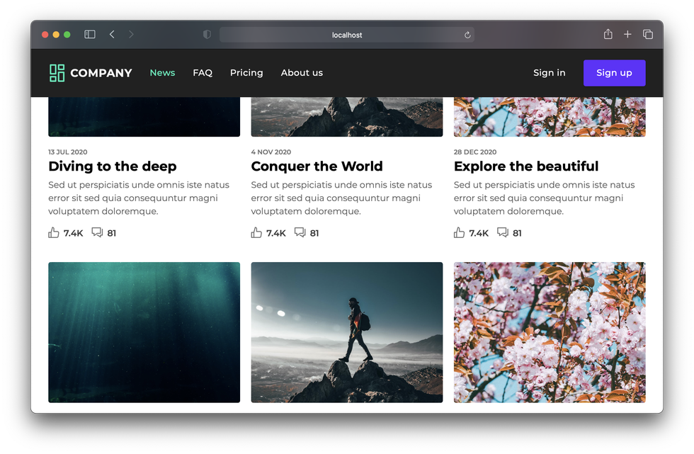
Desktop sticky headers.
When designing with the desktop in mind, sticky headers are usually not much of a problem. We have enough vertical space for the header, but even in this case, some pitfalls can be found. If you’re a weirdo like me who doesn’t always use his browser full-screen, a sticky header might be a bit too much. There are some factors that come into play here:
- What is the height of the sticky header?
- How do we decide if there is enough room for a sticky header?
- Do we expect the user to rely on the main navigation?
Let’s get the last bullet point out of the way, because this is subjective to the kind of application.**
I see this far too many times:** I’m visiting a webshop, the main navigation consists out of the following:
- Home (or a logo click)
- Products
- FAQ
- About us
- Contact
Let me say this bluntly: I’m here to buy some stuff and I couldn’t care less about your organisation. The only kind of contact I want is the handover of my ordered goods on my doorstep. I really hope that your homepage doesn’t have the most important information and is rather a collection of items. I’m sure it’s a beautiful homepage with a great intro and a huge banner with your promotions, but I just want to buy this product I found while searching on google.
When it comes to the FAQ, I’m not interested in finding that in the main navigation. If I have a question about delivery or products, I’m probably already browsing a product or even in the checkout process. Why not add a link from one of those pages? Or even better, show the answers right away.
What’s even worse, is that in a lot of cases, the navigation gets removed while I’m checking out: Where did my FAQ-link go? Is this some shady trick to make me follow the process anyway? There might have been some important information there such as: “why doesn’t this ship to my country? Why is the delivery going to take so long?
So maybe the FAQ related to the checkout process should be found on those pages instead of the main navigation where I’ll have to go to an overview and click deeper until I find delivery information. Do not assume your users will just open the FAQ link in a new tab, they probably won’t.
If you have a main navigation that includes your shopping categories, in that case: i’m all for that. But if it’s just random information, let’s fill the screen with some more products, ok?
Maybe the metrics are wrong?
Let’s get a bit more technical and talk about sizes. A lot of sticky headers are just too big and first of all I want to suggest to either keep them small and tidy or at least create a smaller version when scrolling the page. For desktop screens try to keep it around 120px in height.
Another problem we face are those weirdo’s such as myself who like to put their browser windows in a strange aspect ratio. Usually, the metric for keeping a sticky header large or small is based on the viewport width, automatically assuming that a person is browsing at a 16:10 (ish) ratio. A simple solution for that is to also check your header based on the aspect ratio and height, not just the width.
@media (min-aspect-ratio: 16/8) {
  /* A minimum aspect ratio */
}

@media (min-height: 800px) {
  /* A minimum height */
}
Mobile sticky headers.
This is the part where we tend to get a bit lazy. The most common mobile menu on websites looks like this:
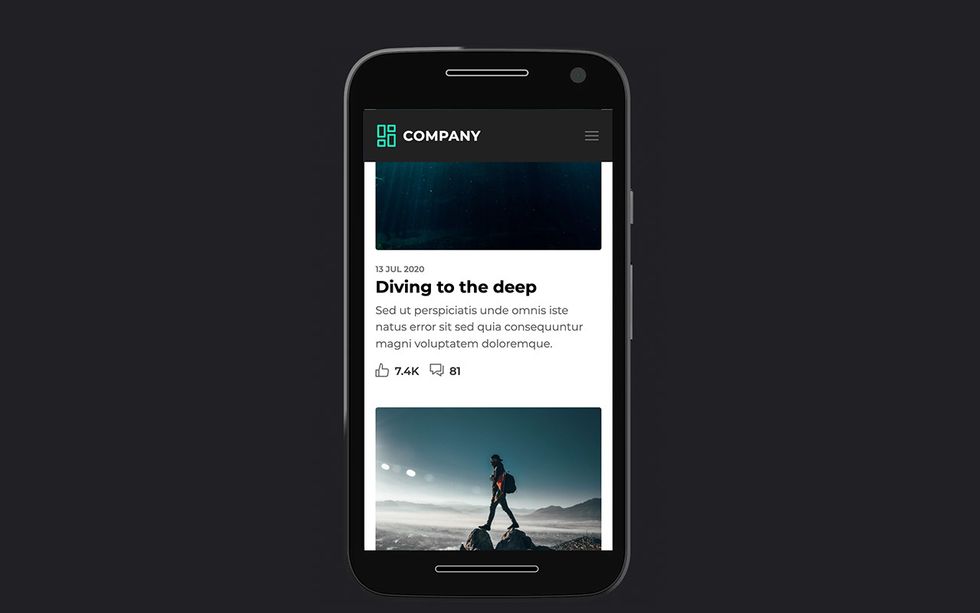
Just add the navigation in the sticky header, and done…
So, this is a sticky header with a logo and a hamburger icon to access the navigation. The benefit is that we are now scrolling on a mobile page, so a quick flick of the scroll wheel might not bring us to the top of the page. The sticky header is actually a good practice for this. However, there is something fundamentally wrong in this example.
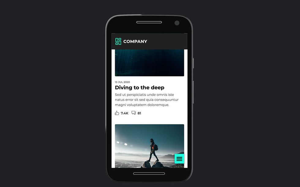
When it comes to phones, the user is usually holding it with one hand and navigating with his/her thumb. In this case, we might have a hard time reaching the button by using our thumb and we also blocked a bit of space for our content on a device that could benefit from it. It also depends on the phone. For smaller phones, the top right is actually quite accessible, but for those big phones, it might be a bit tougher. Same goes here: Media queries based on height are a possible solution.
A great fix for those ultra large phones would be putting the navigation icon on the bottom of the page and creating a sticky hamburger icon.
There is a great article about this by Scott Hurff. This article is a few years old, but it’s still applicable, maybe even more than when it released with phones getting bigger and bigger.
However, there are a few more challenges that occur here.
1) We want our branding to be visible all the time
This is a hard one for me to tackle. Personally, I know which website I’m visiting while scrolling through the content and I believe that there should be more interesting ways to make your brand pop inside of the page instead of using the logo. It’s not just a UX challenge here, it’s a design challenge. A very interesting challenge if you ask me…
2) We want people to return to an overview when entering on a detail page
Maybe we can do something else: a sticky breadcrumb or a sticky return to overview? It might take less space than a logo.
3) What about tablets?
Interesting question, because users with a tablet usually use their index finger to navigate around. I can see that placing the hamburger in the header might be a better idea there. There is also a lot more height, so it could remain sticky as well.
4) What about left-handed people? Aha, you got me there! Although the majority of people are right handed. When holding the phone with your left hand, it might be harder to reach a navigation button on the bottom right. Still, it’s easier than the top right.
You could put it in the center, but then it might be the worst (or the best?) of both worlds. Which brings me to this crazy idea I had:
Left handed media queries.
We have preferences and media queries for so many things these days. In the settings of your device you might find something called dark mode. We can target this with CSS by using:
@media (prefers-color-scheme: dark) {
  /* Targets user preference dark mode */
}
So we are actually styling our website based on the user preference. That’s great!
With accessibility (finally) getting more attention each day, why not introduce a left handed setting, we already do this when setting up our mouse.
I actually did some research about this and noticed there is already an issue logged on the csswg-drafts.
I think this could be a great addition to CSS so I upvoted it! The suggested syntax is the following:
@media prefers-hand: right {
  .mySuperCTA {
    right: auto;
    left: 0;
  }
}
I agree that this isn’t a setting on mobile devices at the moment, but who knows, maybe we’ll see a marketing campaign soon “The first phone for lefties!”.
My conclusion on sticky headers.
I think there is a lot to think about here. It’s all very subjective and choices have to be made. Always think about your user first and what is beneficial. Do we need the sticky header? Or is it just to show off our logo? Do we want the menu at the top all the time, or do we want to show more content? I’m certainly not saying that sticky headers are a bad thing, they get misused and we probably should think about why we want them before we implement them as an easy solution.