Scroll-driven animations are one of my favourite things in CSS. But if you have ever tried to build an interactive story with them, you probably noticed that scrubbing is not always what you want. There are cases where you just want the scroll position to tell an animation when to start, and then let it play smoothly with its own timing. Now that the W3C has specced CSS Animation Triggers and it is a candidate for Interop 2027, we might be getting this sooner than I thought. I built a few demos to try it out, and I want to share what I learned.
I really love scroll animations. When scroll-driven animations first arrived in browsers, I spent hours playing with them. Being able to connect an animation directly to the scrollbar without any JavaScript still feels mind-blowing to me from time to time. In February this year, I first heard about scroll-triggered animations and I thought it was fantastic. That time, I had to get my valentine’s day post in order and sort of went over the top, but at the same time I think I reviewed the feature pretty well. But a more “general” blogpost on this feature is long overdue, so time to get cracking.
In this article, I took my time to write as much information as possible, even if people read less nowadays, I had to do this. Mostly because it helps me to get a grip on this micro syntax inside of CSS. So, I understand it might get a bit lengthy, if you already understand most of this, feel free to skip right to the demos.
Why scroll-driven isn’t enough
The scrubbing behavior in a scroll-driven animation is wonderful for a progress bar at the top of a page, or for a subtle parallax effect on a background image. But for normal website elements, like a title popping in, three feature cards fading into place, or an illustration popping in and drawing itself, scrubbing just feels weird. In those cases, you don’t want the user’s scroll speed to control the animation, mostly because you don’t want a sort of “pause” in your animations. You just want the scroll position to act as a trigger: once the element enters the screen, play a normal CSS animation with its own nice timing and easing curve.
In the past, we always had to use JavaScript and IntersectionObserver to add a class like .is-visible, and then write a CSS transition. I remember doing this thing back in the jQuery ages as well, which feels like a decade ago (wait.. it is a decade ago, I’m getting old). Still, this feature seems long overdue.
But now the good stuff, we now have CSS scroll-triggered animations as a specification and it’s already available in Chromium browsers. It is also documented on MDN, and is a candidate for Interop 2027 (yes, it’s in my favourites! And if you want that as well put it in your top 15 for next year!). The Chromium support shipped in 146+ (start of this year), so it’s time for a practical approach with simple, but fun demo’s.
Before we look at the demos, let’s take a quick look at the syntax and how the ranges work.
Scroll-driven versus scroll-triggered
The names sound a lot alike, but the concept is different:
- Scroll-driven animation: The animation progress is tied to scroll progress. If you scroll 50%, the animation is at 50%. Stop scrolling, and the animation pauses.
- Scroll-triggered animation: The scroll position only decides when the animation starts. Once it triggers, it runs as a normal time-based CSS animation (like
0.6s ease-out).
For continuous effects like parallax or reading bars, use scroll-driven. For entering content, cards, and text reveals, use scroll-triggered.
How the syntax works
The feature adds two new CSS properties: timeline-trigger and animation-trigger.
Sort of like a light switch and a lightbulb. One element sets up the trigger, and another element (or the same one) listens to it.
1. Setting the trigger with timeline-trigger
You put timeline-trigger on the element you want to watch as it moves through the viewport:
.card {
  timeline-trigger: --card-trigger view() entry 100% exit 0%;
}
Here is what these parts mean:
--card-trigger: A name for the trigger. It starts with two dashes, just like a CSS variable, the name after that is of your own choosing.view(): The timeline source. This watches the element inside the scroll area. You can also passview(inline)if you are scrolling horizontally (depends on writing mode).entry 100% exit 0%: The activation range (the range where the trigger activates). In the absence of an explicit active range (set via the slash syntax/), the active range defaults to being the same as the activation range.
2. Linking the animation with animation-trigger
Next, you tell your animated element to wait for that trigger:
.card {
  animation: pop-in 0.6s cubic-bezier(0.34, 1.5, 0.64, 1) both;
  animation-trigger: --card-trigger play-forwards play-backwards;
}
The animation definition itself is just a regular CSS animation: keyframes, duration, easing, etc…. But animation-trigger tells the browser: “do not play right away on page load. Wait for --card-trigger, and then use these actions”:
animation-trigger: <name> <enter-action> <exit-action>;<enter-action>: What happens when the element enters the activation range (scrolling down into view).<exit-action>: What happens when the element leaves the active range (scrolling back up out of view).
Looking ahead: activation and deactivation actions
Current browser implementations and initial documentation refer to <enter-action> and <exit-action>, but the CSS Animation Triggers specification is planning to rename them to <activation-action> and <deactivation-action>.
The reason reason actually makes me more hyped about this feature: triggers won’t just be limited to scroll and view timelines. In the future, the specification will also support pointer triggers (and event triggers in general, like pointerdown and pointerup). With pointer or click interactions, you don’t “enter” or “exit” a scroll area, instead the trigger simply activates and deactivates. This keeps syntax consistent across every trigger type.
It also seems that Bramus is currently creating a tool for this in DevTools. This will come in handy. I’m looking forward to that.
I might update the post in the future for this, but at least I wanted to document the change for now.
Understanding the ranges: entry, contain, exit, and cover
The range part got me confused quite a lot of times in the past, I’m not gonna lie, I really struggled with hem for some reason and they still trip me up from time to time. They were already a part of Scroll-driven animations, so yeah, lot’s of struggles. I finally sort of got the hang of them without using a cheat code.
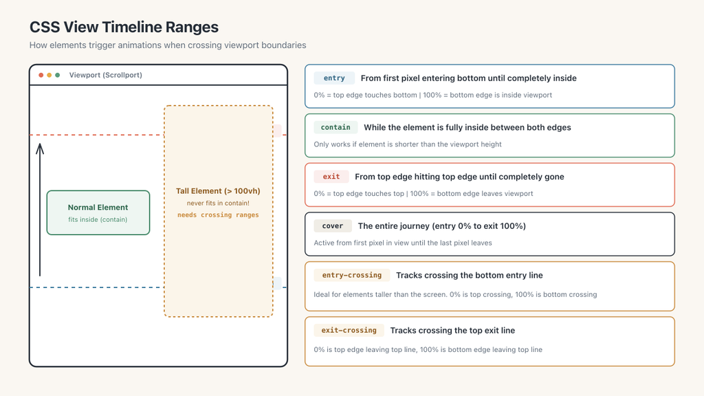
An element passing through the screen goes through four main phases:
entry: The moment the top edge of the element enters the bottom of the screen (0%), until its bottom edge is inside (100%).contain: While the element is completely inside the screen, between the bottom and top edges.exit: From the moment the top edge touches the top of the screen (0%), until the bottom edge leaves the screen (100%).cover: The entire journey from start to finish (from first pixel entering the bottom to the last pixel leaving the top).
In practice, I often use entry 100% exit 0%. This basically means: wait until the element is completely inside the screen before triggering, and reverse the animation once the element starts leaving.
What about elements taller than the screen?
There is an important detail when you build larger scrollytelling sections. What happens if your section is taller than the viewport, say 150vh?
If an element is taller than the screen, contain will never happen. Because it physically never fits between both screen edges at the same time. And entry will only reach 100% once you have scrolled all the way through the element to reach its bottom edge. In a demo I’ve never really encountered that problem, but I’m sure I will at some point. Especially if you’re planning really complicated parallax effects with scroll-driven animations this would come in handy. For scroll-trigged, this probably won’t be used often. I did want to add the following items for completeness sake, as the specification has a fix for that:
entry-crossing: Tracks the element crossing the bottom entry line of the screen.0%is when the top of the element touches the entry line, and100%is when the bottom of the element crosses that same entry line.exit-crossing: Tracks the element crossing the top exit line of the screen.0%is when the top of the element hits the exit line, and100%is when the bottom of the element crosses that exit line.
The animation actions
Inside animation-trigger, you can choose what should happen when entering and leaving:
play-forwards: Plays the animation forward.play-backwards: Plays the animation in reverse.play-once: Plays the animation once and stays there. Even if you scroll away and come back, it won’t re-trigger.pause: Freezes the animation wherever it currently is.reset: Jumps straight back to the starting frame.none: Does nothing on that edge.
The two combinations I use the most are:
play-forwards play-backwards: Great for reversible page sections. Scroll down, it plays in. Scroll up, it plays back out.play-once none: Great for one-time introductions. Once a user scrolls to an item, it animates in once and stays clean. I feel that most of the time we want to give the user a great experience and not bombard them with animations in every direction.
I also want to do a shout-out to pause. I mean, it’s not in the demo’s I created, but it is a lot of fun, you can sort of do a peek-a-boo with your triggered animations.
A fun trick with attr() for trigger names
In my original article I relied heavily on attr() to wire up my animations. I still stand by that, I love this new capability! Instead of writing unique CSS classes for every single trigger name, you can use the typed attr() feature in CSS:
<section class="card" data-trigger="--my-card">...</section>[data-trigger] {
timeline-trigger: attr(data-trigger type(<custom-ident>)) view() entry 100% exit 0%;
}The browser reads the attribute and turns it into a valid custom identifier. That saved me a lot of boilerplate across all these demos.
Ok! Time for the juice. The last few months, I feel like I haven’t been challenged enough when it comes to animations, so I wanted to try out a few things/techniques. I hope they’re not too much all over the place and that you find value in these demo’s.
Demo 1: Headline Reveal (start simple)
This is a simple headline reveal where two lines of text slide up out of an overflow mask, followed by a dividing line underneath. The idea was to combine scroll-triggered animations, with advanced attr() capabilities. To create a staggered effect, got to have some sibling-index() in there as well.
Here is the CSS (more details below):
@property --delay {
  syntax: "<time>";
  inherits: true;
  initial-value: 0ms;
}

[data-trigger] {
  timeline-trigger: attr(data-trigger type(<custom-ident>)) view() entry 50% exit 50%;
}

.line-wrap {
  /* Stagger lines with sibling-index */
  --delay: calc((sibling-index() - 1) * 200ms);
}

[data-trigger="--headline"] .line {
  animation: reveal 0.9s cubic-bezier(0.2, 1, 0.3, 1) var(--delay, 0ms) both;
  animation-trigger: --headline play-forwards play-backwards;
}

[data-trigger="--headline"] .rule {
  animation: rule-grow 0.8s cubic-bezier(0.22, 1, 0.36, 1) 0.6s both;
  animation-trigger: --headline play-forwards play-backwards;
}
Instead of writing :nth-child(1) and :nth-child(2) by hand to delay the second line, I’m using sibling-index() to calculate the delay directly in CSS. Do take note that you will have to register the custom property using @property, otherwise the browser will pass down a raw, uncomputed token.
When the section reaches halfway into the screen, the lines slide up and unblur. When you scroll back up, they reverse.
This animation is fun, and snappy and can be an easy win for your projects.
Demo 2: Feature Cards (more sibling-index stagger effects)
We build card grids all the time, right?. Following up the technique in the previous demo… In this demo, we have three feature cards. When the section enters the screen, the cards stagger in, and then each card’s internal elements (icon, title, text, and button) cascade one after another.
Here is how the timing works.
First, we register our custom properties for the staggering effects:
@property --stagger {
  syntax: "<time>";
  inherits: true;
  initial-value: 0ms;
}

@property --cascade-delay {
  syntax: "<time>";
  inherits: true;
  initial-value: 0ms;
}
Next up, we wire up those custom properties with a bit of sibling-index() magic, making sure our code is smart out of the box. We set our animation-trigger and stagger effect on the card. I also played around with the ranges a bit.
[data-trigger] {
    timeline-trigger: attr(data-trigger type(<custom-ident>)) view() entry 90% exit 60%;
}

.card {
  /* Stagger across the cards */
  --stagger: calc((sibling-index() - 1) * 120ms);
  --cascade-base: 50ms;
  --cascade-step: 100ms;

  animation: card-enter 0.8s cubic-bezier(0.34, 1.56, 0.64, 1) var(--stagger) both;
  animation-trigger: --card play-forwards play-backwards;
}
Now to stagger the inside of our card, we use the second delay (--cacade-delay) to make sure each item stacks. For the cascade delay we want to make sure it only starts when our card entered, thus using the previous --stagger and adding a bit of an extra delay --cascade-base, multiply this by the amount of siblings and increase them with a --cascade-step of 100ms.
/* Inner elements cascade inside each card */
.card > * {
  --cascade-delay: calc(var(--stagger) + var(--cascade-base) + sibling-index() * var(--cascade-step));
}

.card-visual { animation: pop-in 0.6s ease var(--cascade-delay) both; }
.card-title  { animation: text-reveal 0.6s ease var(--cascade-delay) both; }
.card-desc   { animation: fade-up 0.6s ease var(--cascade-delay) both; }
.button      { animation: pop-in 0.6s ease var(--cascade-delay) both; }

[data-trigger="--card"] :is(.card-visual, .card-title, .card-desc, .button) {
  animation-trigger: --card play-forwards play-backwards;
}
The animations themselves are pretty straightforward, so check out the demo code for those, just your typical opacity, scales, translates, etc…
This stagger combination is a lot of fun, and we’re not writing any custom delays. The amount of cards you add to the HTML doesn’t matter anymore, the browser takes care of it.
Demo 3: Variable Font Typography
I almost never play with variable fonts, and it was time to do something about that, so why not just do it with a trig-animation while I was at it. When you scroll into each full-height section, the letters shift in weight and width.
Because this is a punchy title reveal, I did not want it to reverse every time you scroll up and down (yes, you’ll have to refresh to replay animations). I wanted to make a point that for this sort of animation, a play-once action comes in handy.
There are three effects in the demo, I’ll just cover this first one in the article, as the idea behind them is pretty much the same.
[data-trigger] {
  timeline-trigger: attr(data-trigger type(<custom-ident>)) view() entry 80% exit 0%;
}

[data-trigger="--vf-expand"] span {
  font-variation-settings: "wght" 100, "wdth" 25;
  animation: vf-expand 0.9s cubic-bezier(0.25, 1.2, 0.5, 1) calc((sibling-index() - 1) * 120ms) both;
  animation-trigger: --vf-expand play-once none;
}

@keyframes vf-expand {
  from {
    font-variation-settings: "wght" 100, "wdth" 25;
    opacity: 0;
    translate: 0 40px;
  }
  to {
    font-variation-settings: "wght" 900, "wdth" 151;
    opacity: 1;
    translate: 0 0;
  }
}
Each letter is wrapped in a <span>, so sibling-index() animates the letters one by one across the word. With play-once none, it runs only on entry and stays in place as you keep reading.
Demo 4: Kinetic Quote (combining triggered and driven)
Just to show that scroll-driven and scroll-triggered can be combined to create beautiful effects.
In this demo, we show a quote: “The best animation is that which goes unnoticed.”
The quote words rise into view with a trigger. But in the background, a huge outlined word drifts across the viewport (scroll-driven). By now, you should already have good idea on how I do the staggering, so I’ll keep it short:
/* 1. Triggered: words animate in with a clean easing curve */
blockquote > span > span {
  animation: rise-in 1s cubic-bezier(0.2, 1, 0.3, 1) var(--delay) both;
  animation-trigger: --quote play-once none;
}

/* 2. Scroll-driven: the background drifts as you scrub the page */
.bg-drift {
  animation: drift linear both;
  animation-timeline: scroll(root);
}
This shows why both features belong together. The background creates a sense of continuous motion and depth through scroll scrubbing, while the text entrance stays crisp and readable with a timed curve.
Demo 5: CSS Carousel (horizontal triggers and SVG drawing)
For the last demo, we take the trigger into a horizontal scroller: a pure CSS carousel displaying line drawings.
Here, we pass inline to view(), so the trigger listens to horizontal scrolling instead of vertical:
[data-trigger] {
  timeline-trigger: attr(data-trigger type(<custom-ident>)) view(inline) contain / cover;
}

.draw {
  stroke-dasharray: 1;
  stroke-dashoffset: 1;
  /* Read path duration from HTML */
  animation: draw attr(data-dur type(<time>), 0.6s) ease calc((sibling-index() - 1) * 180ms) both;
}

[data-trigger="--mug"] .draw {
  animation-trigger: --mug play-forwards play-backwards;
}
It’s your typical SVG stroke animation, but now triggered!
Each product card also uses the new CSS Carousel buttons (::scroll-button(inline-start) and ::scroll-button(inline-end)), meaning the whole carousel works with zero JavaScript. As each item slides into view, its SVG paths draw themselves automatically.
A note on accessibility!
So, while these demo’s are fun, we do need to think of our users relying on assistive technology such as screen readers. In quite a few of my demo’s I cut up words inside of spans and that can become an accessibility nightmare (words do not get read as a sentence anymore). Notice how I’m using aria-label and aria-hidden to make sure these people get a good experience
<h1 class="headline" aria-label="Typography in motion">
  <span class="line-wrap"><span class="line" aria-hidden="true">Typography</span></span>
  <span class="line-wrap"><span class="line italic" aria-hidden="true">in motion</span></span>
</h1>
By setting an aria-label, the people hear the h1 as a normal title, I’m setting aria-hidden on the spans inside the title. In contrast to buttons, headings don’t have a children-presentational: true, so make sure to add those hidden tags there as well.
And last but not least, you can fine-tune this to your heart’s content, but for the demo’s I went for the lazy approach and just killed all animations for people who don’t like them, potentially causing nausea:
@media (prefers-reduced-motion: reduce) {
  * {
    animation-trigger: none;
    animation-duration: 0.01ms;
    animation-delay: 0ms;
  }
}
Think of your users.
Progressive enhancement with @supports
Even though the specification is official and who knows, potentially gets inside Interop 2027, cross-browser support takes time to roll out everywhere. That is why progressive enhancement is so important here. The most important rule is simple: if a browser does not support triggers yet, your content must still be visible and readable.
You never want an element to start with opacity: 0 or a translate off-screen, only to stay stuck there.
A clean way to handle this is using @supports:
/* 1. Default: everything is visible and positioned normally */
.card {
  opacity: 1;
  transform: none;
}

/* 2. Enhanced: only add animation triggers if supported */
@supports (animation-trigger: none) {
  .card {
    animation: card-enter 0.8s ease both;
    animation-trigger: --card play-forwards play-backwards;
  }
}
Or, if you prefer writing fallbacks defensively:
@supports not (animation-trigger: none) {
  .card,
  .line,
  .button {
    animation: none;
    opacity: 1;
    translate: 0 0;
  }
}
The bottom line is that there are a few strategies you can use. You could fallback to a scroll-driven animation, or reach for JavaScript with interseationobserver, or not animate at all. It really depends how much time you have on your project, what you, or your client wants.
A lot of fun in this API
Being able to use scroll position to trigger time-based CSS animations is a great addition to the web platform. Combined with sibling-index() and scroll-driven timelines, attr(), we can build lovely experiences with very little code. Combining these newer CSS features really turned CSS in a scroll animation machine that runs butterly smooth.
With the W3C specification in place and a potential candidate for Interop 2027, I am really excited about where this is heading. If you want to test it in Chrome, grab the CodePens and play around with them. Try swapping the actions or tweaking the ranges to see how the timing changes (it’s what I do!). Change the text in headlines, add more lines, etc… Don’t just wait for the skill file in your LLM, make sure you get what’s going on, so you’ll be able to tweak this and create an experience that is unique and engaging.
I hope this gave you a good starting point to experiment with it yourself. I for one, am happy I got to learn this feature a little bit better.
Extra
I couldn’t resist and created a peekaboo demo as well, Happy Halloween!