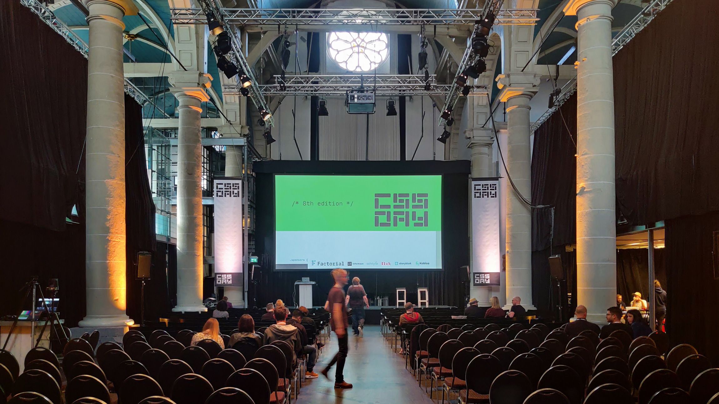
After a long break because of Covid-19, CSS Day is back. In a new location at the Zuiderkerk in Amsterdam. Once again trying to create the perfect line-up for everything design and CSS, and boy, they delivered just that.
Waking up in the beautiful Amsterdam
Every time I go to a hotel, I seem to struggle the first night with getting some sleep. Waking up way too early to head off to the conference, I decided to go for a morning run, the sun was just starting to peep through the trees, letting me know that today will be a good day.

About the venue of CSS Day
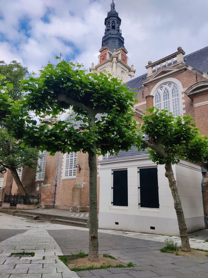
Now being hosted in the Zuiderkerk, a fantastic location. When I arrived, to my surprise, I was welcomed by the clocks of the church. But strangely enough, when you are inside of the church you can barely hear them. I’m not the church-going type of person, let alone, two days in a row. But I do know a bit about acoustics and they really did a lot of effort when it comes to sound, except for the beautiful architecture, you could barely notice that you were sitting in church. After a hard deserved croissant after my morning run, It was time to take places and start the conference.
The speakers at day 1
Jeremy Keith: In And Out Of Style
Quite a known speaker, he’s been around for some time and gave a great keynote about the current and upcoming exciting times for CSS. With a blast from the past, showing us how third party libraries and hacks can become standards, or at least become reasons for standards to be created. I felt a bit of nostalgia listening to that talk, especially when he was talking about rounded corners in the Internet Explorer 6 era. Showing off his work and on the WorldWideWeb NeXT timeline and explaining a few of those points of history and last but not least sharing his love for design systems. A great talk to start the day.
Rachel Andrew: Interop 2022
The so-called “browser wars” are a thing of the past. Nowadays, all browser vendors come together to solve the top browsers compatibility issues identified by developers. This is interop 2022 and if you haven’t checked it out, I advise you to do so. It’s interesting to see the main working areas on browsers and also the dedication to first fix the things already implemented such as the gap property for Flexbox. A lot of the Interop 2022 items would become more clear during the day, but It was interesting to hear how these things get measured, about tests and also that we still have a chance to influence priorities for Interop 2023 by creating and starring issues on Github. The future of CSS is bright.
Lea Verou: CSS Variable Secrets
The first in-depth tech talk of the day. There was clearly a lot to say about using CSS variables. This is so much more than just SASS variables in native CSS. From creating booleans out of variables to some more complex algebra and showing us that CSS Custom Properties can hold just about any value. This was one of those talks that made me say: wait? You can actually do that? Creating space toggles in variables to create progressive enhancement for the new color modes in CSS, now that is a clever hack. Her talk also made me realise how badly I want to play around with the style container queries in the future. I know that this talk made me want to try some things out with variables and custom properties. So much information, so little time.
Bramus Van Damme: The CSS Cascade, a deep dive
It’s nice to see a Belgian up on that stage, as a former lecturer at Odisee you can clearly see the teaching skills of Bramus. With an audience still recovering from a lunch break he was able to keep the attention while going in depth about the cascade. He already wrote a blogpost about this which I read some time ago. But hearing him speak about it in combination with beautiful crafted slides made my enthusiasm grow just that little bit more. Excellent talk about this feature that is rolling out in all major browsers right now. The love for cascade layers is real and from a personal standpoint, I’m really happy about the syntax of this feature, it’s simpel, elegant, and easy to understand, especially after you understand the cascade just that little bit better. Thanks Bramus, keep talking with those hands!
Ana Ferreira: Collaborating without Borders
Ana Ferreira is Head of design at Doist, and has been working remotely for the company for about 8 years. She clearly explained that remote work is not the same as working from home, especially compared to working from home during the Covid pandemic. Asynchronous tools were key here, and such reducing meetings that could’ve been an email or a ticket. A lot of her talk was about trusting employees and taking a human first approach. I felt kind of jealous when she spoke about never having to log hours and just making sure that the work gets done. I can relate to this. An agenda shouldn’t always be stuffed with tasks. When the job gets done a bit more early, it might be interesting to work on personal development and growth, which in the end benefits a company. Because you can present your newly discovered technologies and maybe make the world/company a better place.
“Let’s not use being overworked as a badge of honor. Set boundaries and prioritize your well-being” Anna Ferreira
Chris Lilley: Escaping the sRGB Prison
I was actually looking forward to this talk because it was only a few weeks back since I chose to start reading the color modules 5 draft on the w3c website. And to be completely honest, colors are hard. I had a tough time understanding what was going on. But Chris Lilley delivered big time. Really showing how the gamut works and how different color syntaxes can give us different results was eye opening. One thing is for sure, in the future, gradients will look a lot more pretty. It’s an interesting module but also with a note of caution. Because we are going outside the sRGB prison, colors may become a bit more subjective. I might experience a color to be “greenish”, while another person might find it a bit more blue with a bit of green in it. Very interesting stuff. And for once we can say the following: There is no support for this in any browser, except for Safari, which supports all of those features!
Marcin Wichary: I pressed ⌘B. You wouldn’t believe what happened next
I don’t have a lot of experience when it comes to Figma, so I didn’t know what to expect from this talk. But “OMG”, this was a talk to be remembered. Marcin came on stage with an enthusiasm and a well crafted presentation that blew everyone away. I’ve always loved a good typography talk but this was next level. Talking about the struggles of font uses, the different weights, versions, sup and sub fonts, the struggle it takes to just press cmd+B to make a font bold. This was eye-opening. What is bold? If a font has a base weight of 400, but the bold version has 900, is using cmd+b to make it bold still a good idea? Is it just too bold and should it be considered as something else? And what do you do with all the other modifier keys on the keyboard? What about the legacy of numpads keys in figma to zoom? I personally never really thought of these things when it comes to design files and it was a great way to end the day. This was the surprise of CSS Day 1 for me. You can find an alternate version of the talk, but we got to see a lot more and enjoyed it very much.
The speakers at day 2
Adam Argyle: Oh Snap!
A little snap of the fingers and away we go for day 2. I was really looking forward to this because I had been working on accessible scroll tabs a while back. Adam made a beautiful presentation made with scroll snaps, as it should be ;). Really showing the full potential of scroll snapping beyond your basic slider. Using the scroll snap alignment to place the last item of a chat window at the bottom, so on page load it will always be visible. Using sticky positioning to create an overflow effect, and a lot more. He ended with a few things that they are working on in the scroll snap module 2 which among other things includes a :snapped pseudo element to target the current snapped item. Lovely stuff. Ow yeah, and I might need to revisit my demo just a little bit. Oh, and an interesting sidenote, together with Tab Atkins he’s also working on the CSS nesting module.
Michelle Barker: Creative CSS Layout
Michelle started off with one of the questions that all of the css developers asked themselves before: In this use-cas, would you use Flex or Grid. And the answer can really depend on the use-case, you should always choose what feels right. She also showed some of the strengths in using the aspect-ratio property. For example when using it on a grid itself with images inside of it. A lot more of these nifty grid tricks such as creating fluid padding around your grid and let’s not forget container queries and fluid typography. A great tool for fluid typography named utopia.fyi is something i’ll take a look at very soon
Amit Sheen: Getting Creative with Keyframes
Animations, animations, ANIMATIONS! We are getting spoiled at CSS Day this year with a variety of topics. Amit Sheen creates some of the greatest CSS animations out there. He does note that some of his animations aren’t to be used in a live environment due to the performance issues they could bring. But giving an insight on how he starts working on them was a great thing to see. It sounds simple but he starts with pen and paper, writing multiple graphs to align animations to each other, by writing curves on the graph to indicate the easing of them. Using a negative delay on animations so that you don’t get the “hard start” when an animation begins. Another really clever thing is to use @property to animate multiple transforms at the same time. A lot to take home from and some best practises that i’m sure to use in the future.
Ben Evans: The Joy of CSS
If you don’t know Ben Evens, I strongly suggest you take a look a at his work.
This talk really felt a bit like watching Bob Ross on television, very calming, live painting in CSS. It was very relaxing to see, but to be honest, maybe a bit too relaxing so shortly after the lunch break. Still it was wonderful to see how he starts with creating his CSS paintings and the dedication it takes to make something, a half hour a day, and about a year till completion. But why does he do that? To quote Ben:
- “You can’t master something without knowing it’s limits”
- It’s fun and relaxing
Maike Klip: Service Design and Front End Interaction
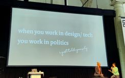
When designing for services, what are the things you need to think about. In the past you had to actually go to a physical place for all your government related issues, nowadays the “government” is more becoming a computer rather than a physical person you can talk to. This brings a lot of frustration. How can you make a computer have a compassionate relation to its users? Maike has documented all her interactions with the government for over an entire month and translated the key values into: desirable, viable, responsible, technological.
She also talked about the earthquakes in Groningen where people could get a subsidy for repairs or strengthening their houses. This resulted in enormous waiting lines, not only in real life, but also on the web. A badly created website, where by changing the URL you could get another spot on the waiting list and another person would be kicked out instead; When you hopefully/eventually got in after hours of waiting you were treated to a very bad crafted form that could even make a tech person scared for filling it in.
Tab Atkins-Bittner: The Future of Organizing Your CSS
Pages have become a lot more complex over time. The time that we used a simple selector is long gone. Now you could give everything a unique class in your CSS or you could nest a lot of levels deep, but in the end, you know you’ll end up with an “!important” slapped on top of it.
You could fix that by just giving up and using a framework such as Tailwind or Bootstrap. But Tab thinks that we can do better. By using the shadow DOM to reduce long pages and scoping CSS inside of little components we could make pages significantly smaller in size. You can import a stylesheet inside of your components but what if you need to style them from the outside. Well, with some variable trickery you can make that happen. I loved how he created a dice-roll component, because he plays D&D.
You can help with the nesting module!
He also talked about the CSS nesting module and they need your help. I wasn’t going to add code in this article because I feel like I should play around with some of the topics instead of just copying code from slides. However, they need our help with the nesting module. You can join the discussion of the nesting module here. And here are the current ideas:
.a {
	color: black;
	& .b {}
	@nest .c & {}
	@nest &.d, .e {}
}
.a {
	color: black;
	@nest & .b {}
	@nest .c & {}
	@nest &.d, .e {}
}
.a {
	color: black;
	{
		& .b {}
		.c & {}
		&.d, .e {}
	}
}
Stephen Hay: When Design Systems Lie
Do design systems alway lead to a good design? From that starting point Stephen Hay was going to start with telling some of the things that we lie about, mostly to ourselves. Design decisions are part of a system and often do not resemble the reality of the full design. It’s a system in a system. What this talk was really about is communication really. We need to talk with designers, show them what is possible in CSS. We don’t do that enough and there are a lot of cool things we can do nowadays which could impact design decisions.
Conclusion
So, why did I not go into detail of all these talks, maybe I wasn’t paying attention at all?
No, that’s not the case. First of all, I’m sure many will write an in-depth review of this event with code examples, links to slides and all of that. But I’m going to hold on to my notes for now, let things sink in, maybe create a few Codepens, try stuff out, re-read some of the things the speakers were talking about and maybe highlight something of it in the coming months.
You can always look some of these speakers up or go to an event yourself. There is a lot of information out there and I encourage you to do so. Because even after hearing them speak, I’ll be doing the same, going in depth, learning.
This was an amazing CSS Day edition, there was so much variety, I had some really interesting conversations as well with some of the speakers. It was a real “brain overload” at the end of it.
And guess what, they’ll be back next year! On the 8th and 9th of june.
